It's THIMM time.
It’s THIMM time.
Client:
THIMM Group
Creative direction:
Jonas Meyer
Photography:
Maximilian König
Lead agency:
K’UP
Realization:
Ediundsepp
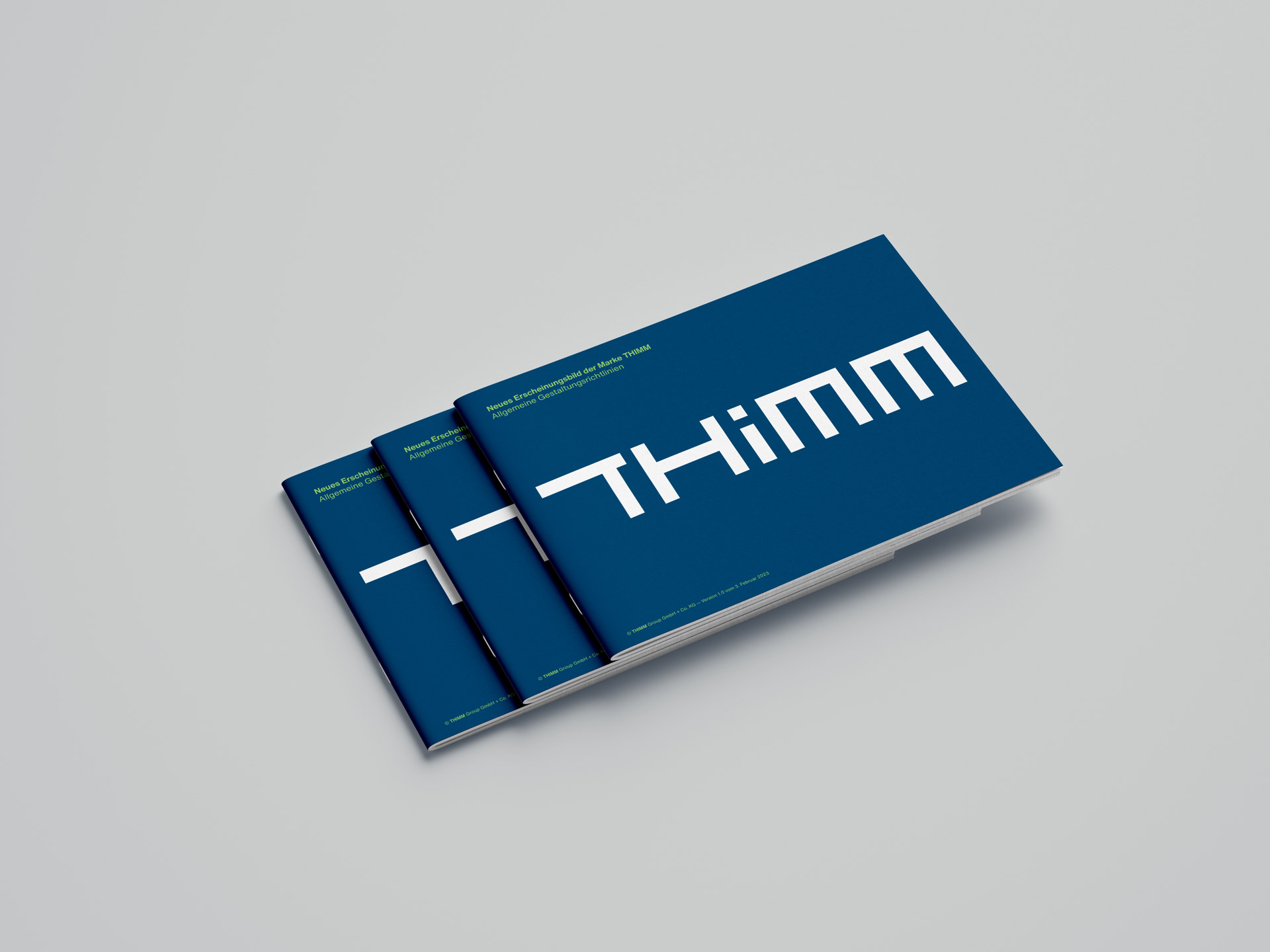
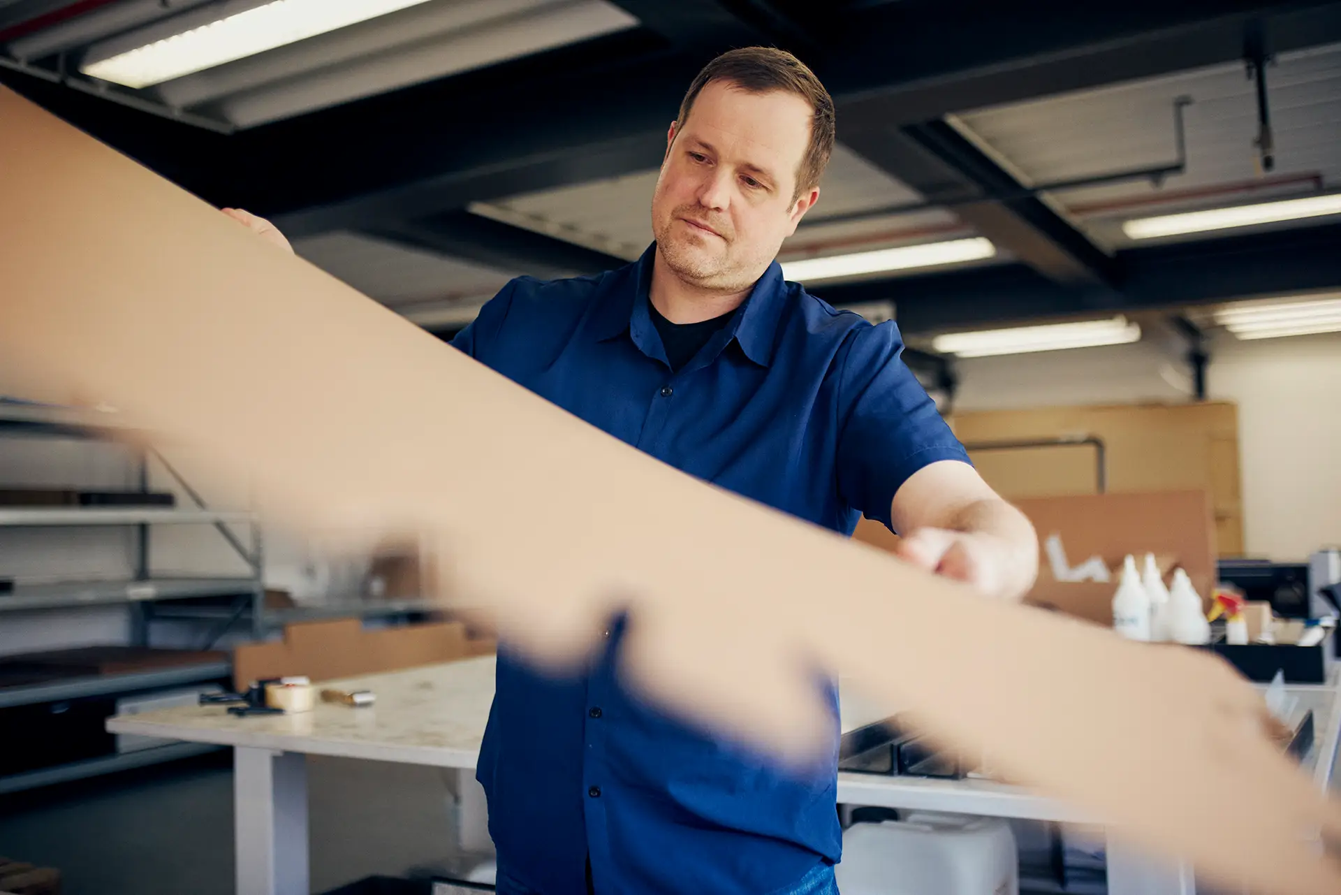
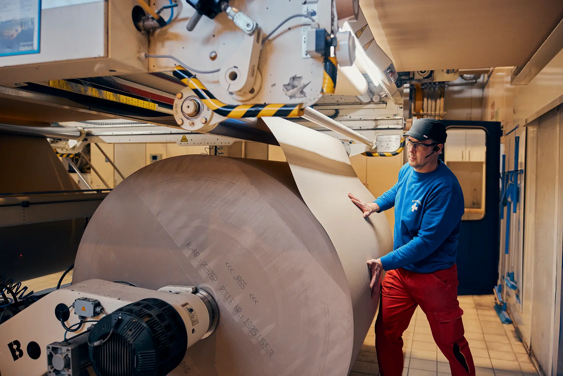
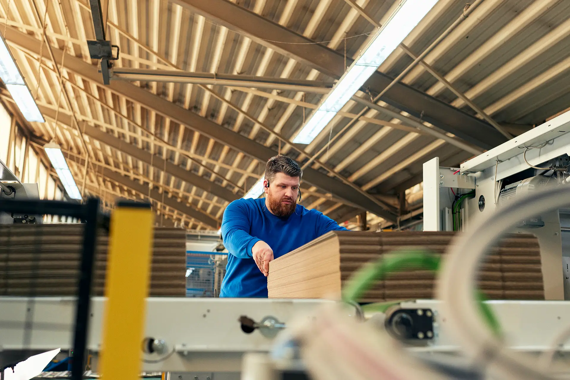
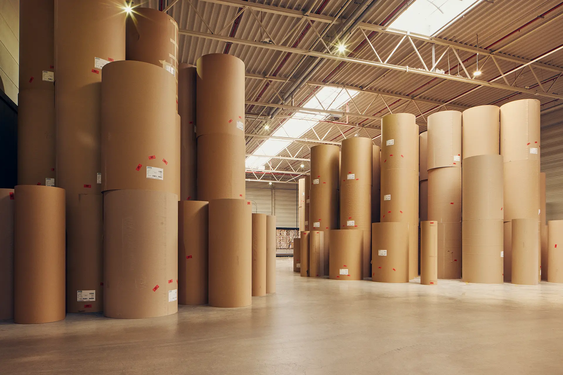
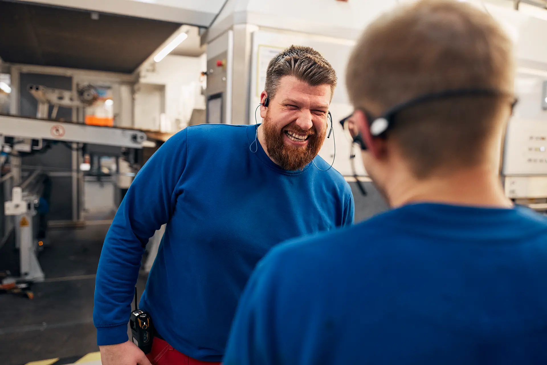
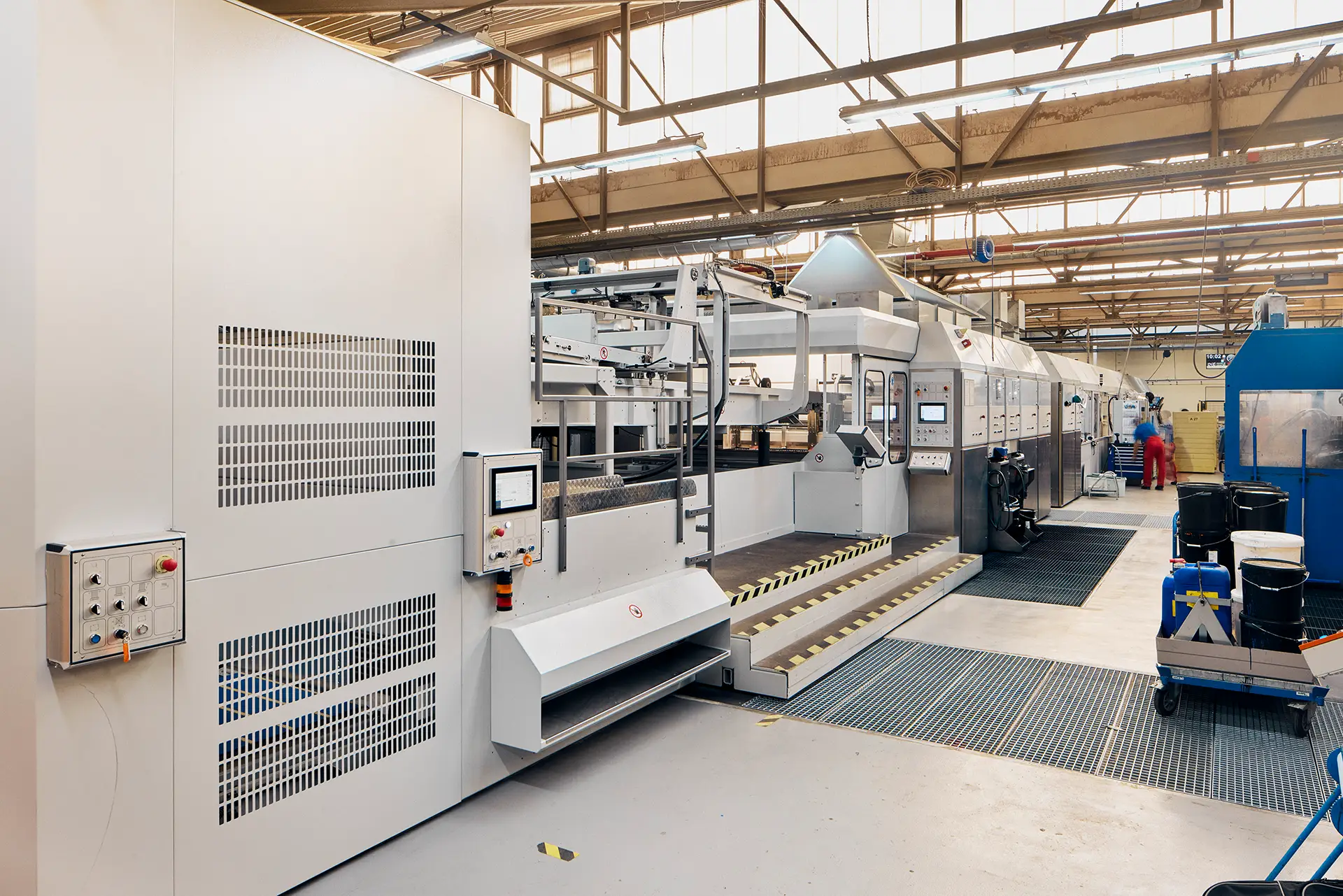
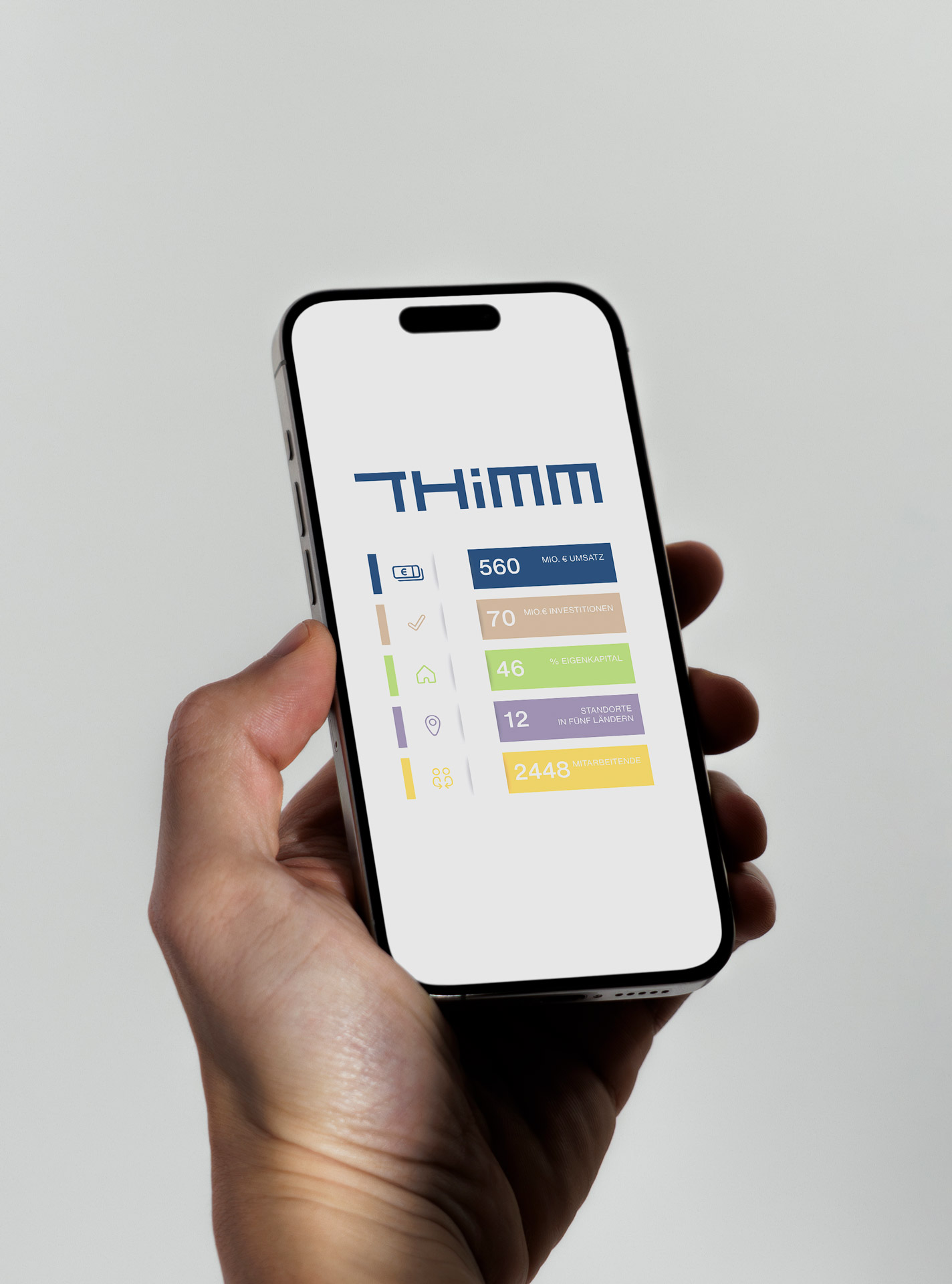
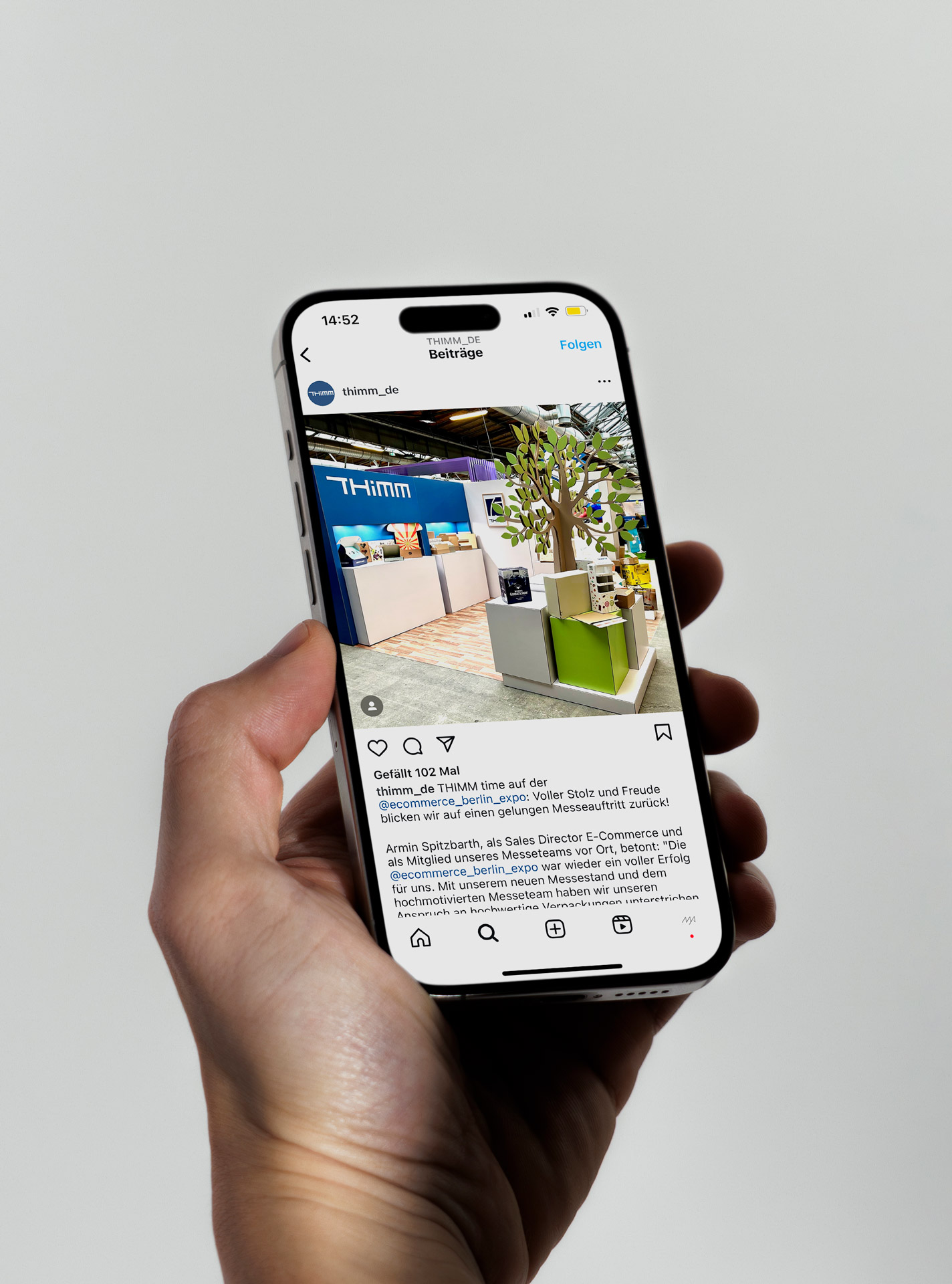
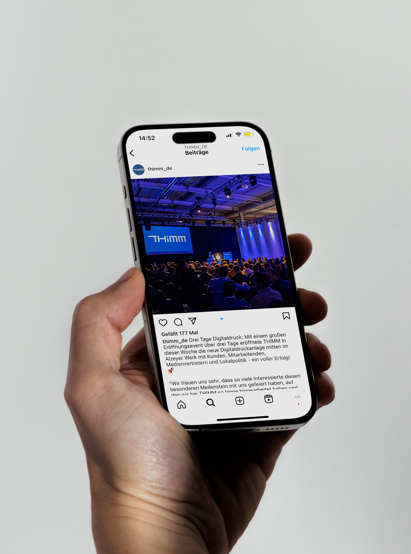
In the fall of 2022, I was commissioned to develop a new corporate design for the family-owned company THIMM. The medium-sized corporation, which was founded in 1949 in Herzberg am Harz and today employs almost 3,000 people at locations throughout Europe, is a leading solution provider for packaging and the distribution of consumer goods.
It's THIMM time.
Client:
THIMM Group
Creative direction:
Jonas Meyer
Photography:
Maximilian König
Lead agency:
K’UP
Realization:
Ediundsepp
In the fall of 2022, I was commissioned to develop a new corporate design for the family-owned company THIMM. The medium-sized corporation, which was founded in 1949 in Herzberg am Harz and today employs almost 3,000 people at locations throughout Europe, is a leading solution provider for packaging and the distribution of consumer goods.
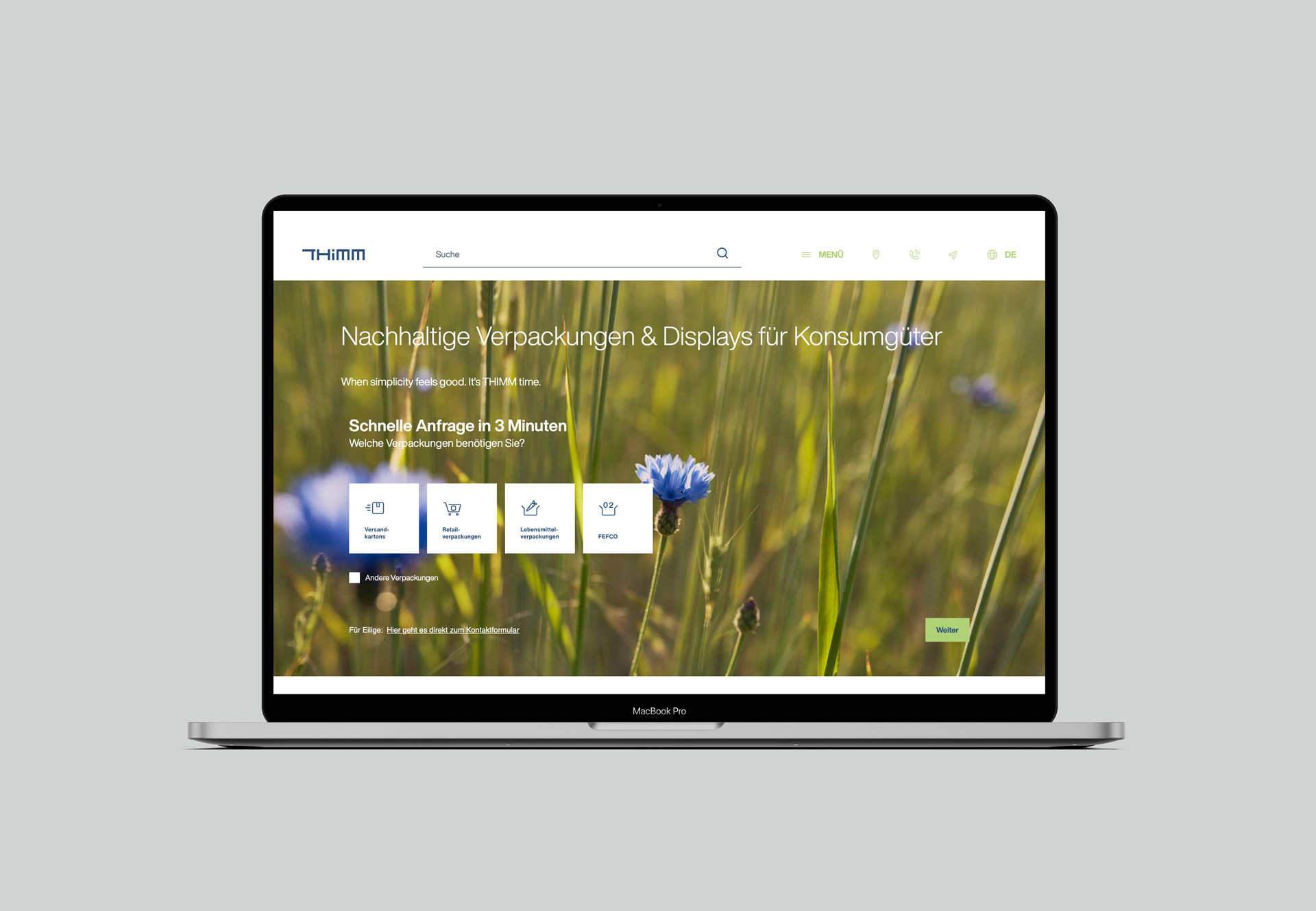

After the Berlin-based brand consultancy K’UP had first developed a new management and cultural guideline for the company, then a new brand strategy based on this and finally a new claim (“When simplicity feels good. It’s THIMM time.”), I was asked to translate this strategic basis into a new visual identity.
After the Berlin-based brand consultancy K’UP had first developed a new management and cultural guideline for the company, then a new brand strategy based on this and finally a new claim (“When simplicity feels good. It’s THIMM time.”), I was asked to translate this strategic basis into a new visual identity.
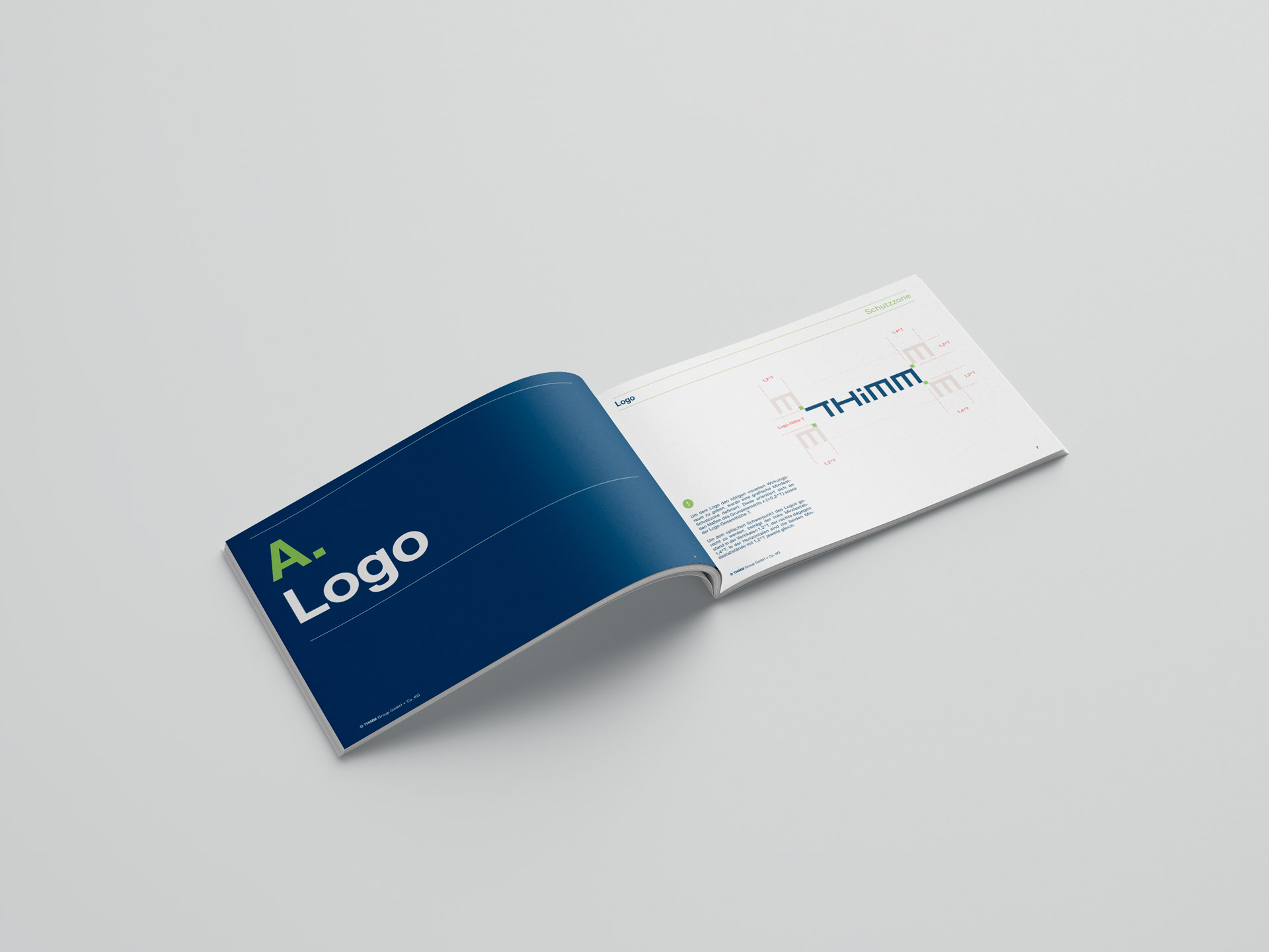
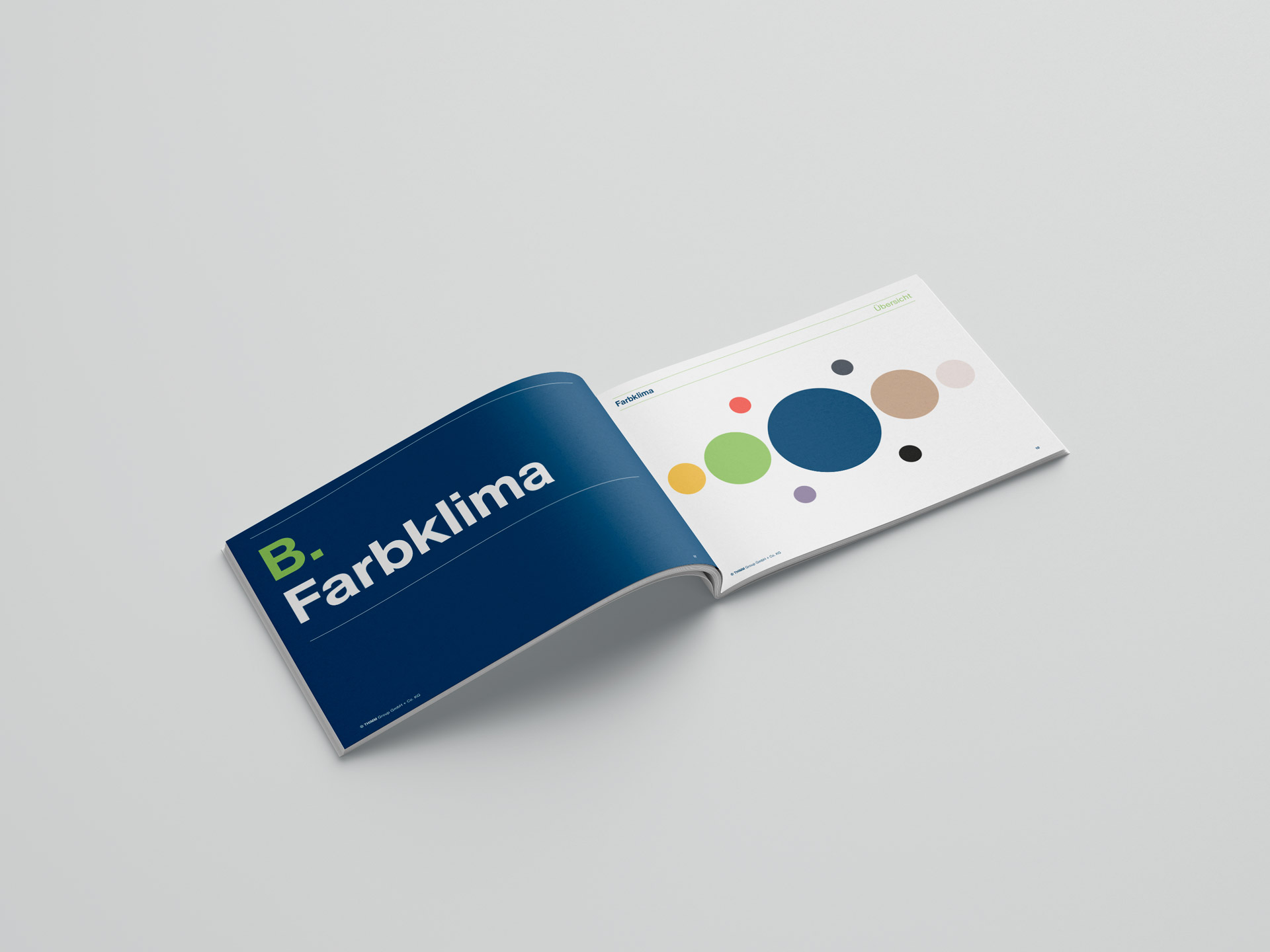
The result is a concise and at the same time relaxed design that is committed to the simplicity and relaxation principle of the new claim — with a logo inspired by the stability and structure of corrugated cardboard products, natural colors and, above all, lots of white space.
The result is a concise and at the same time relaxed design that is committed to the simplicity and relaxation principle of the new claim — with a logo inspired by the stability and structure of corrugated cardboard products, natural colors and, above all, lots of white space.

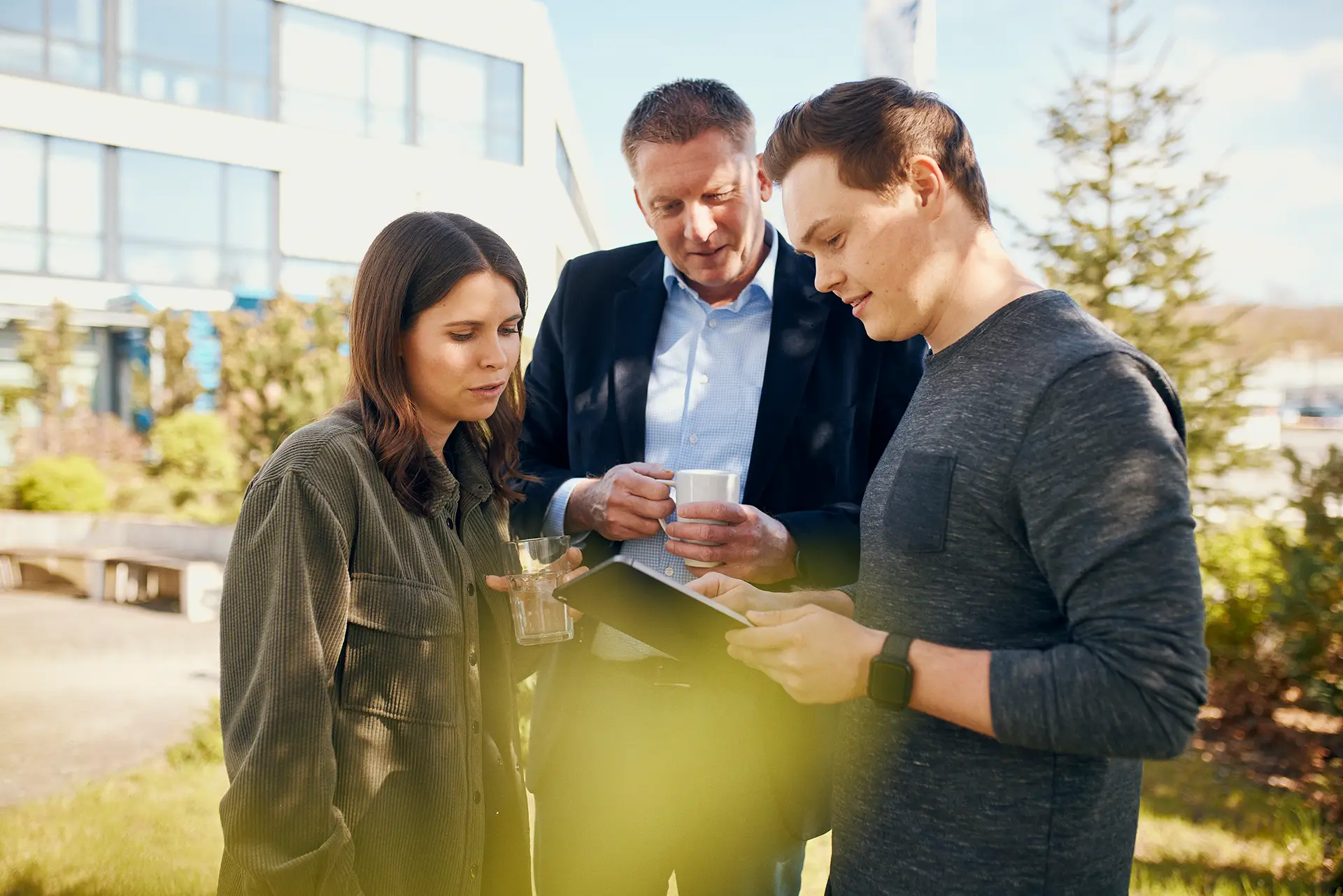
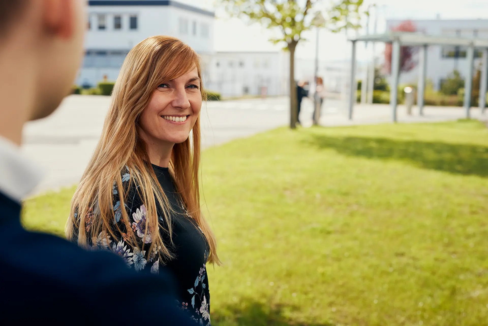
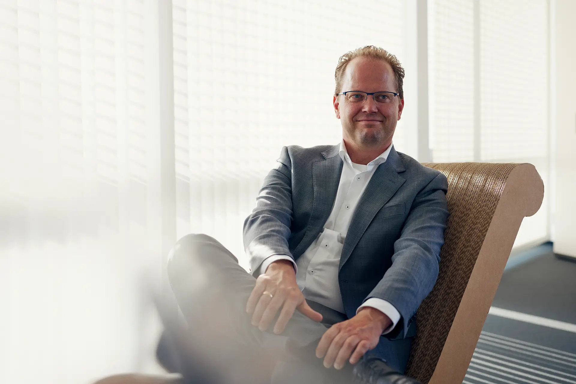
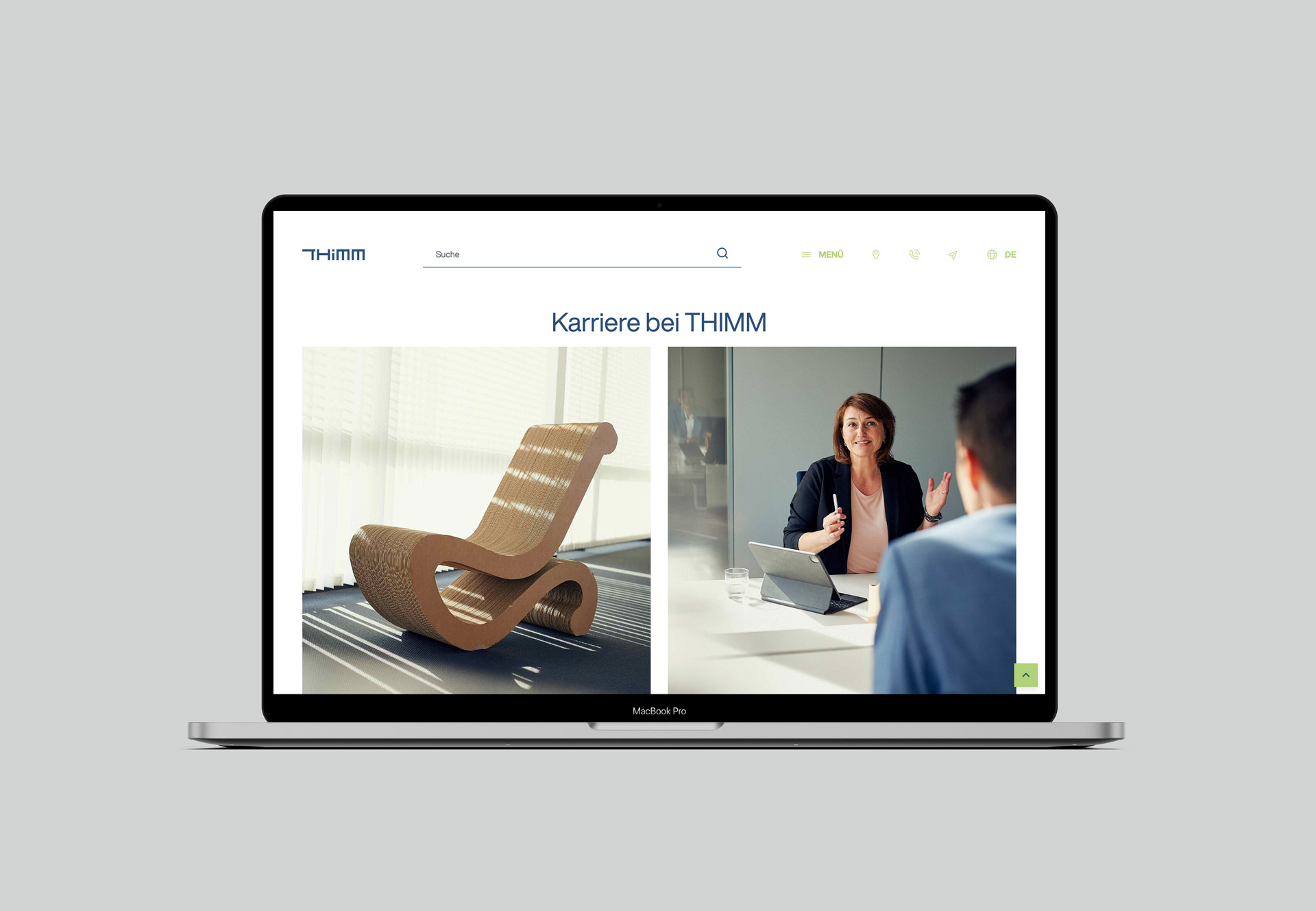
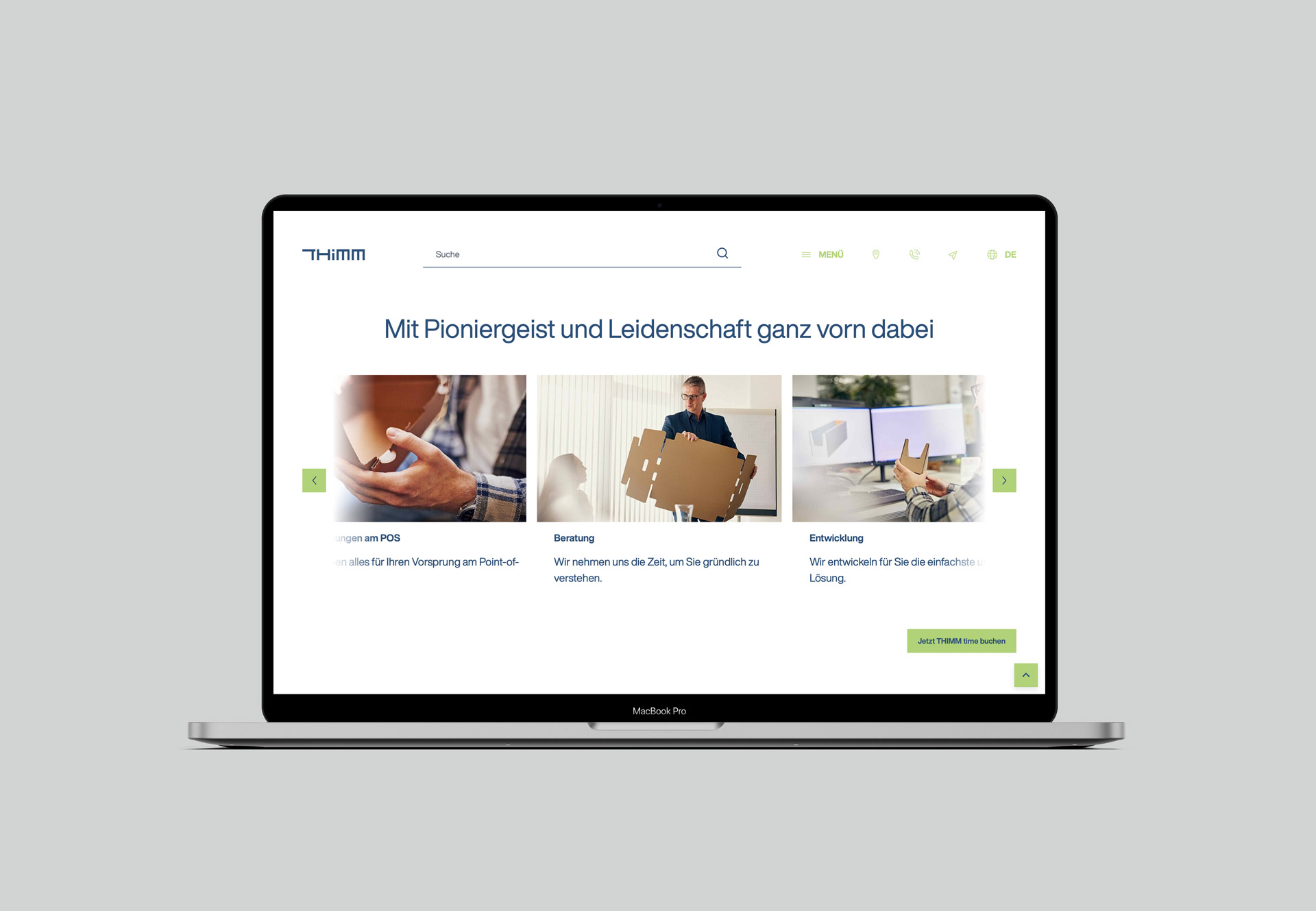
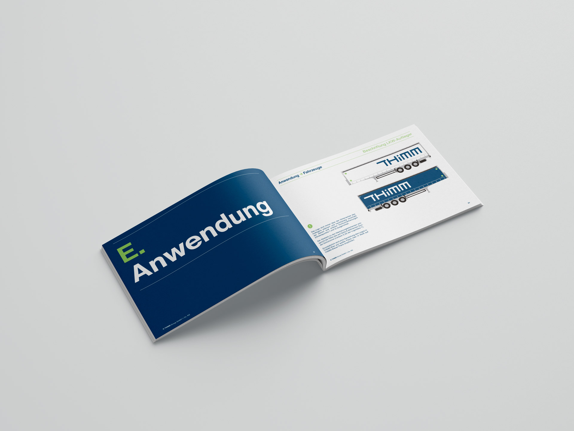
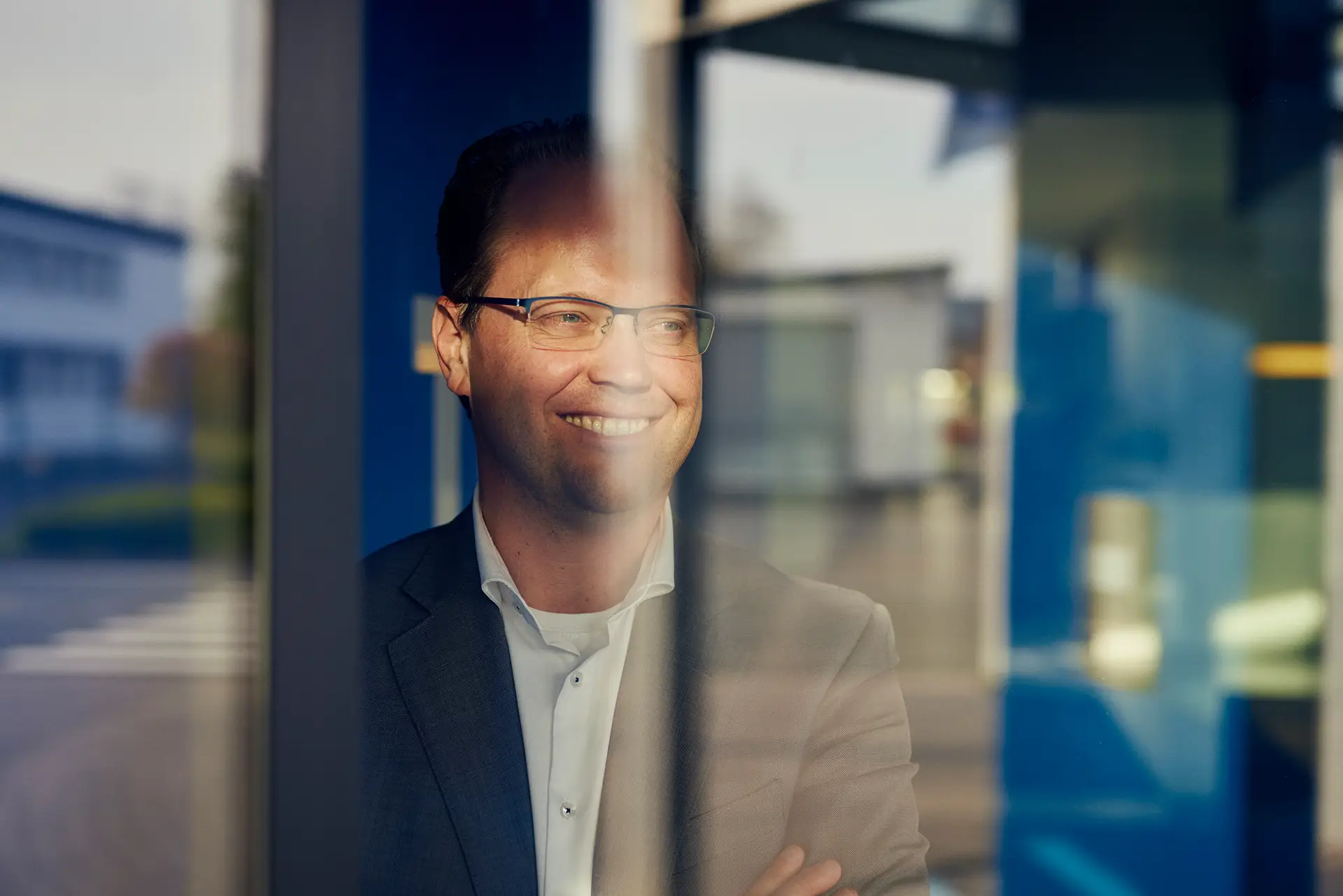
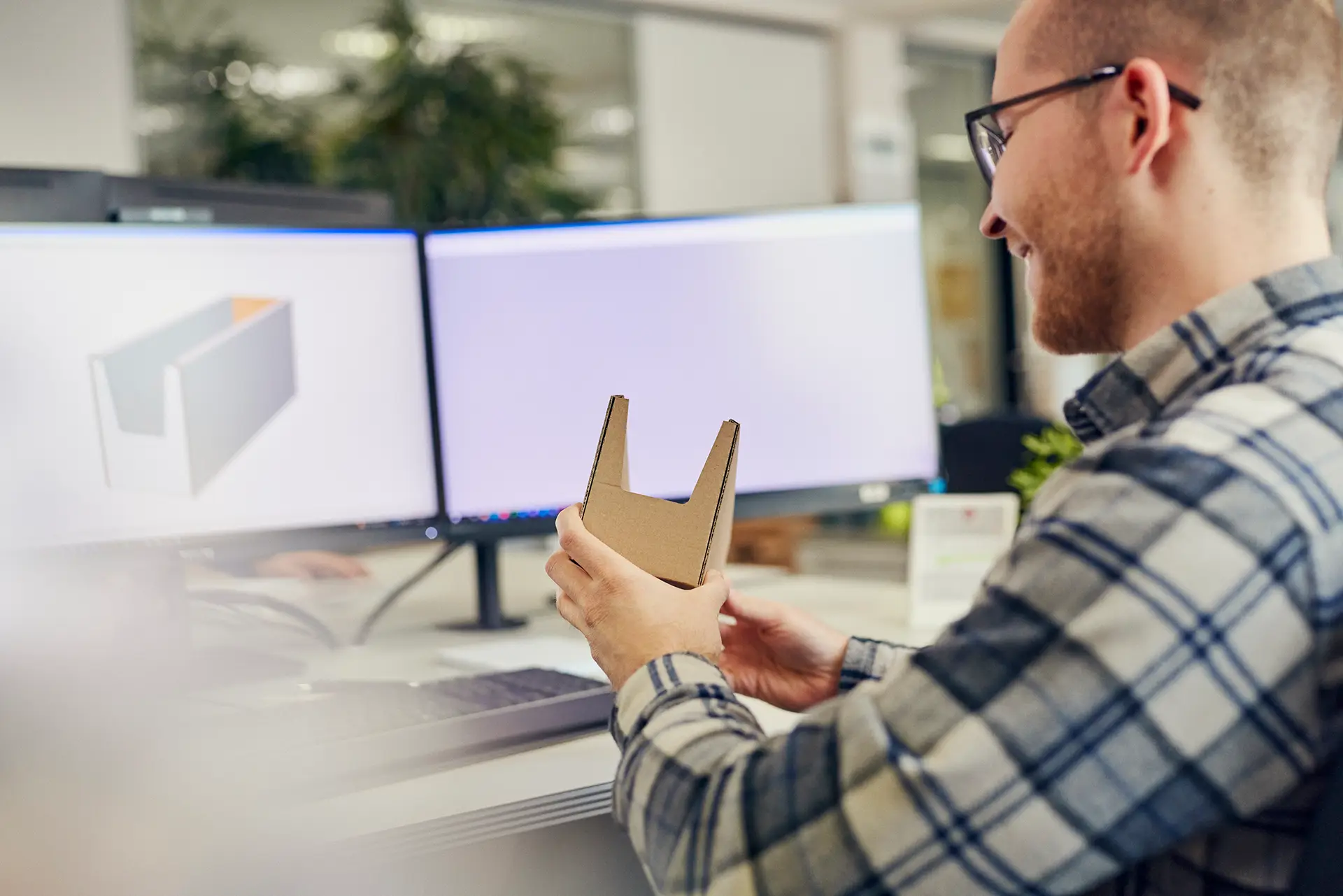
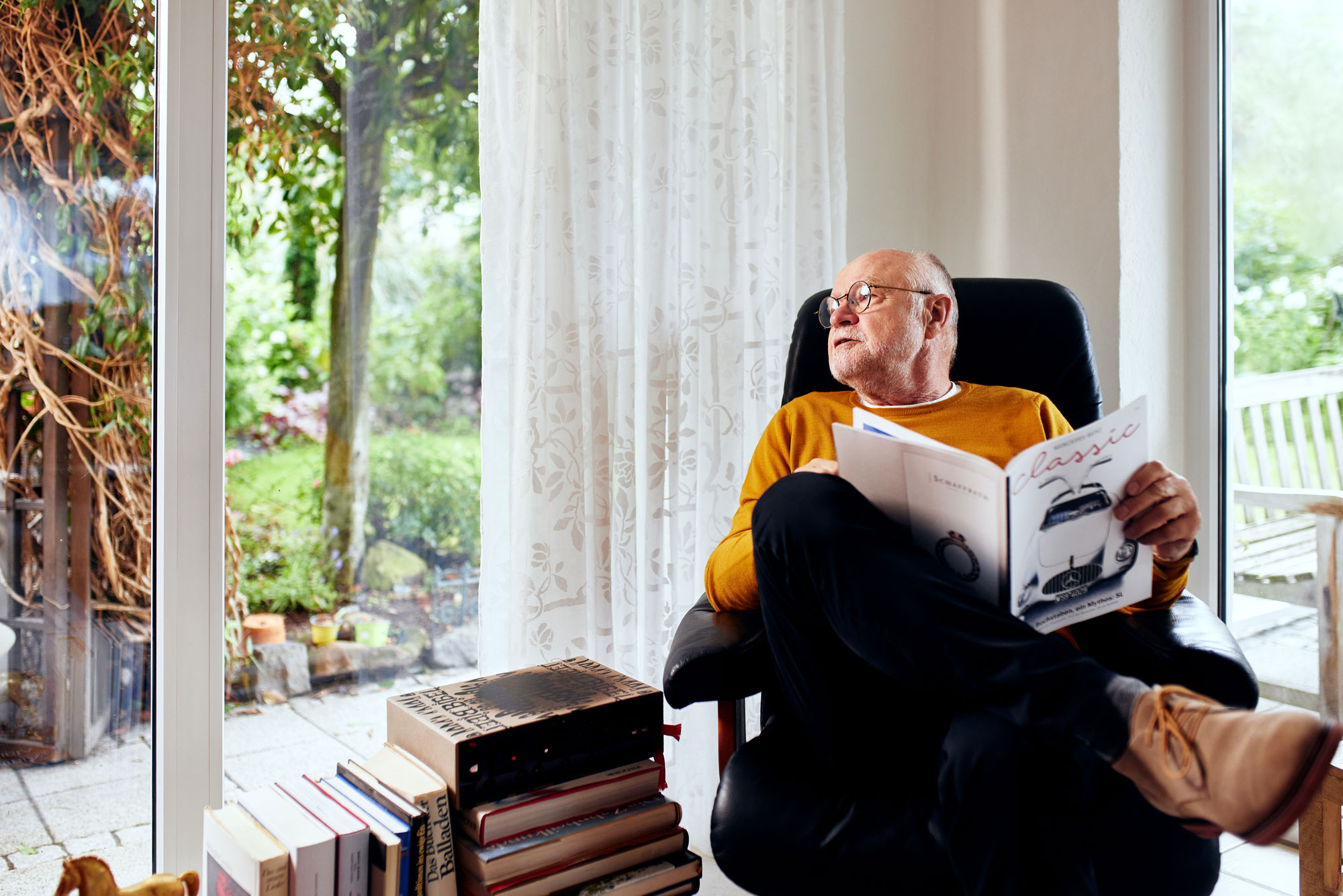
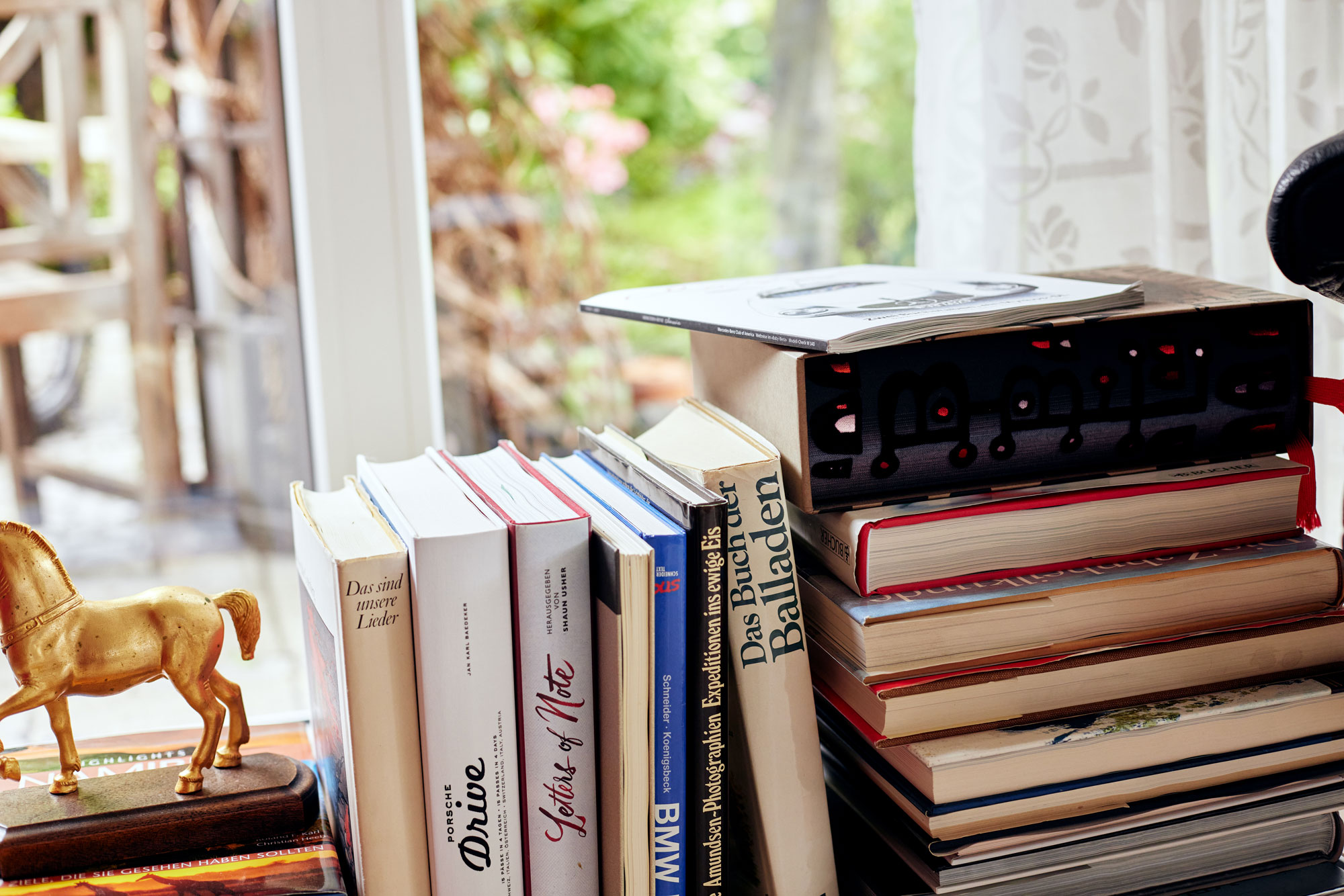
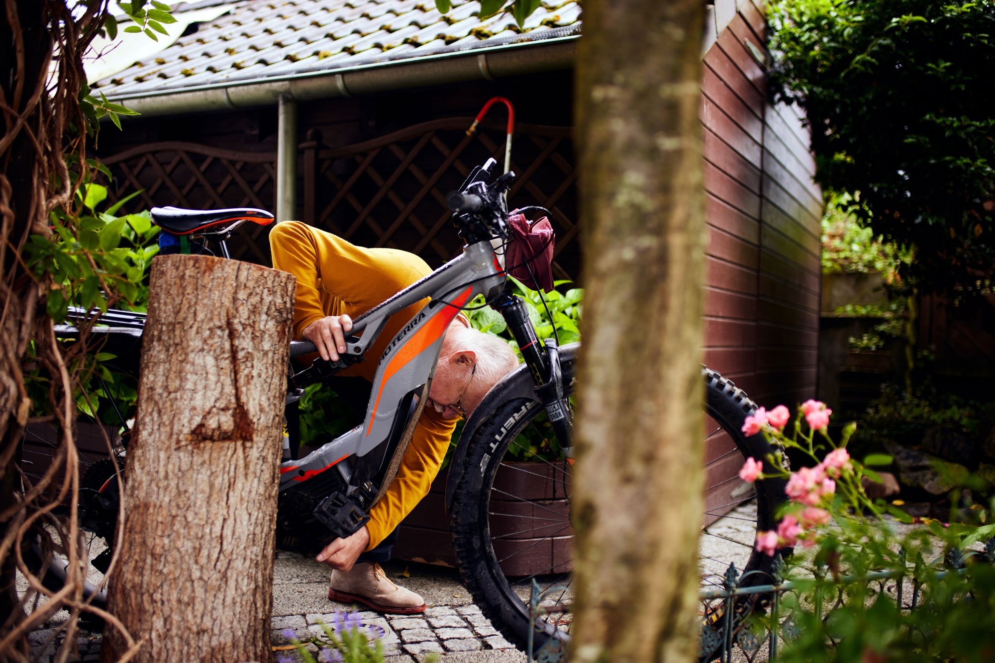
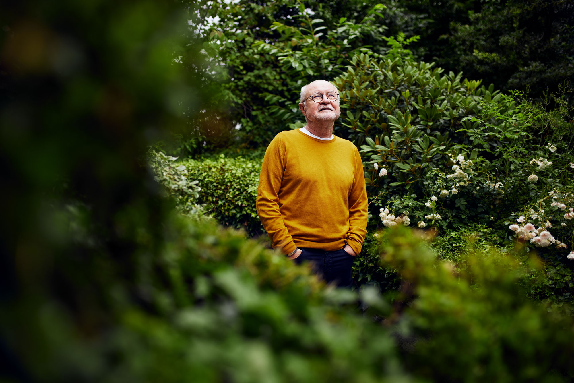
The new visual identity is completed by the imagery created by photographer Maximilian König, which focuses on approachability, appreciation and serenity in line with the new management and cultural guidelines.
The new visual identity is completed by the imagery created by photographer Maximilian König, which focuses on approachability, appreciation and serenity in line with the new management and cultural guidelines.

It's THIMM time.
It’s THIMM time.
Kunde:
THIMM Group
Kreativdirektion:
Jonas Meyer
Fotografie:
Maximilian König
Leadagentur:
K’UP
Umsetzung:
Ediundsepp
Im Herbst 2022 wurde ich mit der Entwicklung eines neuen Erscheinungsbilds für das Familienunternehmen THIMM beauftragt. Der Mittelständler, der 1949 in Herzberg am Harz gegründet wurde und heute knapp 3.000 Mitarbeiter*innen an Standorten in ganz Europa beschäftigt, ist führender Lösungsanbieter für Verpackungen und die Distribution von Konsumgütern.
It's THIMM time.
Kunde:
THIMM Group
Kreativdirektion:
Jonas Meyer
Fotografie:
Maximilian König
Leadagentur:
K’UP
Umsetzung:
Ediundsepp
Im Herbst 2022 wurde ich mit der Entwicklung eines neuen Erscheinungsbilds für das Familienunternehmen THIMM beauftragt. Der Mittelständler, der 1949 in Herzberg am Harz gegründet wurde und heute knapp 3.000 Mitarbeiter*innen an Standorten in ganz Europa beschäftigt, ist führender Lösungsanbieter für Verpackungen und die Distribution von Konsumgütern.
Nachdem die Berliner Markenberatung K’UP für das Unternehmen erst eine neue Führungs- und Kulturleitlinie, dann darauf aufbauend eine neue Markenstrategie und schließlich einen neuen Claim („When simplicity feels good. It’s THIMM time.“) entwickelt hatte, wurde ich gebeten, diese strategische Grundlage in eine neue visuelle Identität zu übersetzen.
Nachdem die Berliner Markenberatung K’UP für das Unternehmen erst eine neue Führungs- und Kulturleitlinie, dann darauf aufbauend eine neue Markenstrategie und schließlich einen neuen Claim („When simplicity feels good. It’s THIMM time.“) entwickelt hatte, wurde ich gebeten, diese strategische Grundlage in eine neue visuelle Identität zu übersetzen.
Das Ergebnis ist ein prägnantes und gleichsam gelassenes Design, das sich dem Simplizitäts- und Entspannungsprinzip des neuen Claims verpflichtet fühlt – mit einem von der Stabilität und Struktur der Wellpappe-Produkte inspiriertem Logo, natürlichen Farben und vor allem sehr viel Weißraum.
Das Ergebnis ist ein prägnantes und gleichsam gelassenes Design, das sich dem Simplizitäts- und Entspannungsprinzip des neuen Claims verpflichtet fühlt – mit einem von der Stabilität und Struktur der Wellpappe-Produkte inspiriertem Logo, natürlichen Farben und vor allem sehr viel Weißraum.
Komplettiert wird das neue Erscheinungsbild durch die von Fotograf Maximilian König erschaffene Bildwelt, die ganz im Sinne der neuen Führungs- und Kulturleitlinie auf Nahbarkeit, Wertschätzung und Gelassenheit setzt.
Komplettiert wird das neue Erscheinungsbild durch die von Fotograf Maximilian König erschaffene Bildwelt, die ganz im Sinne der neuen Führungs- und Kulturleitlinie auf Nahbarkeit, Wertschätzung und Gelassenheit setzt.
Bold & Bright
Bold & Bright
Creative direction:
Jonas Meyer
Brand strategy:
Jonas Meyer & Fred Funk
Photography:
Maximilian König
Lead agency:
Aufsiemitgebrüll
Art direction:
Marie Parakenings
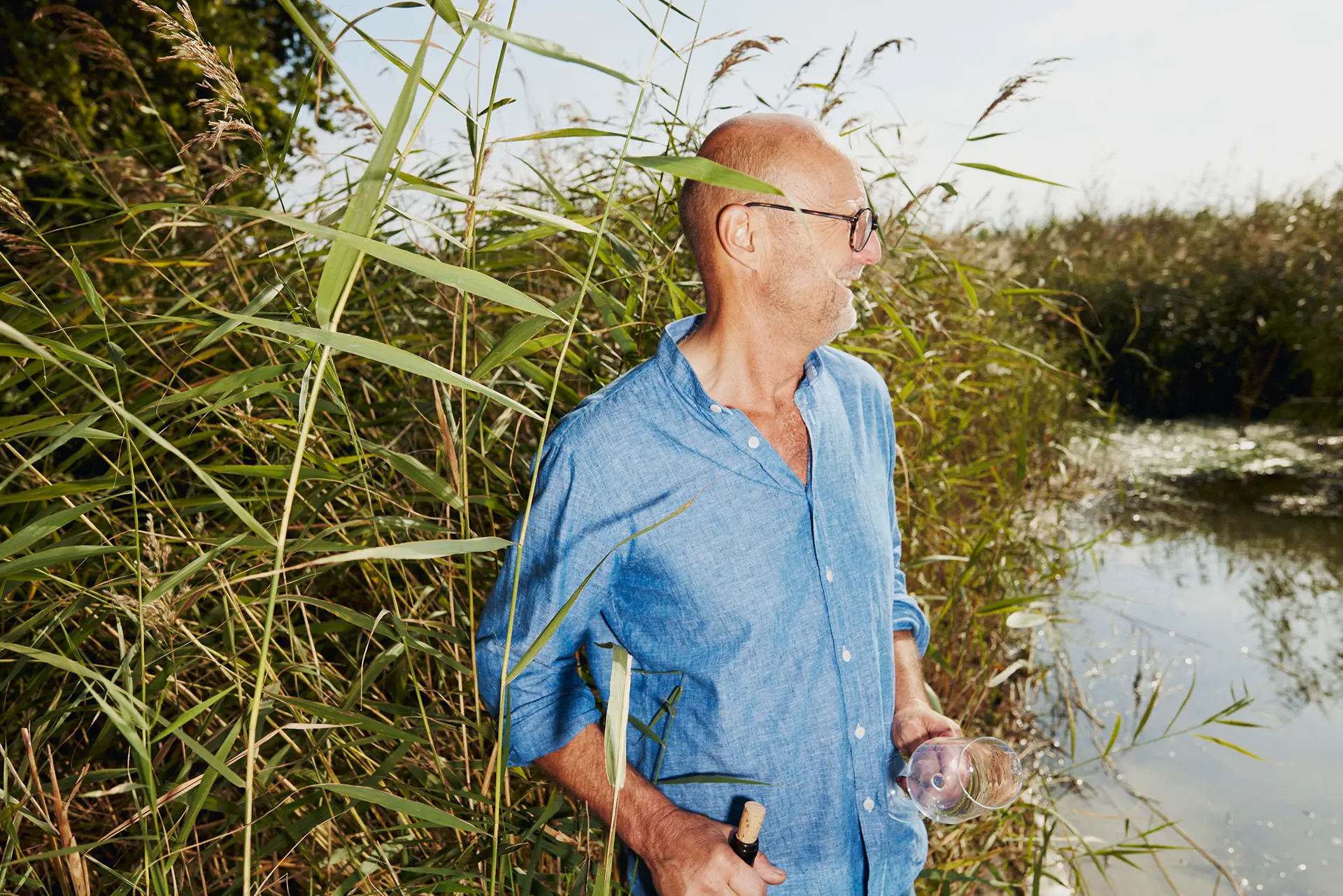
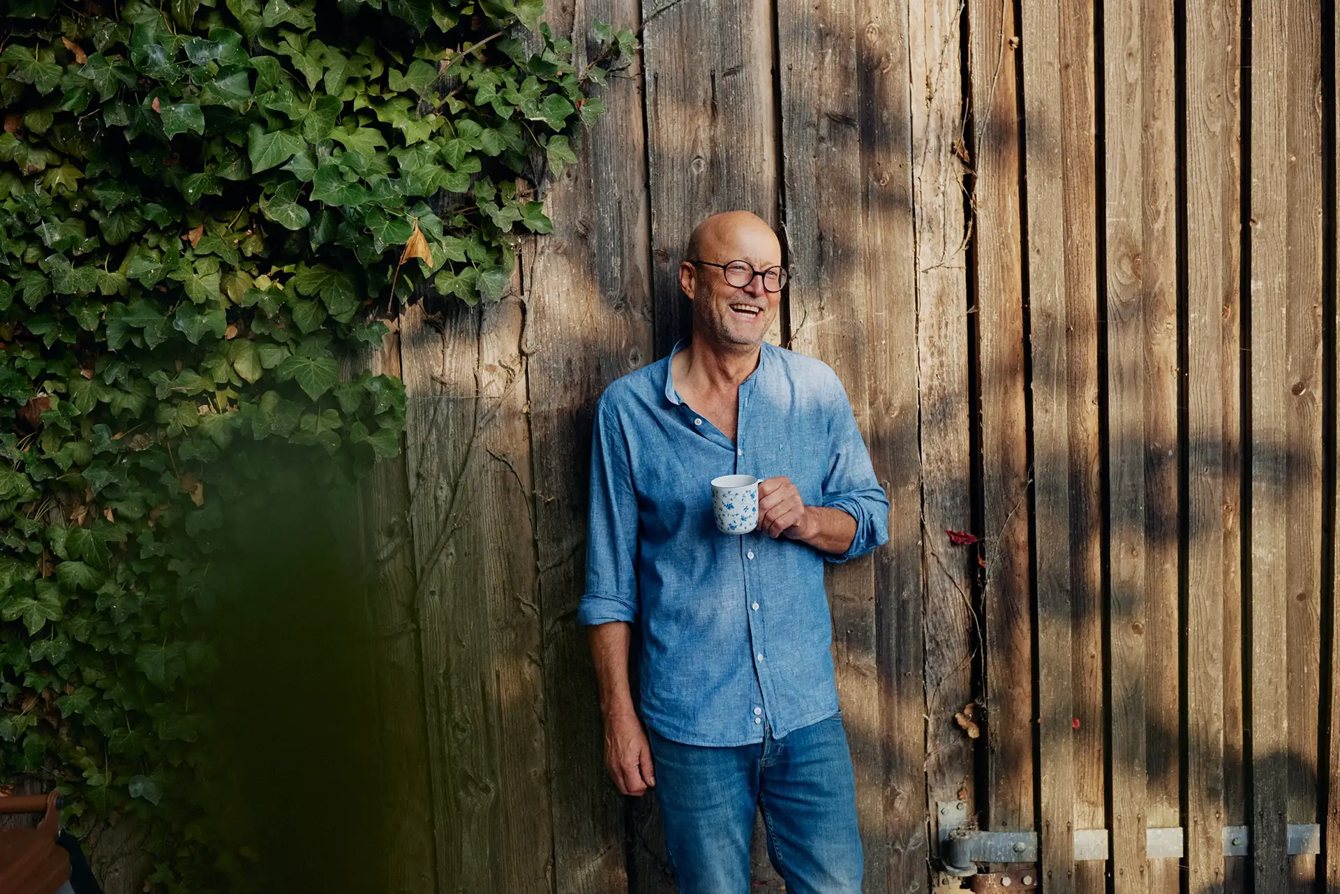
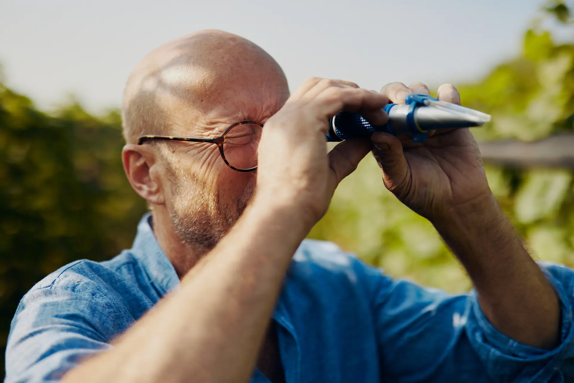
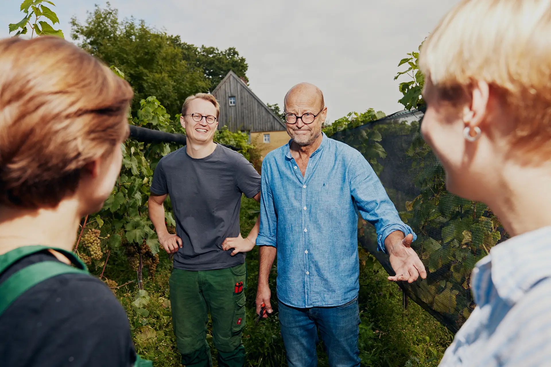
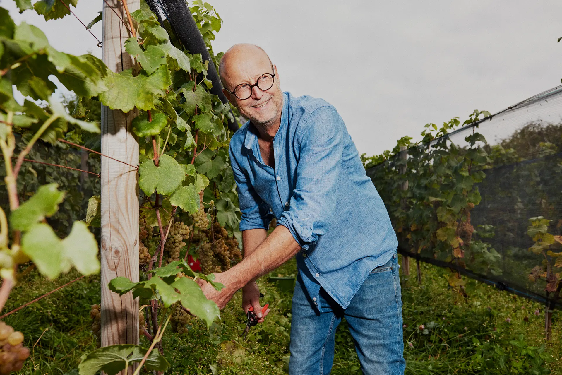
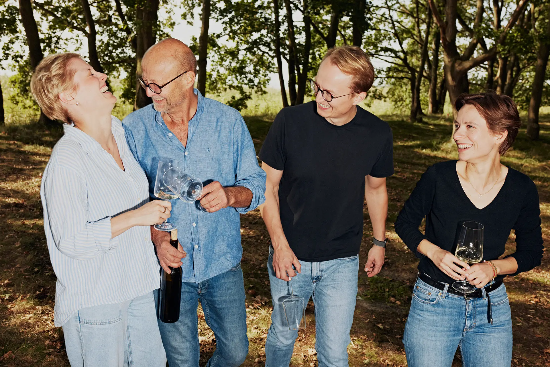
In the summer of 2023, I had the great pleasure of working with the agency Aufsiemitgebrüll and photographer Maximilian König to brand Germany’s north-easternmost winery — run by Christoph Kühne-Hellmessen and his family on the beautiful island of Usedom.
Bold & Bright
Creative direction:
Jonas Meyer
Brand strategy:
Jonas Meyer & Fred Funk
Photography:
Maximilian König
Lead agency:
Aufsiemitgebrüll
Art direction:
Marie Parakenings
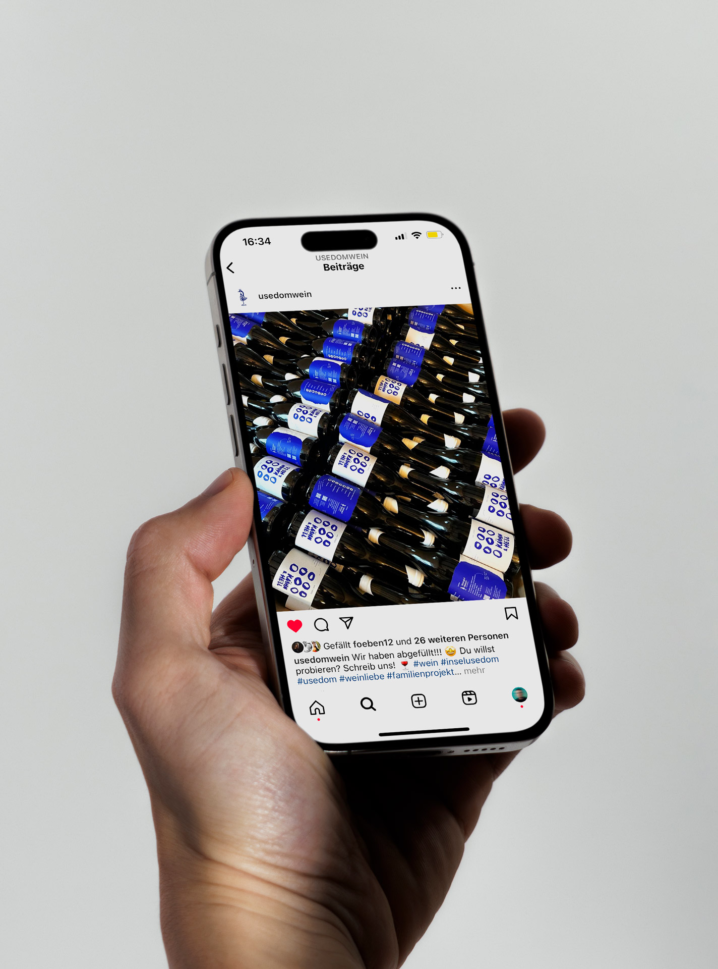
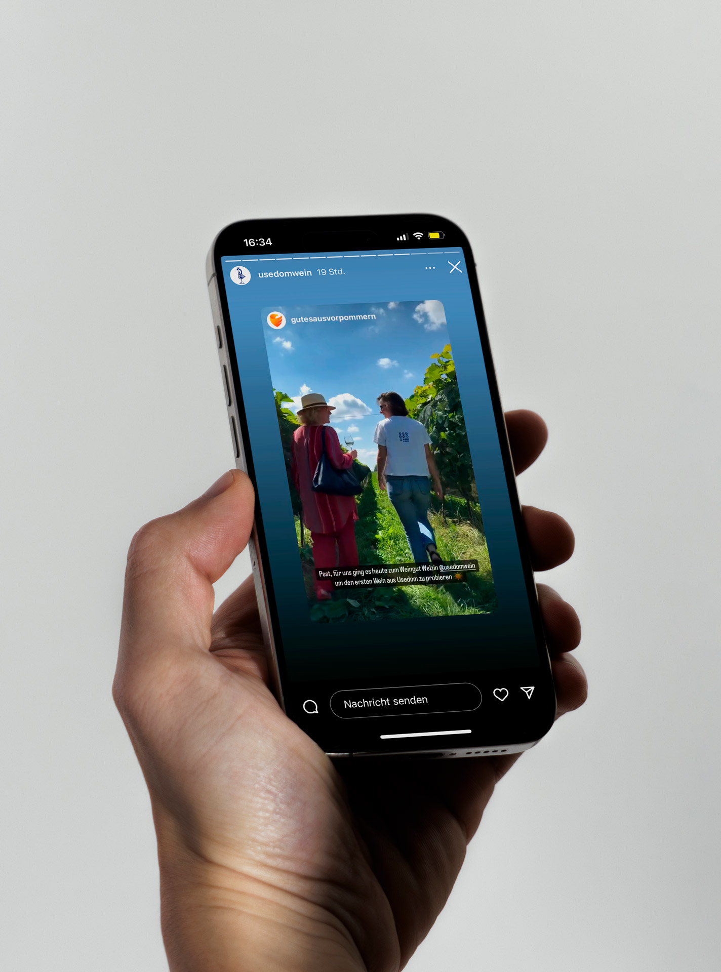
In the summer of 2023, I had the great pleasure of working with the agency Aufsiemitgebrüll and photographer Maximilian König to brand Germany’s north-easternmost winery — run by Christoph Kühne-Hellmessen and his family on the beautiful island of Usedom.
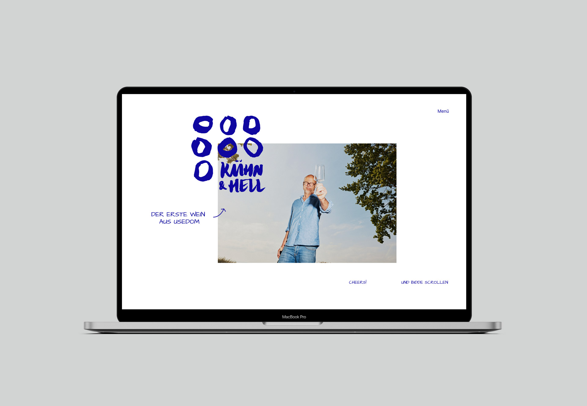
In the first step, we developed the strategic foundations such as brand promise, value framework, vision and mission in a two-day workshop on site — over white wine and grilled trout. We also worked on a pricing strategy for distributors and end customers and formulated initial naming approaches — not only for the winery itself, but also for the first wine of the Kühne-Hellmessen family.
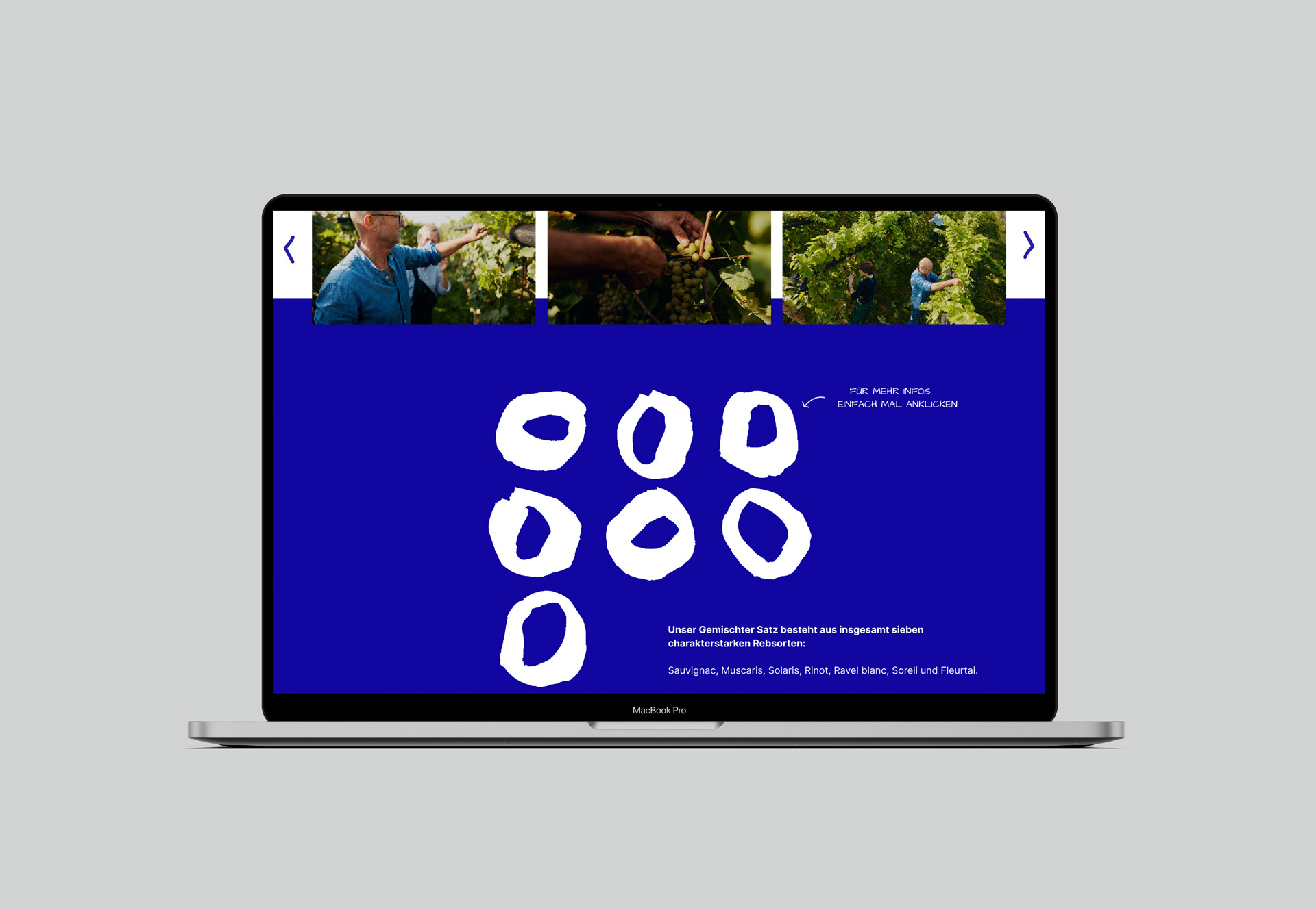
Incidentally, this is also the very first wine from Usedom: a “Gemischter Satz” made from the seven grape varieties Sauvignac, Muscaris, Solaris, Rinot, Ravel blanc, Soreli and Fleurtai. These are also known as future grape varieties, as they are particularly resistant to fungal attack and changes in growing conditions as a result of climate change.
In the first step, we developed the strategic foundations such as brand promise, value framework, vision and mission in a two-day workshop on site — over white wine and grilled trout. We also worked on a pricing strategy for distributors and end customers and formulated initial naming approaches — not only for the winery itself, but also for the first wine of the Kühne-Hellmessen family.
Incidentally, this is also the very first wine from Usedom: a “Gemischter Satz” made from the seven grape varieties Sauvignac, Muscaris, Solaris, Rinot, Ravel blanc, Soreli and Fleurtai. These are also known as future grape varieties, as they are particularly resistant to fungal attack and changes in growing conditions as a result of climate change.
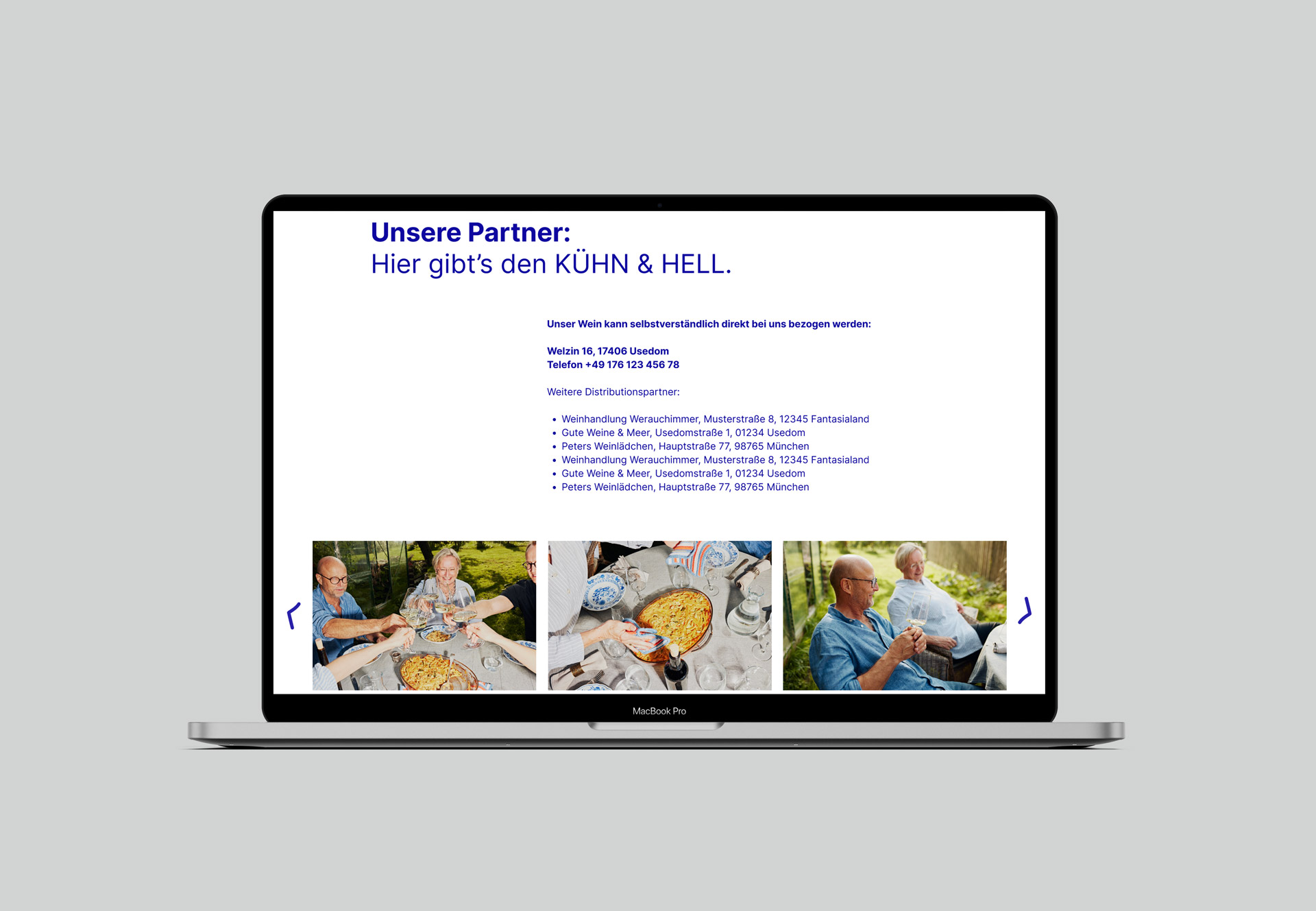
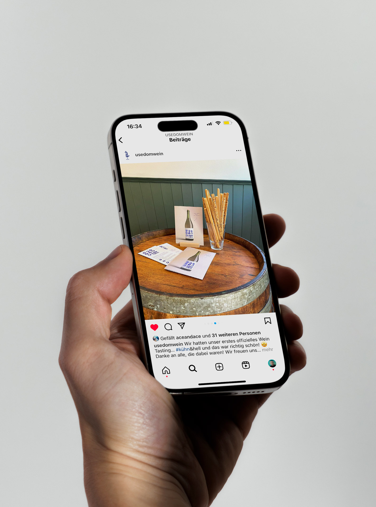
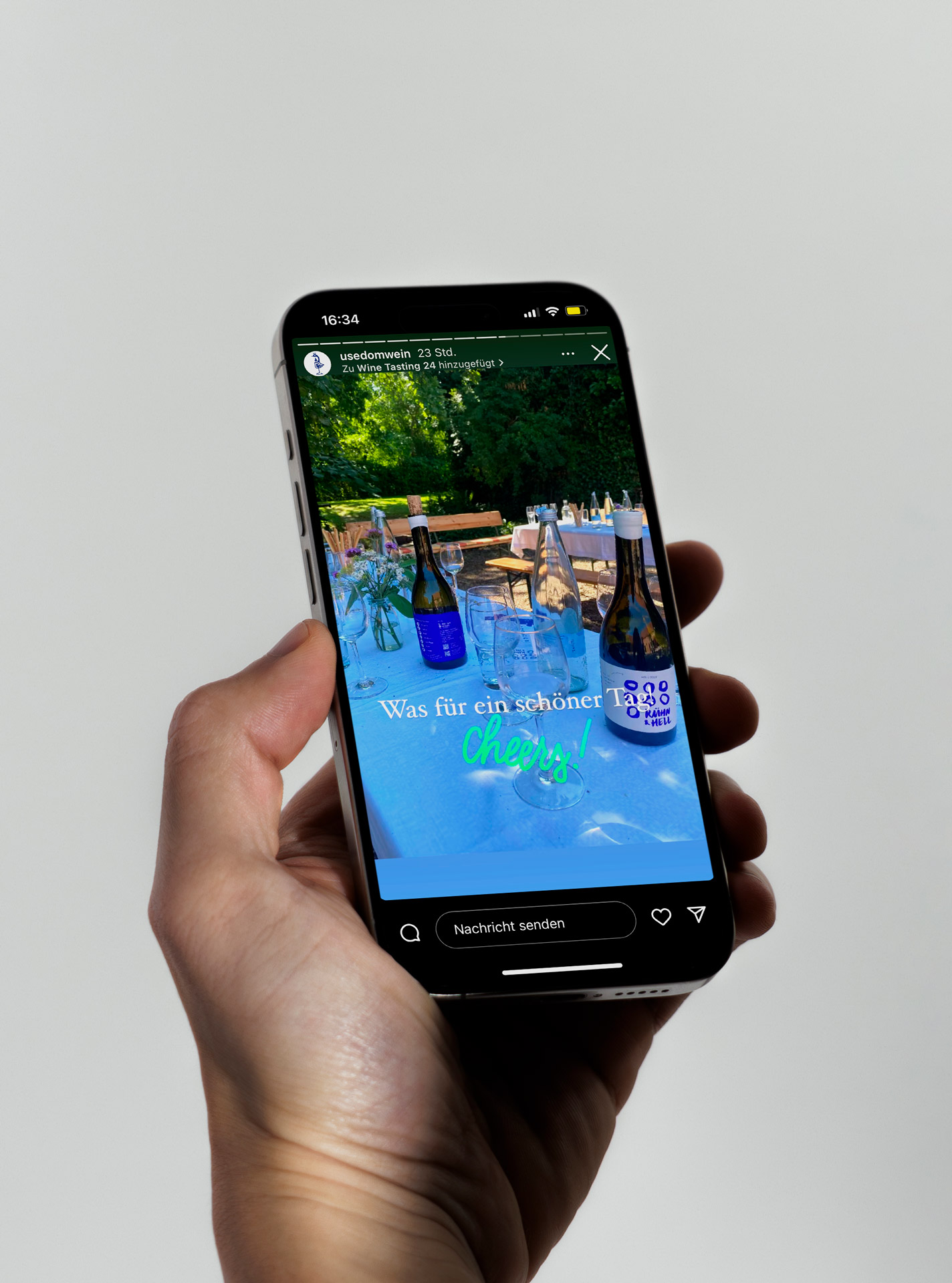
In the second step, we developed various routes for the new image of the young “Weingut Welzin” (“Welzin Winery”) in a five-person design team and created various versions for the label of the Gemischter Satz, which we jointly named “Kühn & Hell” (“Bold & Bright”).
At the end of the process, the winning design was one that was inspired in a special way by the Kühne-Hellmessens‘ approachability, pragmatism and craftsmanship — and also by the bright blue sky over Usedom. It is not for nothing that the island is considered one of the sunniest regions in Germany.
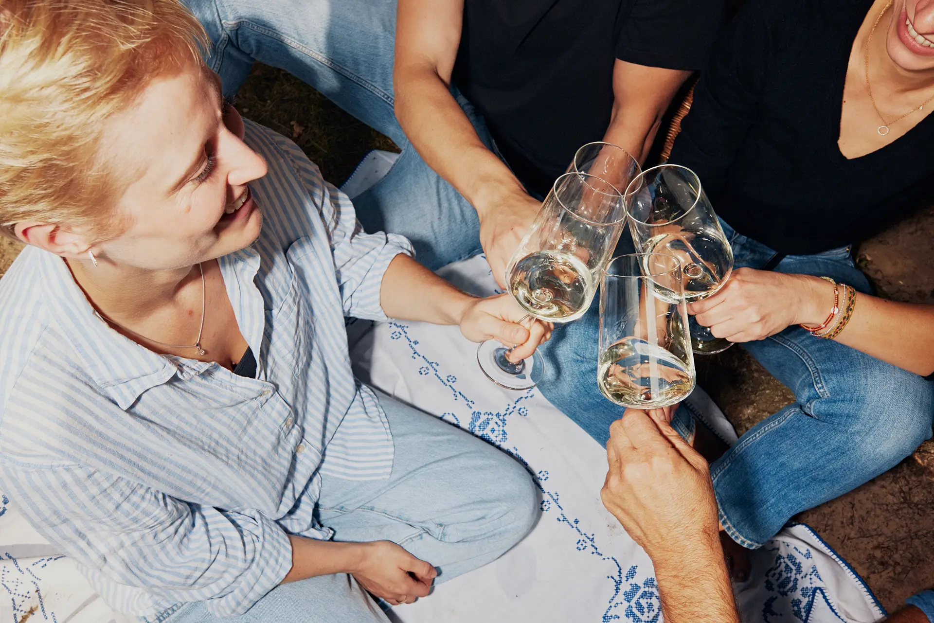
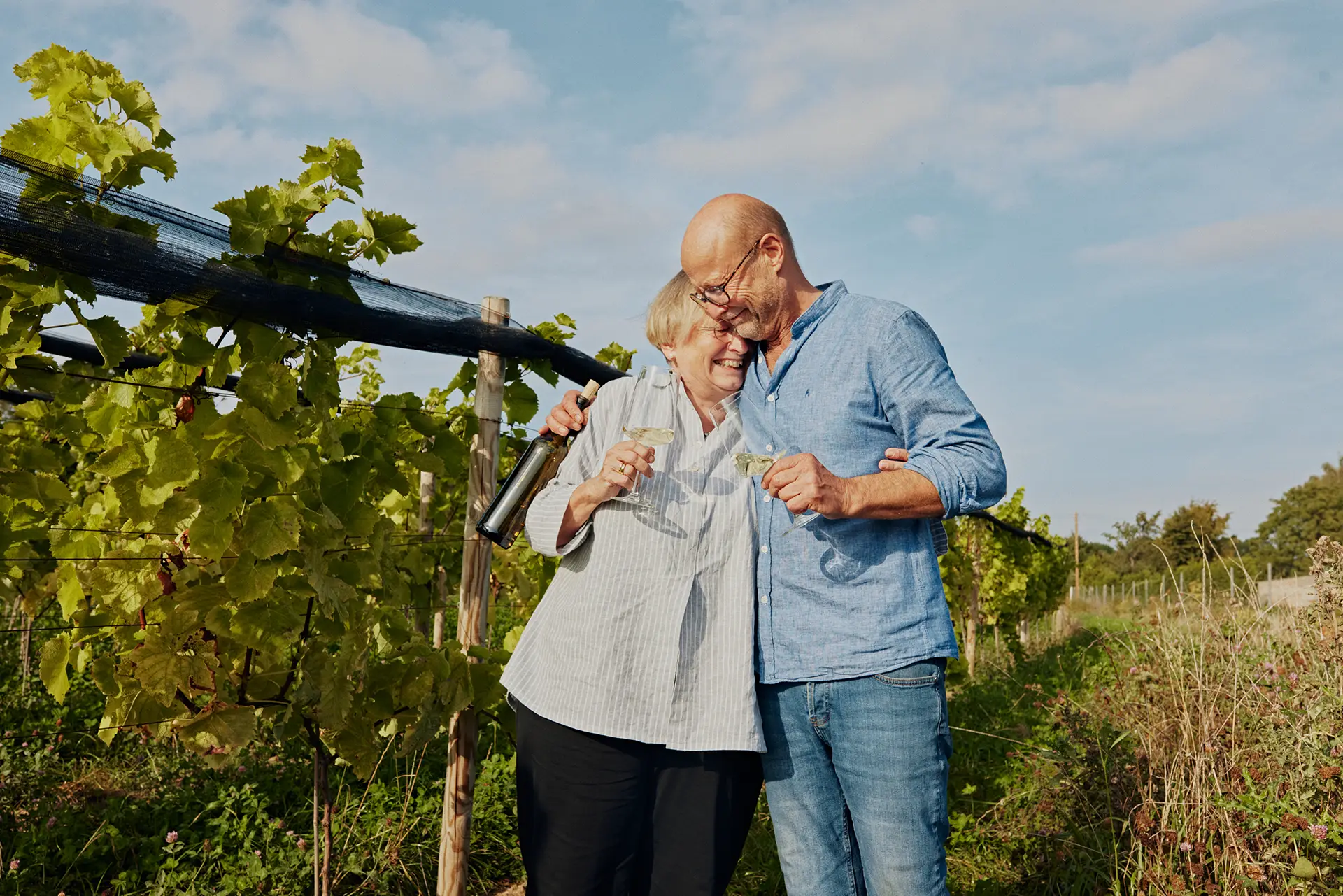
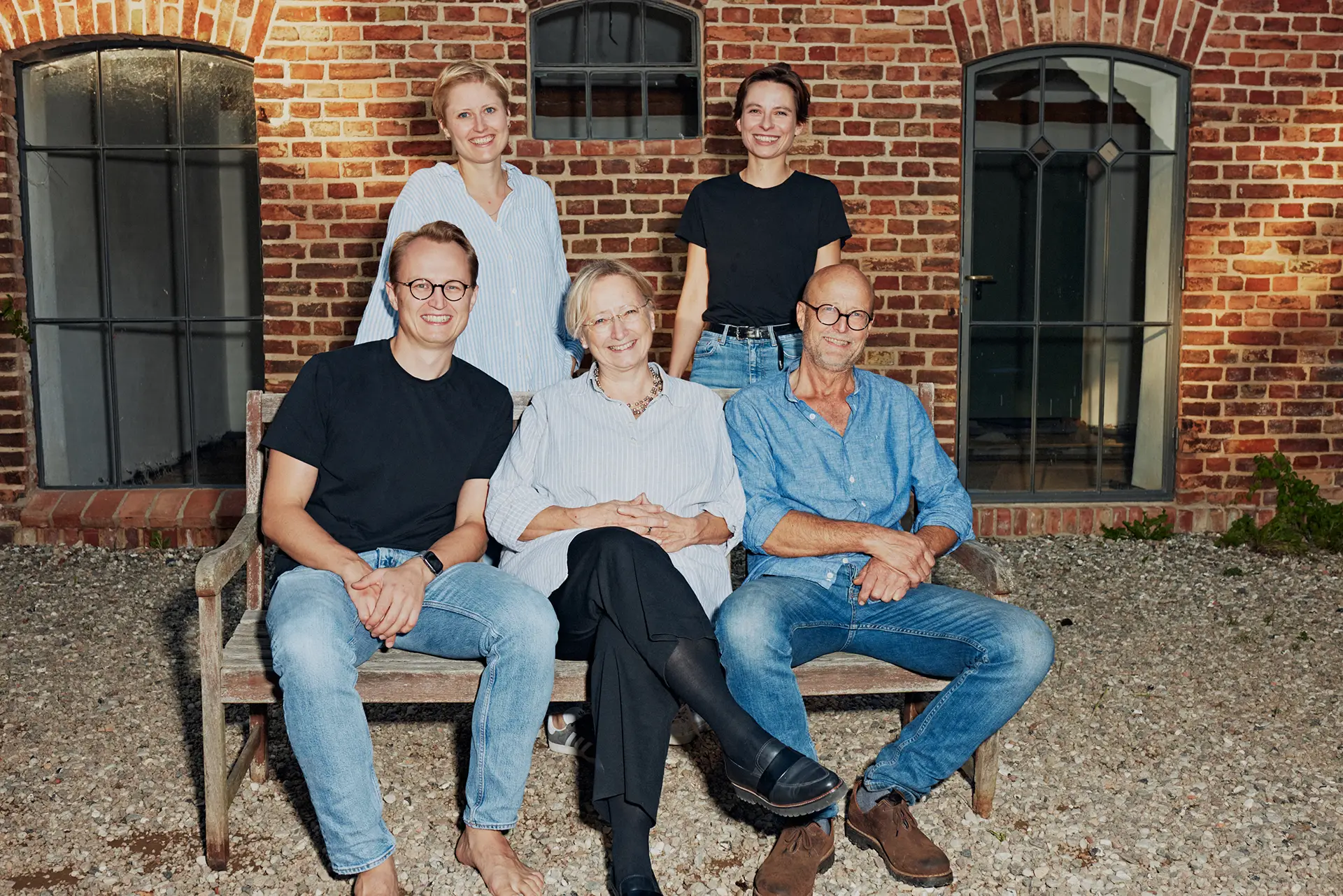
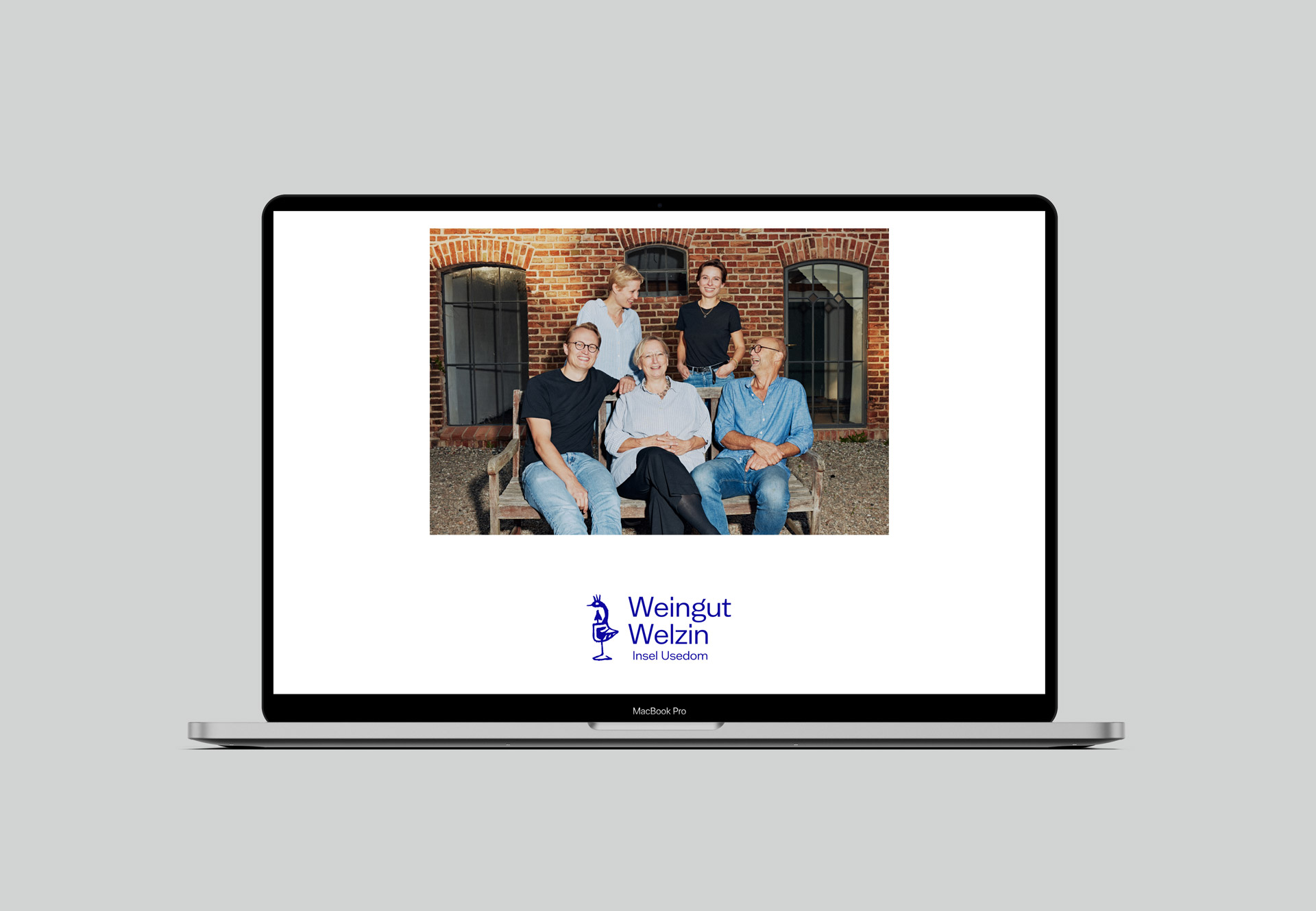
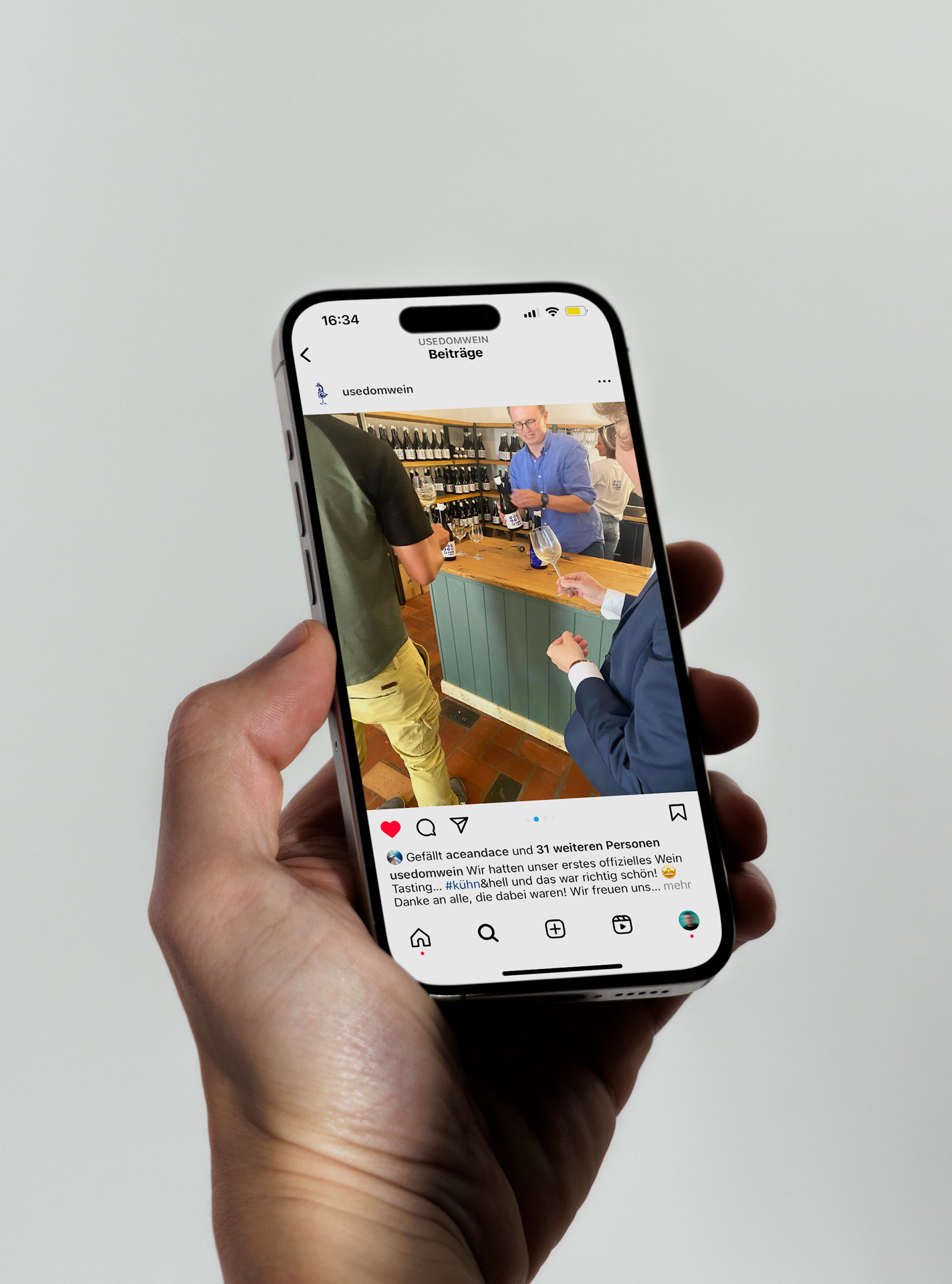
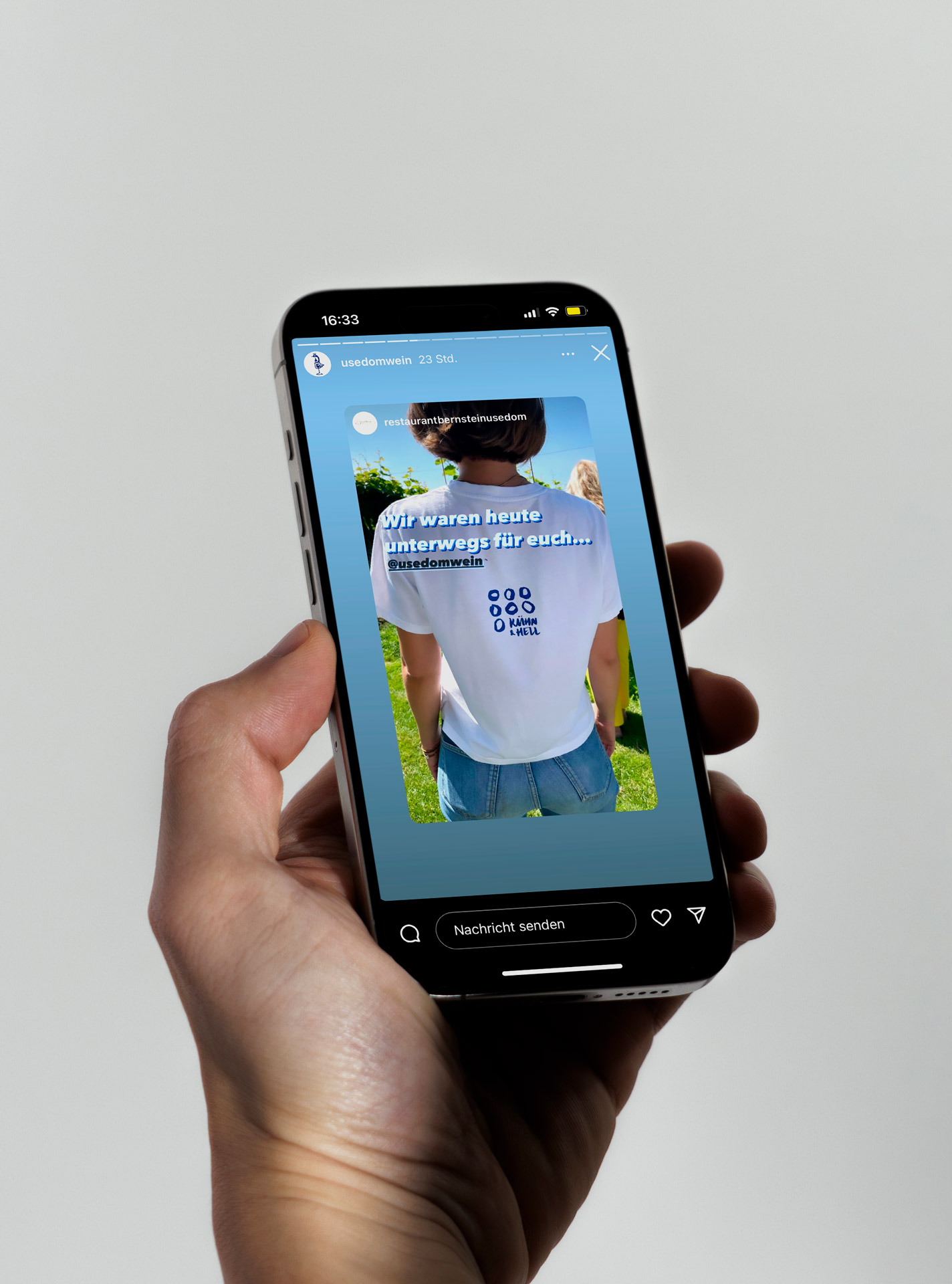
To complete the new corporate design, in the third step we worked with photographer Maximilian König to develop an image concept to match the brand and then had him accompany the Kühne-Hellmessen family with his camera for a day.
To complete the new corporate design, in the third step we worked with photographer Maximilian König to develop an image concept to match the brand and then had him accompany the Kühne-Hellmessen family with his camera for a day.
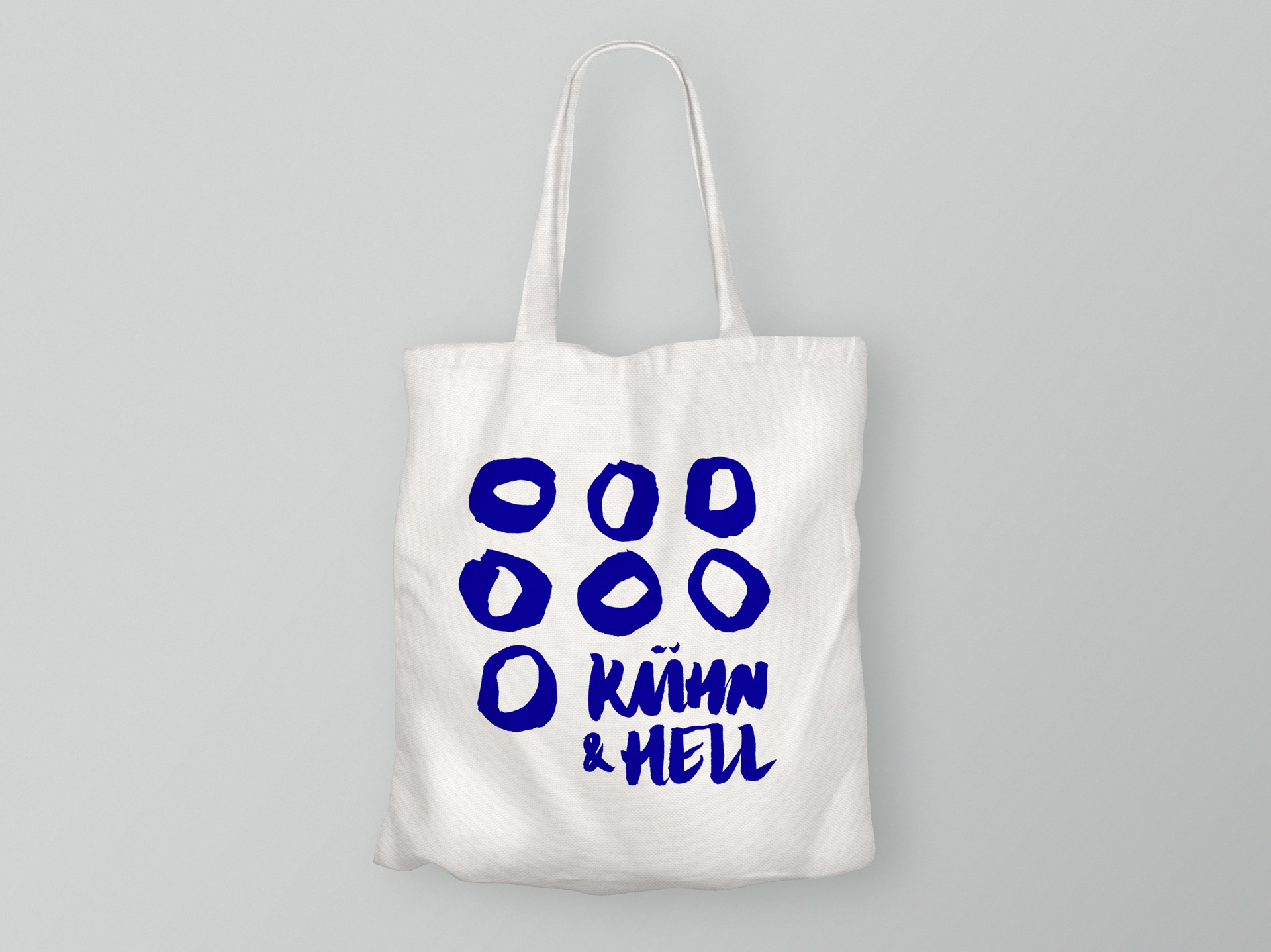
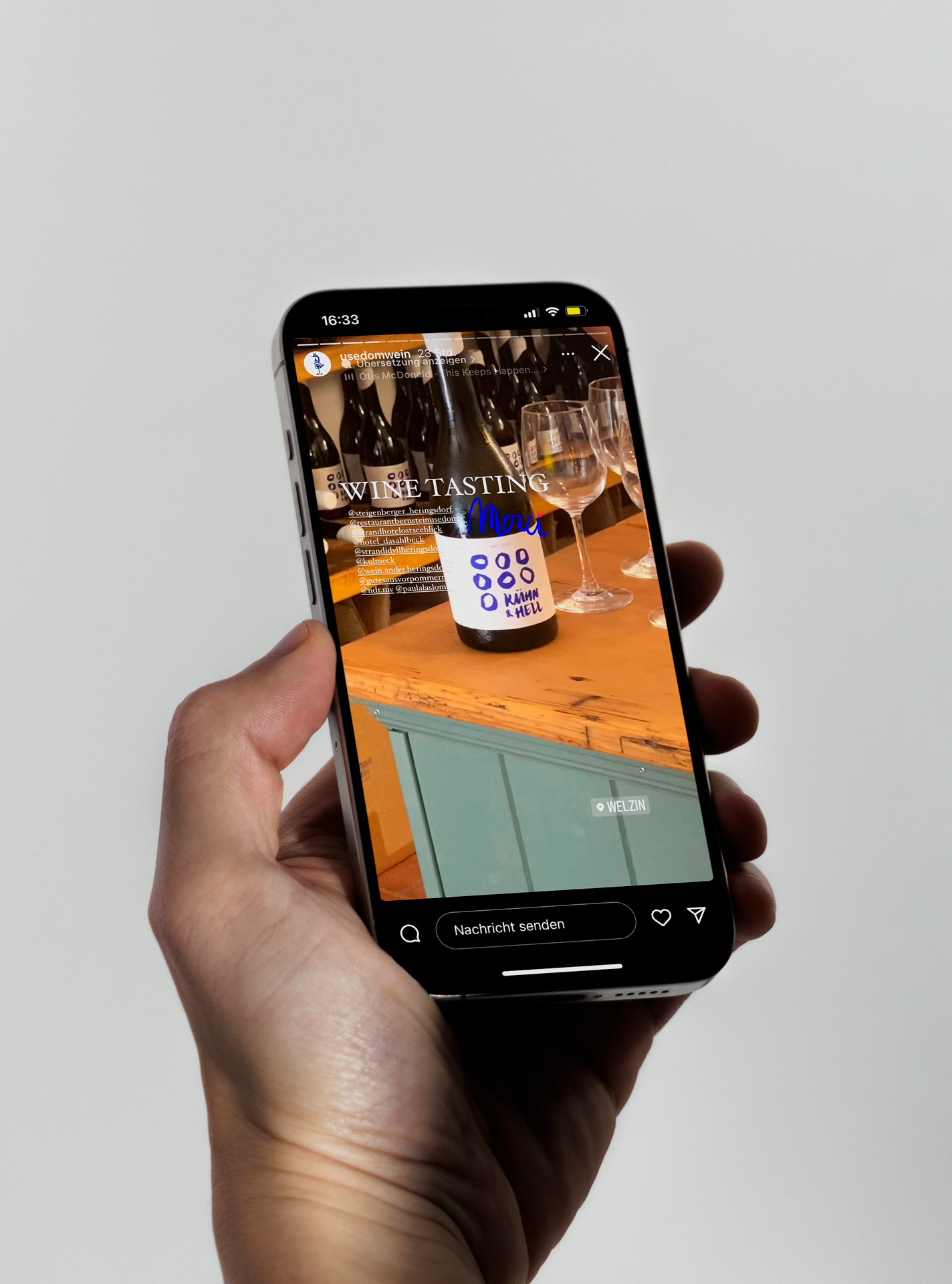
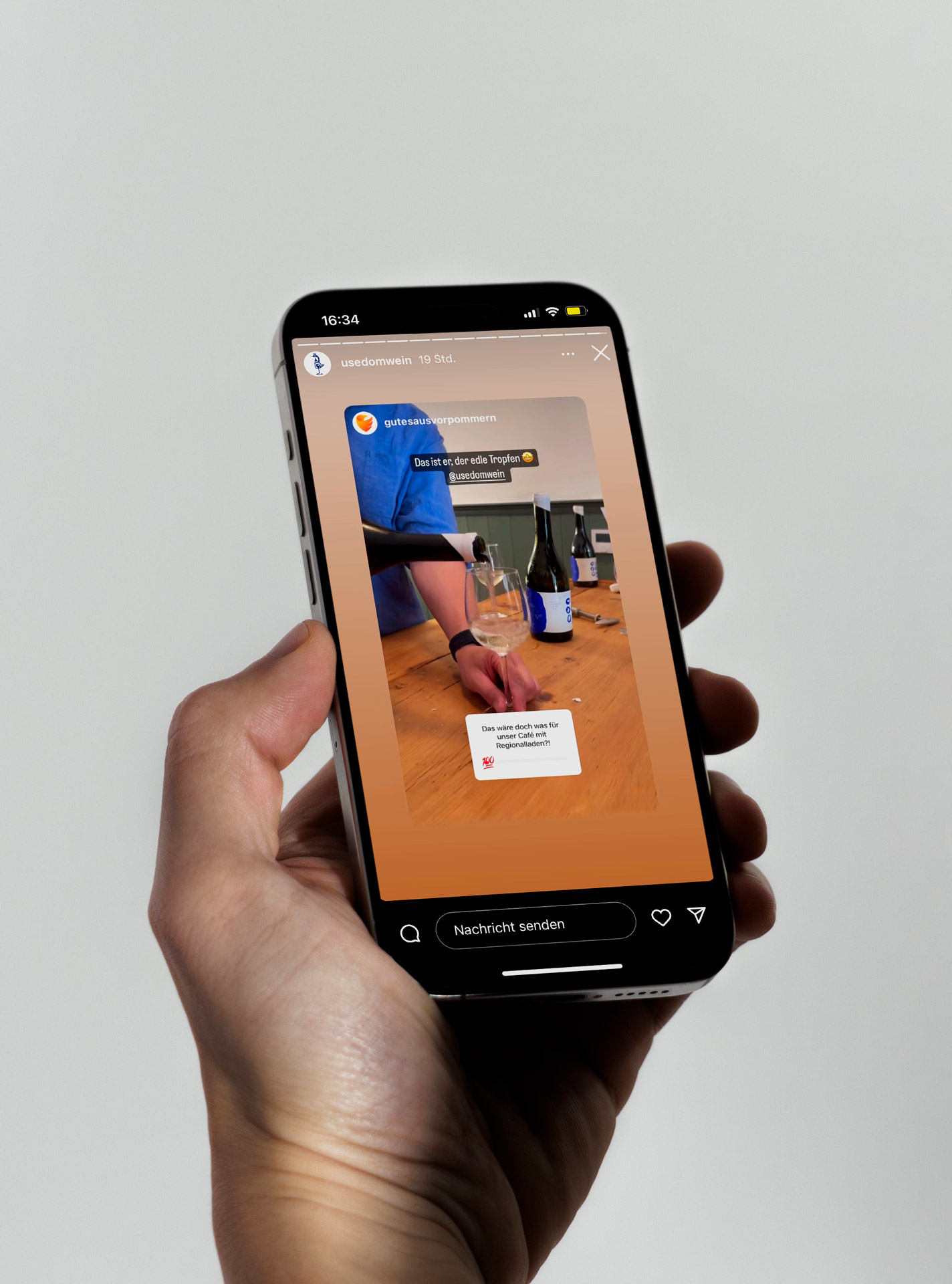
In the fourth and final step, we wrote and designed a one-page website, created a small design toolbox with all the assets required for brand communication, designed some advertising materials and shone like the sun over Usedom in July 2024 when the first box of “Hühn & Hell” arrived at our office. Cheers!
In the fourth and final step, we wrote and designed a one-page website, created a small design toolbox with all the assets required for brand communication, designed some advertising materials and shone like the sun over Usedom in July 2024 when the first box of “Hühn & Hell” arrived at our office. Cheers!

Kühn & Hell
Kühn & Hell
Kreativdirektion:
Jonas Meyer
Markenstrategie:
Jonas Meyer & Fred Funk
Fotografie:
Maximilian König
Leadagentur:
Aufsiemitgebrüll
Art Direction:
Marie Parakenings
Im Spätsommer 2023 hatte ich das große Vergnügen, zusammen mit der Agentur Aufsiemitgebrüll und Fotograf Maximilian König das nordöstlichste Weingut Deutschlands zu branden – geführt von Christoph Kühne-Hellmessen und seiner Familie auf der wunderschönen Insel Usedom.
Im ersten Schritt entwickelten wir in einem zweitägigen Workshop vor Ort – bei Weißwein und Grillforelle – die strategischen Grundlagen wie Markenversprechen, Wertegerüst, Vision und Mission. Außerdem beschäftigten wir uns mit einer Pricing-Strategie für Distributoren und Endkund*innen und formulierten erste Naming-Ansätze – nicht nur für das Weingut selbst, sondern auch für den ersten Wein der Kühne-Hellmessens.
Dieser ist übrigens auch der allererste Wein von Usedom: ein „Gemischter Satz“ aus den sieben Rebsorten Sauvignac, Muscaris, Solaris, Rinot, Ravel blanc, Soreli und Fleurtai. Diese werden auch als sogenannte Zukunftsrebsorten bezeichnet, da sie besonders widerstandsfähig gegen Pilzbefall und veränderte Anbaubedingungen in Folge des Klimawandels sind.
Im zweiten Schritt entwickelten wir in einem fünfköpfigen Designteam verschiedene Routen für das neue Erscheinungsbild des jungen „Weingut Welzin“ – natürlich inklusive diverser Varianten für das Etikett des Gemischten Satzes, den wir gemeinsam „Kühn & Hell“ getauft hatten.
Durchgesetzt hatte sich am Ende des Prozesses ein Entwurf, der in besonderer Weise von der Nahbarkeit, dem Pragmatismus und dem handwerklichen Geschick der Kühne-Hellmessens inspiriert ist – und auch vom strahlend blauen Himmel über Usedom. Nicht umsonst gilt die Insel als eine der sonnenreichsten Regionen Deutschlands.
Um das neue Corporate Design zu komplettieren, entwickelten wir im dritten Schritt zusammen mit dem Fotograf Maximilian König ein zu der Marke passendes Bildkonzept und ließen ihn anschließend einen Tag lang die Kühne-Hellmessens mit der Kamera begleiten.
Um das neue Corporate Design zu komplettieren, entwickelten wir im dritten Schritt zusammen mit dem Fotograf Maximilian König ein zu der Marke passendes Bildkonzept und ließen ihn anschließend einen Tag lang die Kühne-Hellmessens mit der Kamera begleiten.
Im vierten und letzten Schritt texteten und gestalteten wir den Website-Onepager, erstellten eine kleine Design-Toolbox mit allen für die Markenkommunikation erforderlichen Assets, gestalteten einige Werbemittel und strahlten im Juli 2024 wie die Sonne über Usedom, als uns die erste Kiste „Kühn & Hell“ im Büro erreichte. Prösterchen!
Im vierten und letzten Schritt texteten und gestalteten wir den Website-Onepager, erstellten eine kleine Design-Toolbox mit allen für die Markenkommunikation erforderlichen Assets, gestalteten einige Werbemittel und strahlten im Juli 2024 wie die Sonne über Usedom, als uns die erste Kiste „Kühn & Hell“ im Büro erreichte. Prösterchen!
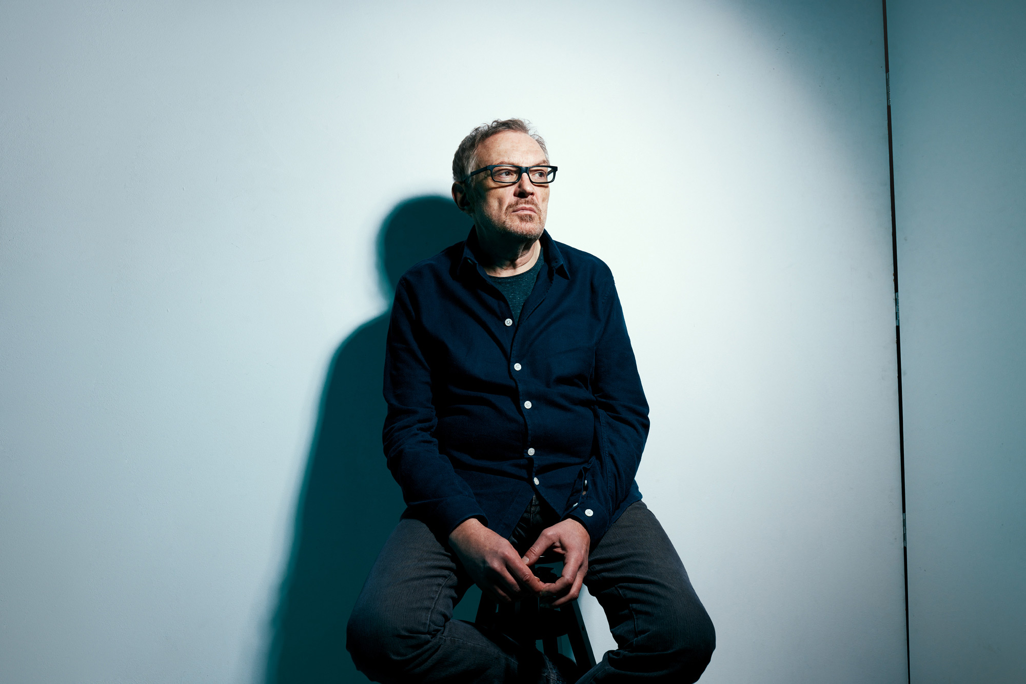
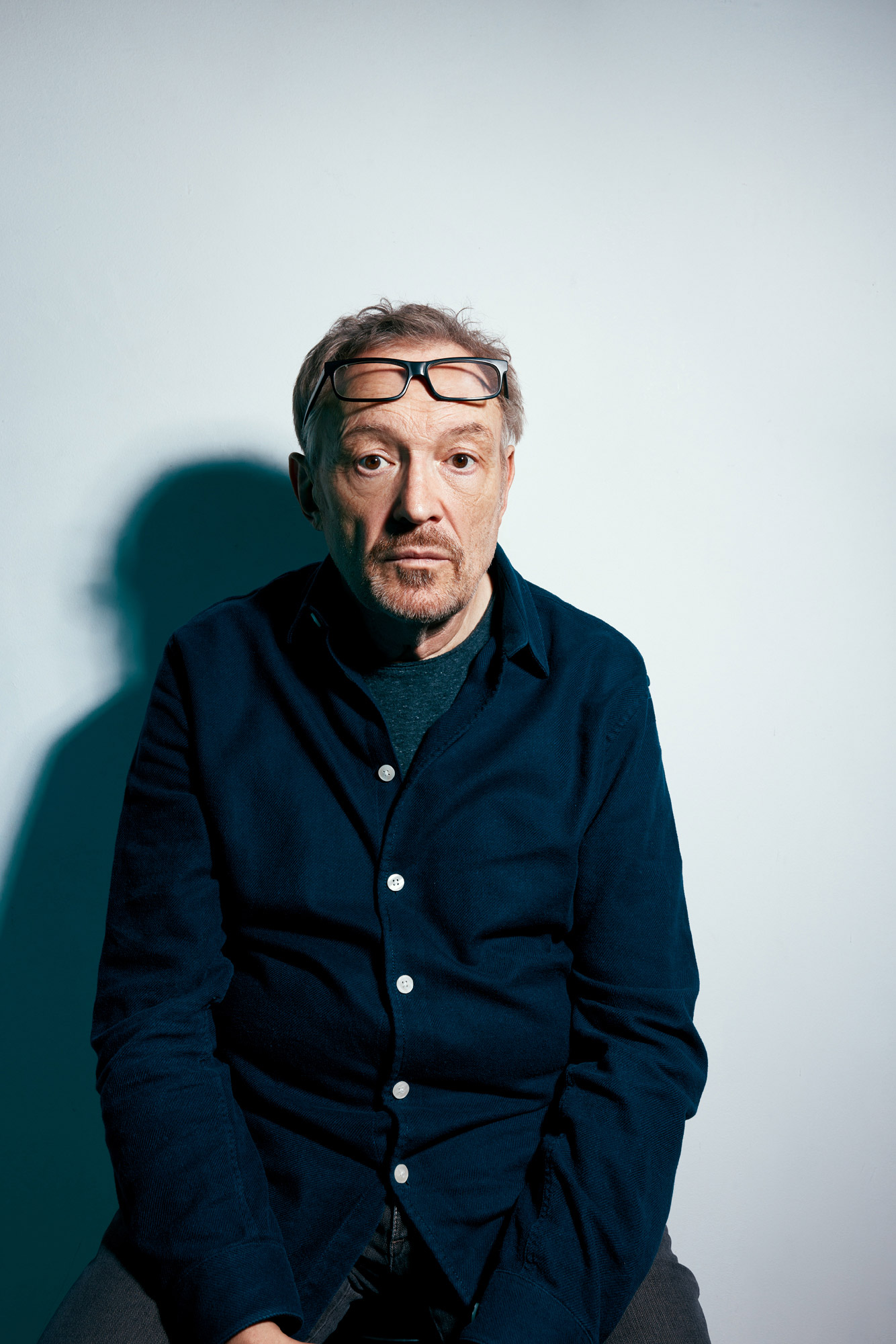
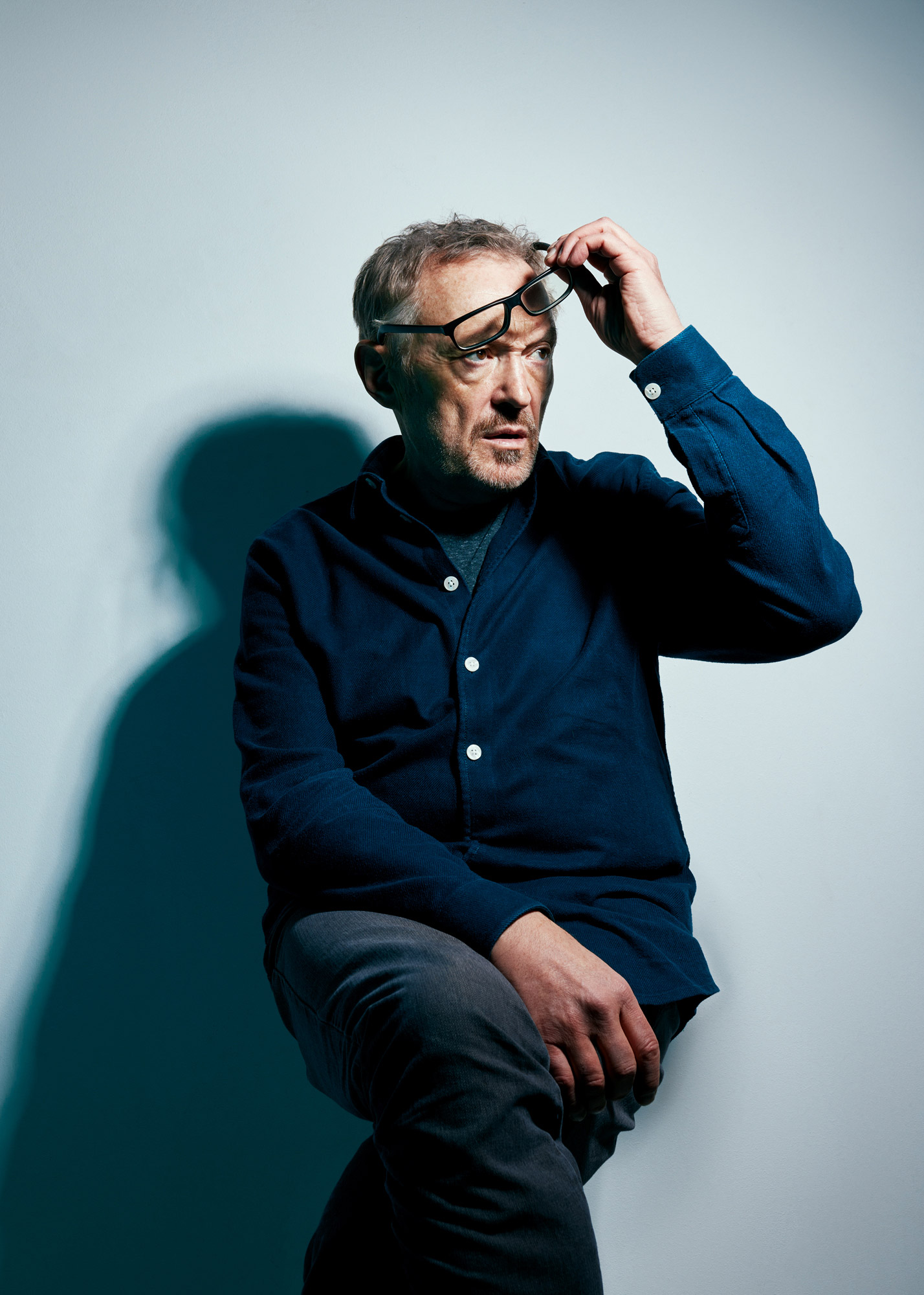
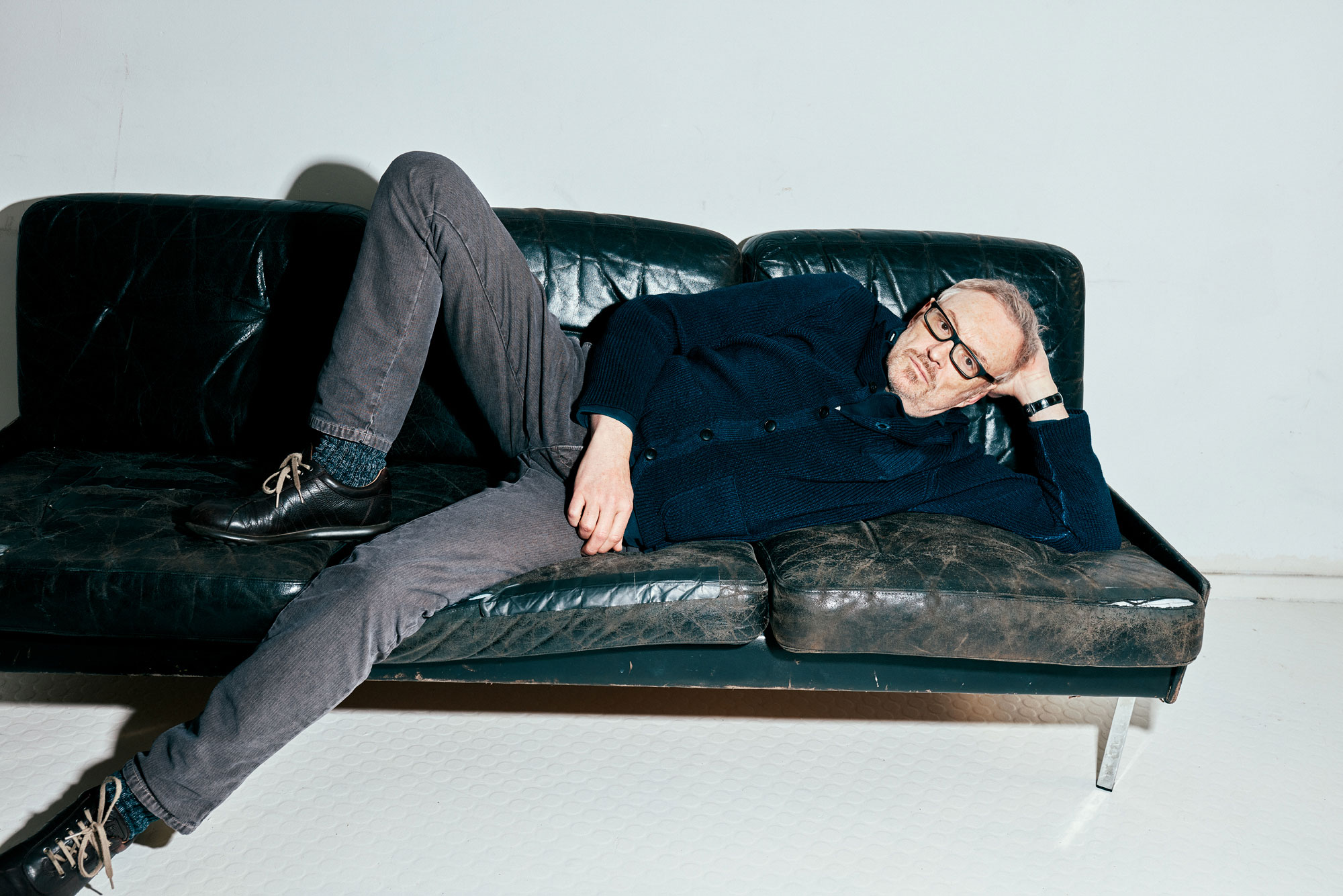
Josef Hader
Josef Hader
Client:
MYP Magazine
Interview & text:
Jonas Meyer
Photography:
Maximilian König
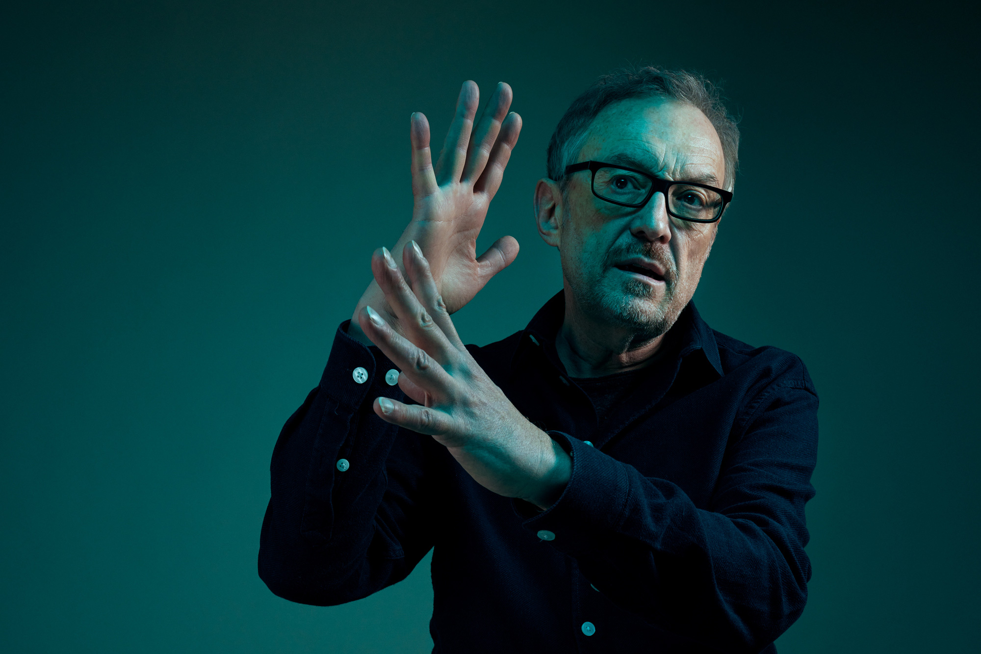
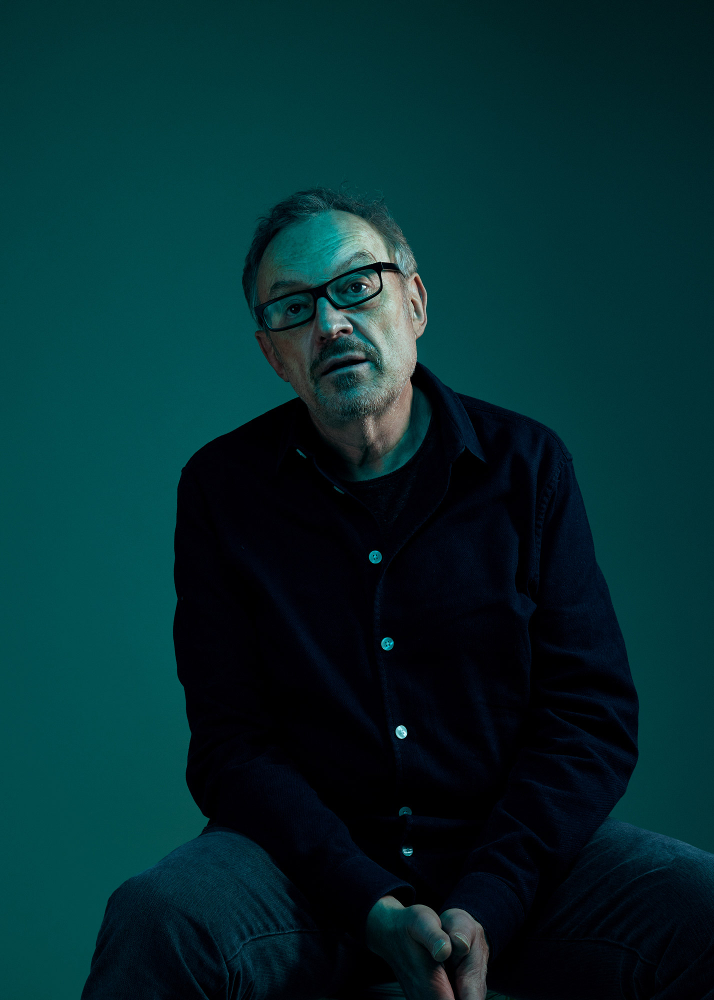
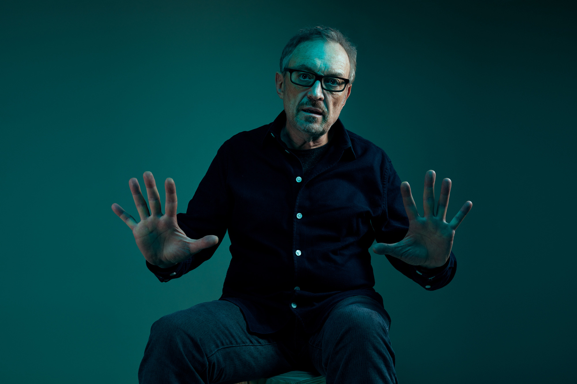
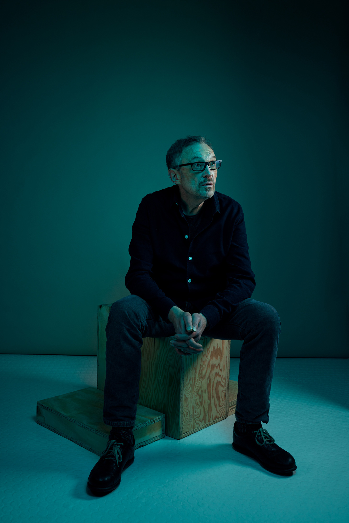
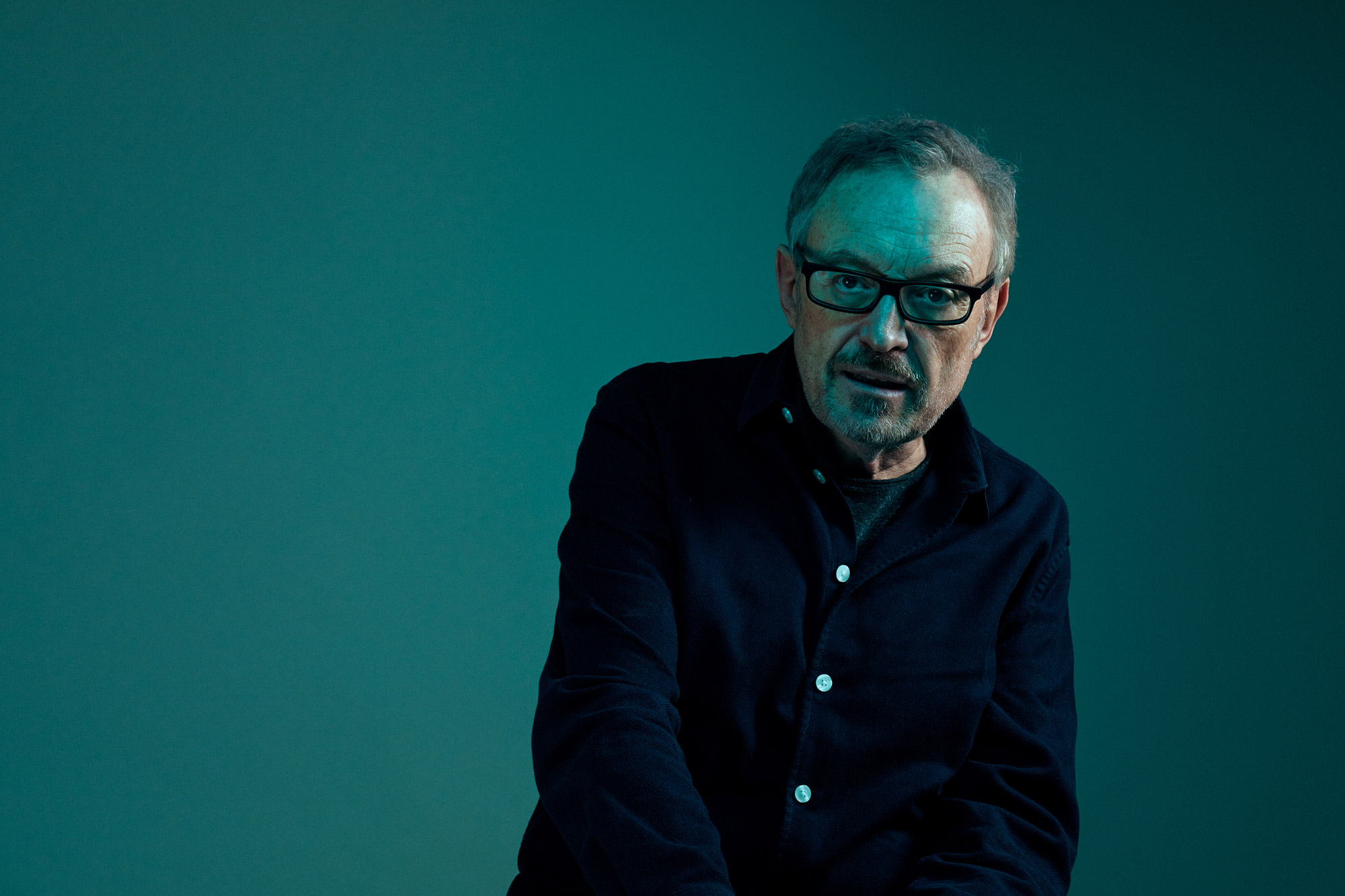
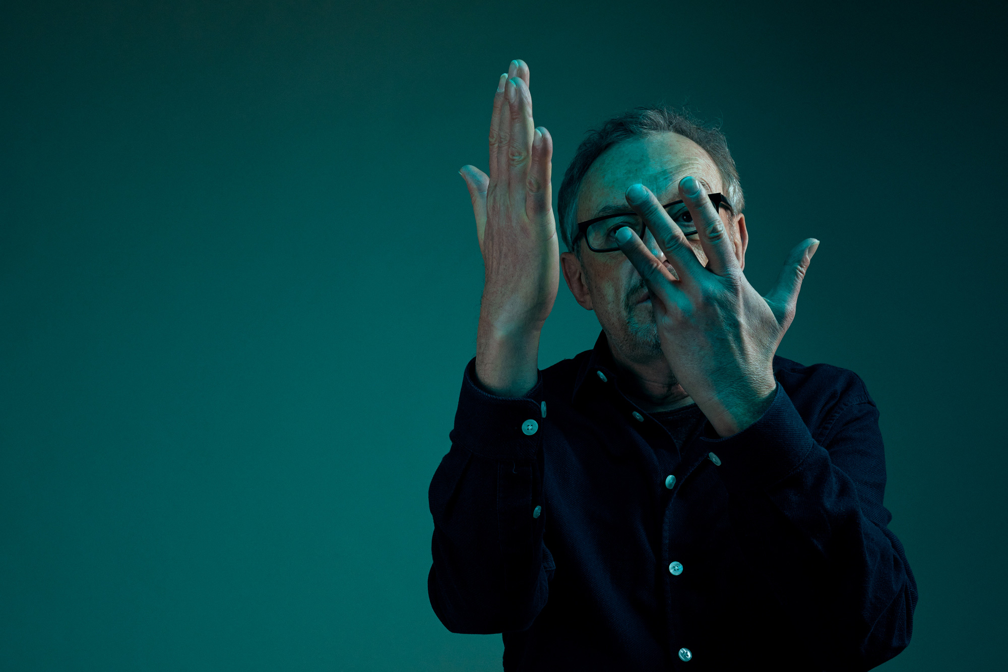
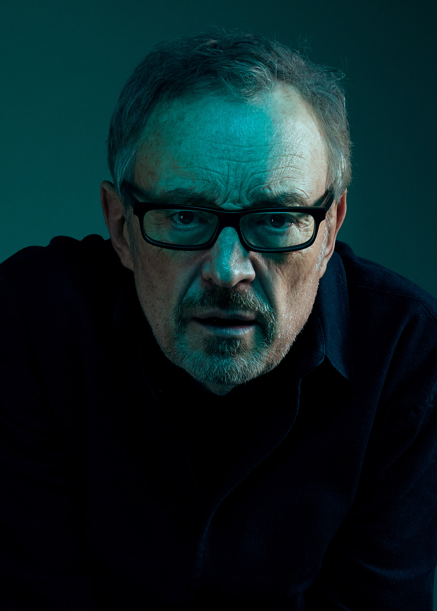
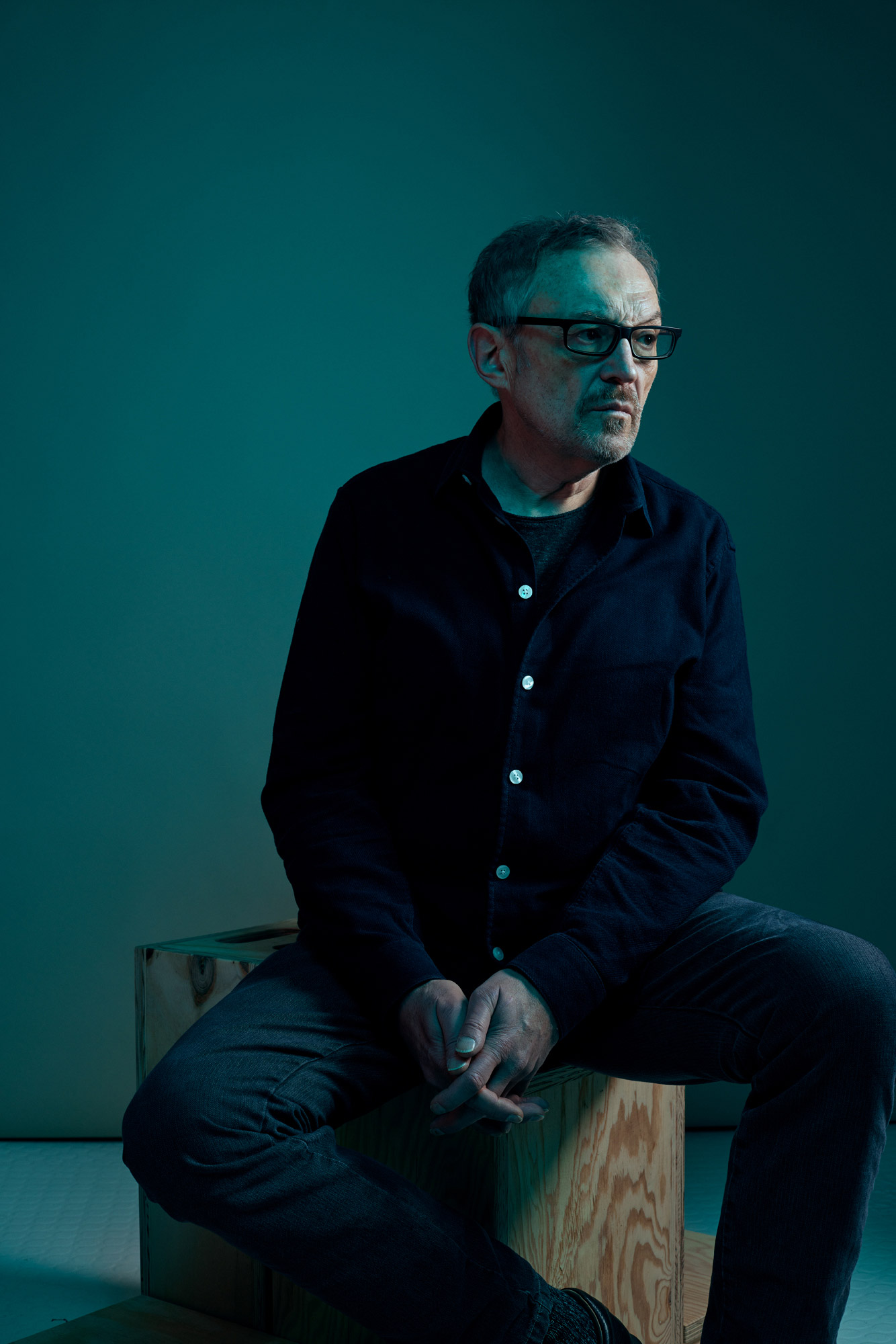
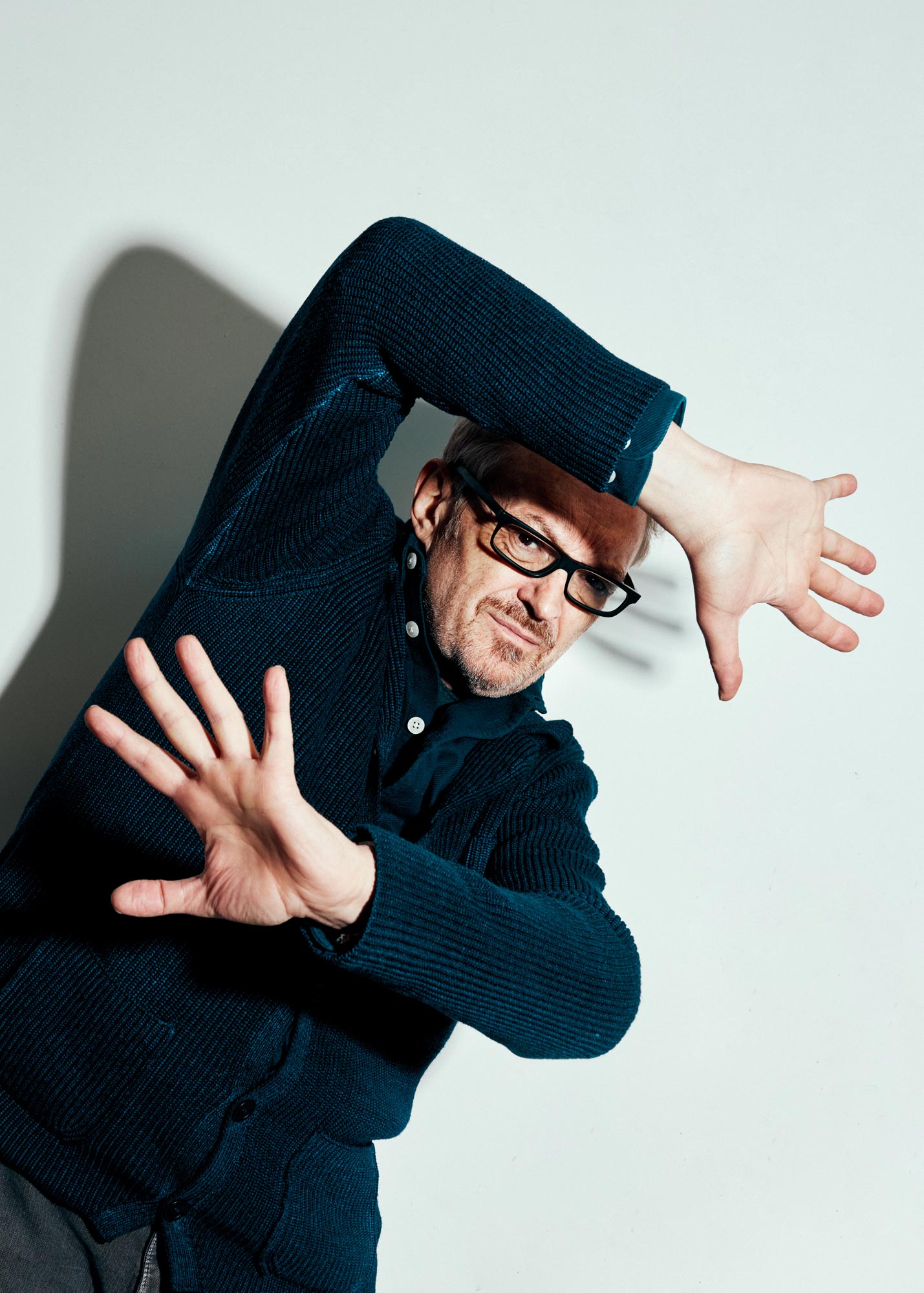
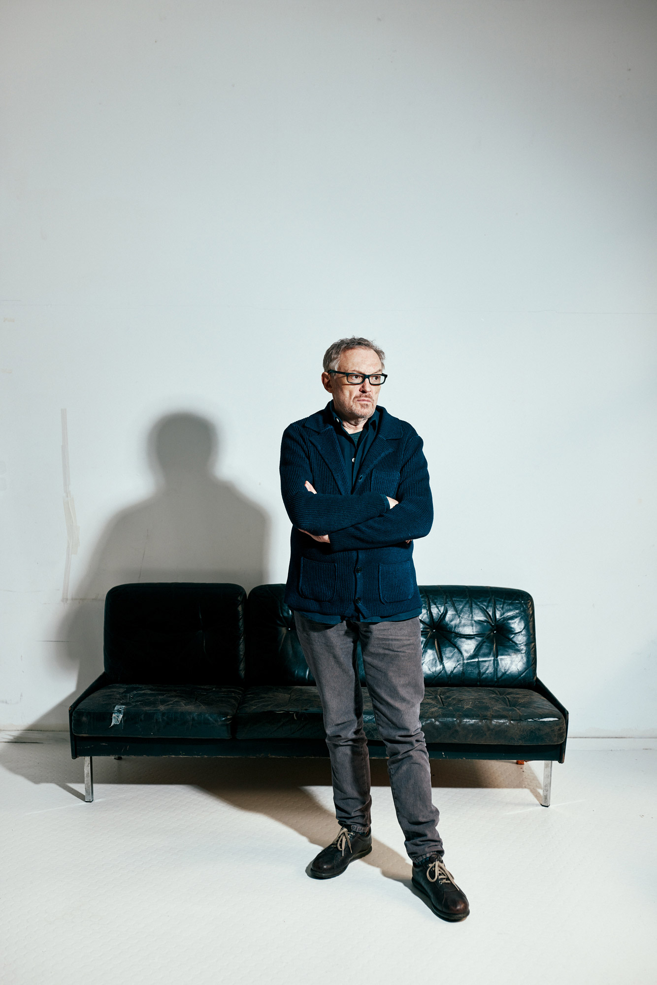
»Old white men often don’t have happy endings«
For our MYP Magazine, photographer Maximilian König and I had the pleasure of meeting Austrian cabaret artist, actor and director Josef Hader for an in-depth interview and portrait shoot in January 2021.
Hader, who had performed the night before at Berlin’s Babylon cinema with his new stage program „Hader On Ice,“ explained to us in the interview why gray gentlemen annoy him, what Jörg Haider has to do posthumously in the teleshop, and why Europe is a construct to which one cannot have a purely enthusiastic relationship.
Josef Hader
Client:
MYP Magazine
Interview & text:
Jonas Meyer
Photography:
Maximilian König
»Old white men often don’t have happy endings«
For our MYP Magazine, photographer Maximilian König and I had the pleasure of meeting Austrian cabaret artist, actor and director Josef Hader for an in-depth interview and portrait shoot in January 2021.
Hader, who had performed the night before at Berlin’s Babylon cinema with his new stage program „Hader On Ice,“ explained to us in the interview why gray gentlemen annoy him, what Jörg Haider has to do posthumously in the teleshop, and why Europe is a construct to which one cannot have a purely enthusiastic relationship.
Josef Hader
Josef Hader
Auftraggeber:
MYP Magazine
Redaktion & Text:
Jonas Meyer
Fotografie:
Maximilian König
»Bei alten weißen Männern gibt’s oft kein Happy End«
Für unser MYP Magazine durfte ich im Januar 2021 zusammen mit Fotograf Maximilian König den österreichischen Kabarettisten, Schauspieler und Regisseur Josef Hader für ein ausführliches Gespräch und Portrait-Shooting treffen.
Hader, der am Abend zuvor im Berliner Babylon-Kino mit seinem neuen Bühnenprogramm „Hader On Ice“ aufgetreten war, erklärte uns im Interview, warum ihn graue Herren nerven, was Jörg Haider posthum im Teleshop zu suchen hat und wieso Europa ein Konstrukt ist, zu dem man keine rein enthusiastische Beziehung haben kann.
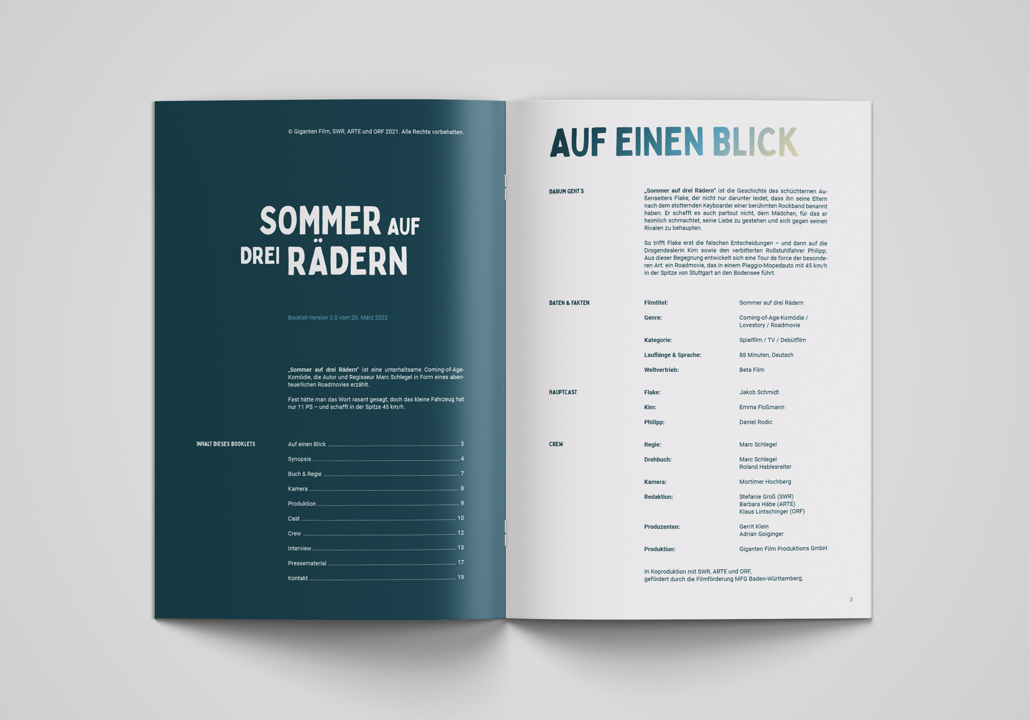
Sommer auf drei Rädern
Sommer auf drei Rädern
Kunde:
Giganten Film Produktions GmbH
Kreativdirektion & Text:
Jonas Meyer
Fotografie & Retouche:
Maximilian König
Produzent:
Gerrit Klein
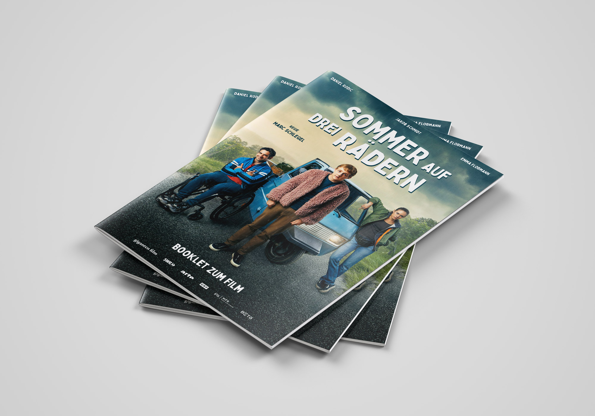
Im Sommer 2021 wurde ich von der Ludwigsburger Giganten Film beauftragt, die Pressebetreuung für den Fernsehfilm „Sommer auf drei Rädern“ zu übernehmen, eine Koproduktion mit dem SWR, ORF und ARTE.
„Sommer auf drei Rädern“ ist eine unterhaltsame Coming-of-Age-Komödie, in der sich drei überaus unterschiedliche Charaktere auf einen abenteuerlichen Roadtrip durch die schwäbische Provinz begeben. Fast hätte man das Wort rasant gesagt, doch sie sind unterwegs in einer Piaggio Ape. Das kleine Fahrzeug hat nur elf PS – und schafft in der Spitze 45 km/h.
Sommer auf drei Rädern
Kunde:
Giganten Film Produktions GmbH
Kreativdirektion:
Jonas Meyer
Fotografie & Retouche:
Maximilian König
Produzent:
Gerrit Klein
Im Sommer 2021 wurde ich von der Ludwigsburger Giganten Film beauftragt, die Pressebetreuung für den Fernsehfilm „Sommer auf drei Rädern“ zu übernehmen, eine Koproduktion mit dem SWR, ORF und ARTE.
„Sommer auf drei Rädern“ ist eine unterhaltsame Coming-of-Age-Komödie, in der sich drei überaus unterschiedliche Charaktere auf einen abenteuerlichen Roadtrip durch die schwäbische Provinz begeben. Fast hätte man das Wort rasant gesagt, doch sie sind unterwegs in einer Piaggio Ape. Das kleine Fahrzeug hat nur elf PS – und schafft in der Spitze 45 km/h.
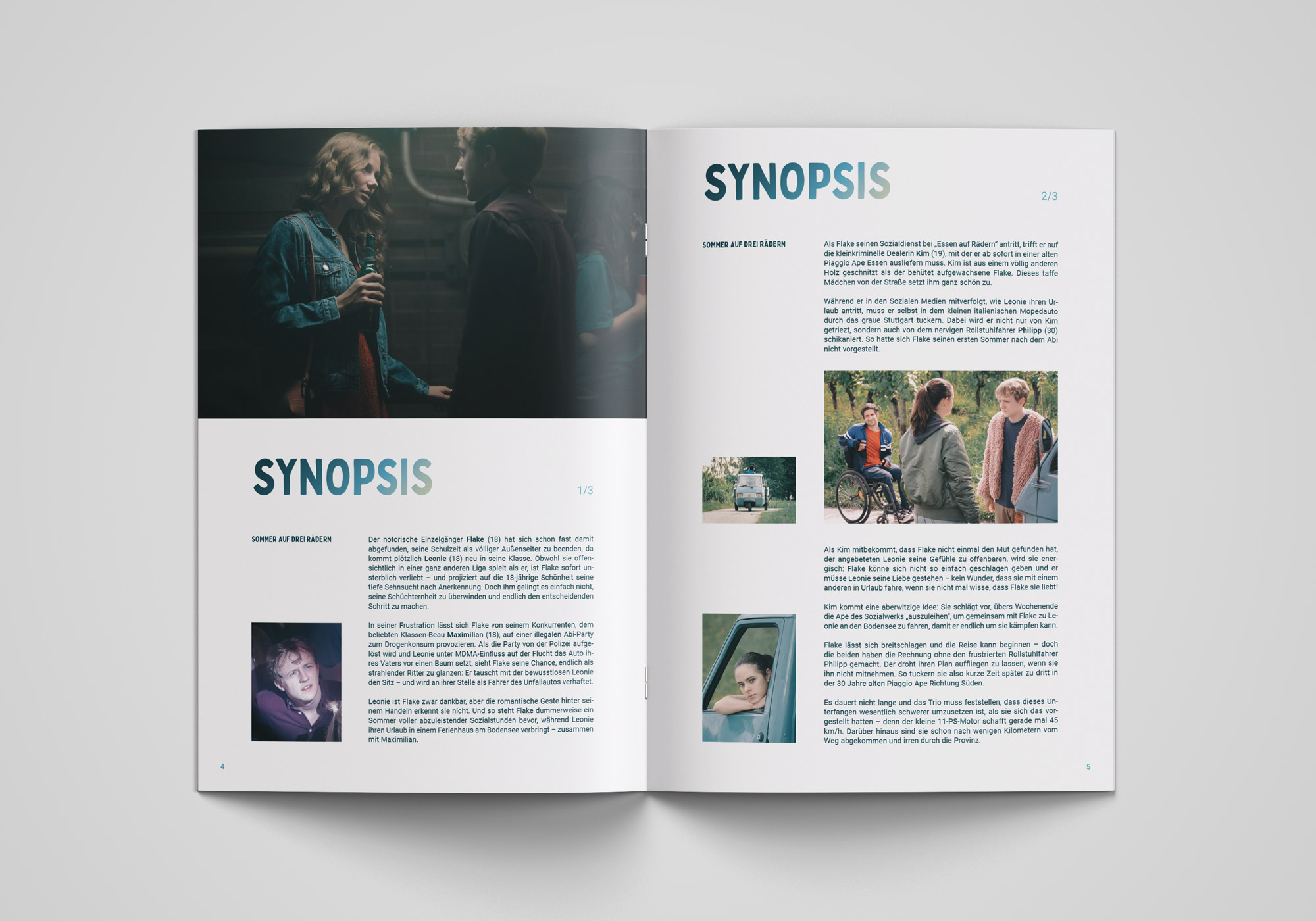
Im ersten Schritt entwickelten Fotograf Maximilian König und ich das Konzept für ein einprägsames Keyvisual, das den Charakter des Films auf den Punkt bringen und für diverse mediale Anwendungen geeignet sein sollte: vom offiziellen Filmplakat über den Einsatz in den sozialen Netzwerken bis hin zur Einbindung in die Mediatheken der TV-Sender.
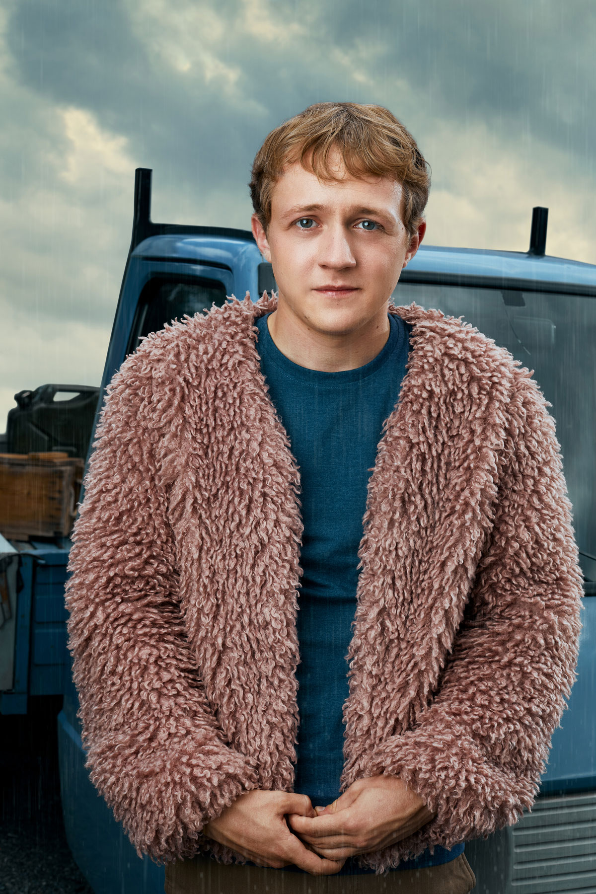
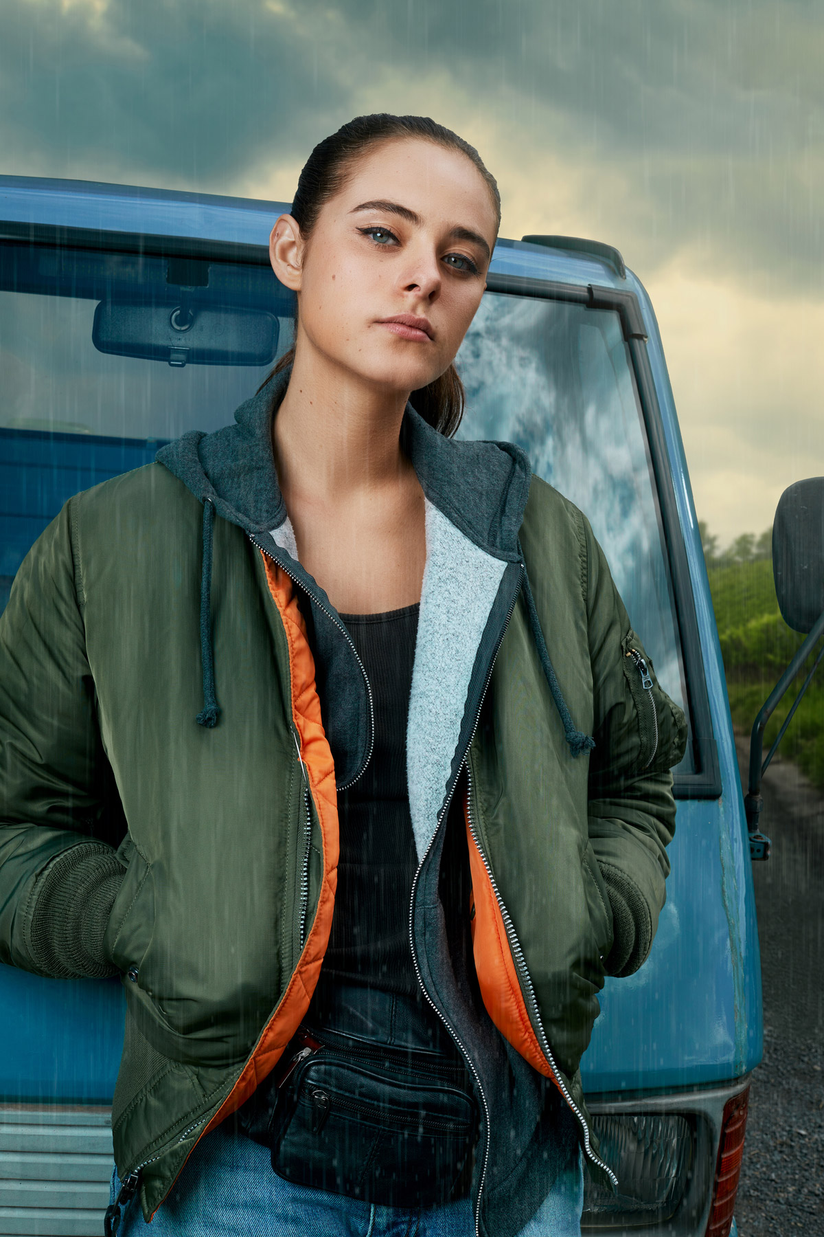
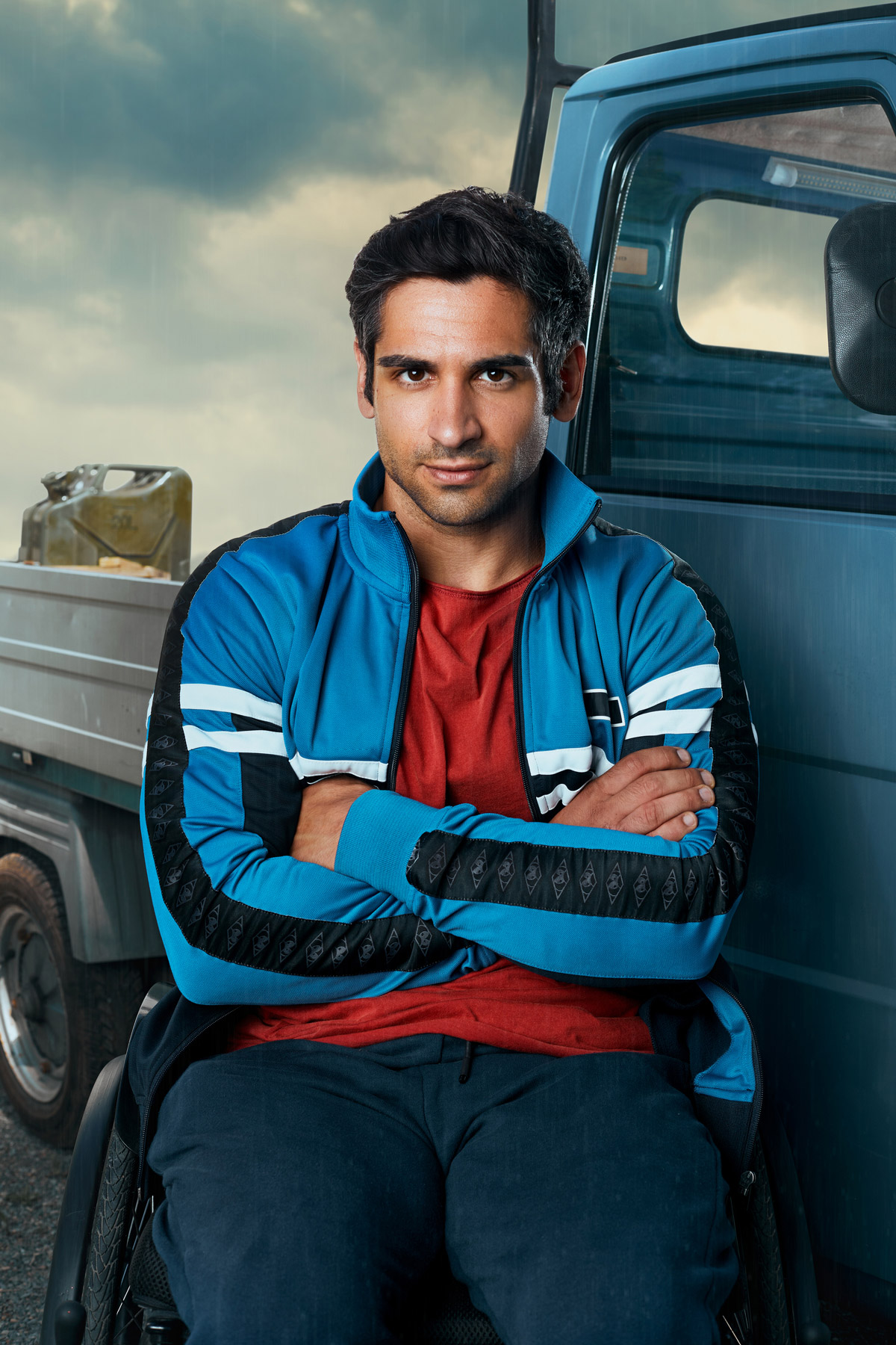
Im zweiten Schritt realisierte Maximilian unsere Keyvisual-Idee und fotografierte das Motiv Ende Juli 2021 parallel zu den Dreharbeiten im Raum Stuttgart. Dank der Unterstützung von Produzent Gerrit Klein konnte er direkt neben dem Filmset ein eigenes Fotoset einrichten, in dem er die Ape sowie die drei Hauptcharaktere Flake, Kim und Philipp inszenierte. In diesem Zusammenhang entstanden auch diverse Portraits der drei Hauptfiguren für die Themenseite des Films in den Sender-Mediatheken.
Im ersten Schritt entwickelten Fotograf Maximilian König und ich das Konzept für ein einprägsames Keyvisual, das den Charakter des Films auf den Punkt bringen und für diverse mediale Anwendungen geeignet sein sollte: vom offiziellen Filmplakat über den Einsatz in den sozialen Netzwerken bis hin zur Einbindung in die Mediatheken der TV-Sender.
Im zweiten Schritt realisierte Maximilian unsere Keyvisual-Idee und fotografierte das Motiv Ende Juli 2021 parallel zu den Dreharbeiten im Raum Stuttgart. Dank der Unterstützung von Produzent Gerrit Klein konnte er direkt neben dem Filmset ein eigenes Fotoset einrichten, in dem er die Ape sowie die drei Hauptcharaktere Flake, Kim und Philipp inszenierte. In diesem Zusammenhang entstanden auch diverse Portraits der drei Hauptfiguren für die Themenseite des Films in den Sender-Mediatheken.
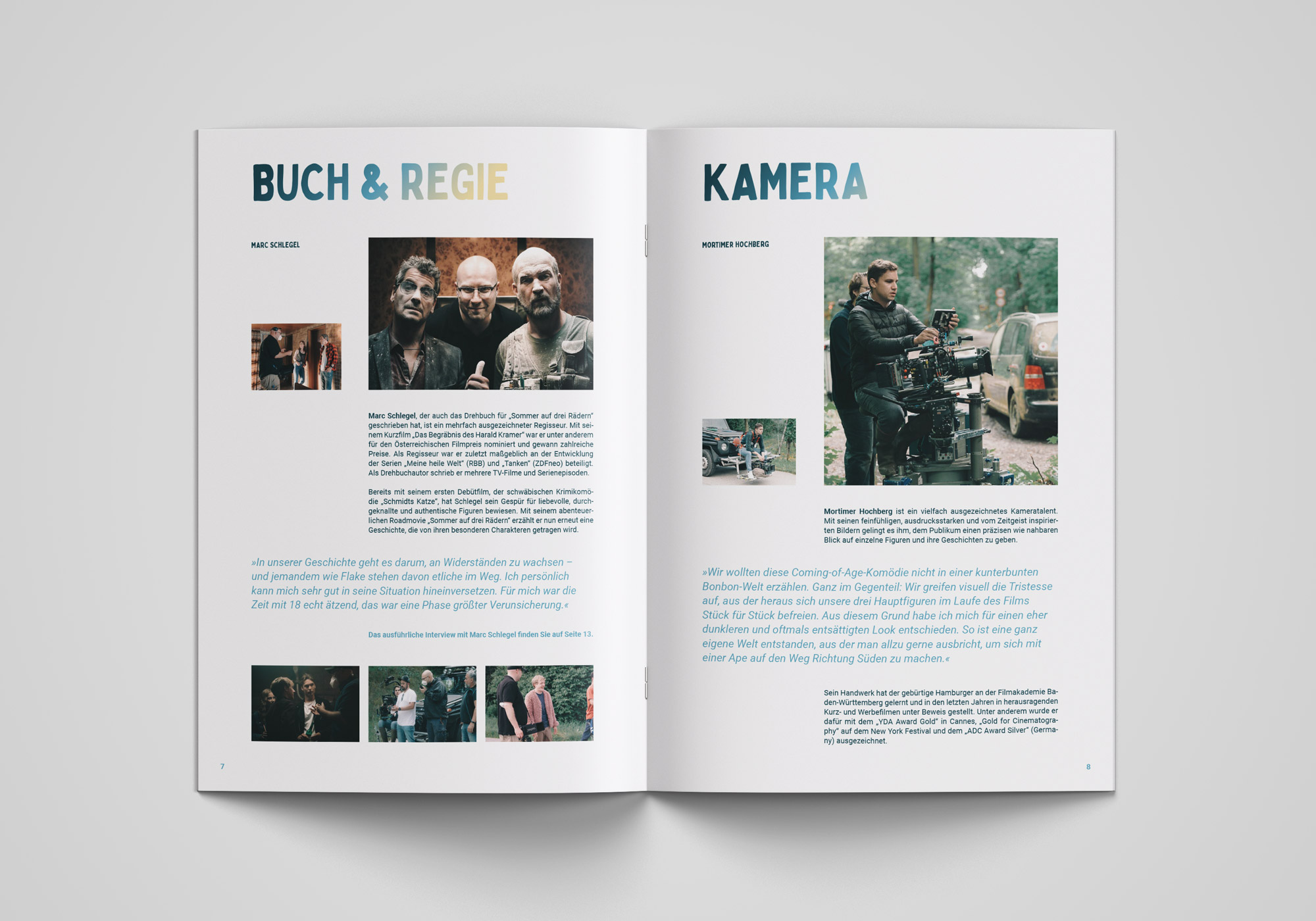
Im dritten und letzten Schritt entwickelte ich die visuelle Identität von „Sommer auf drei Rädern“, gestaltete das offizielle Filmplakat auf Basis des finalen Keyvisuals und führte ein ausführliches Interview mit Regisseur Marc Schlegel, Kameramann Mortimer Hochberg und Produzent Gerrit Klein. Im Anschluss erstellte ich eine umfangreiche Pressemappe zur internationalen Bewerbung des Films.
Im dritten und letzten Schritt entwickelte ich die visuelle Identität von „Sommer auf drei Rädern“, gestaltete das offizielle Filmplakat auf Basis des finalen Keyvisuals und führte ein ausführliches Interview mit Regisseur Marc Schlegel, Kameramann Mortimer Hochberg und Produzent Gerrit Klein. Im Anschluss erstellte ich eine umfangreiche Pressemappe zur internationalen Bewerbung des Films.
Three Wheels, One Summer
Three Wheels, One Summer
Client:
Giganten Film Produktions GmbH
Creative direction & text:
Jonas Meyer
Photography & retouching:
Maximilian König
Producer:
Gerrit Klein
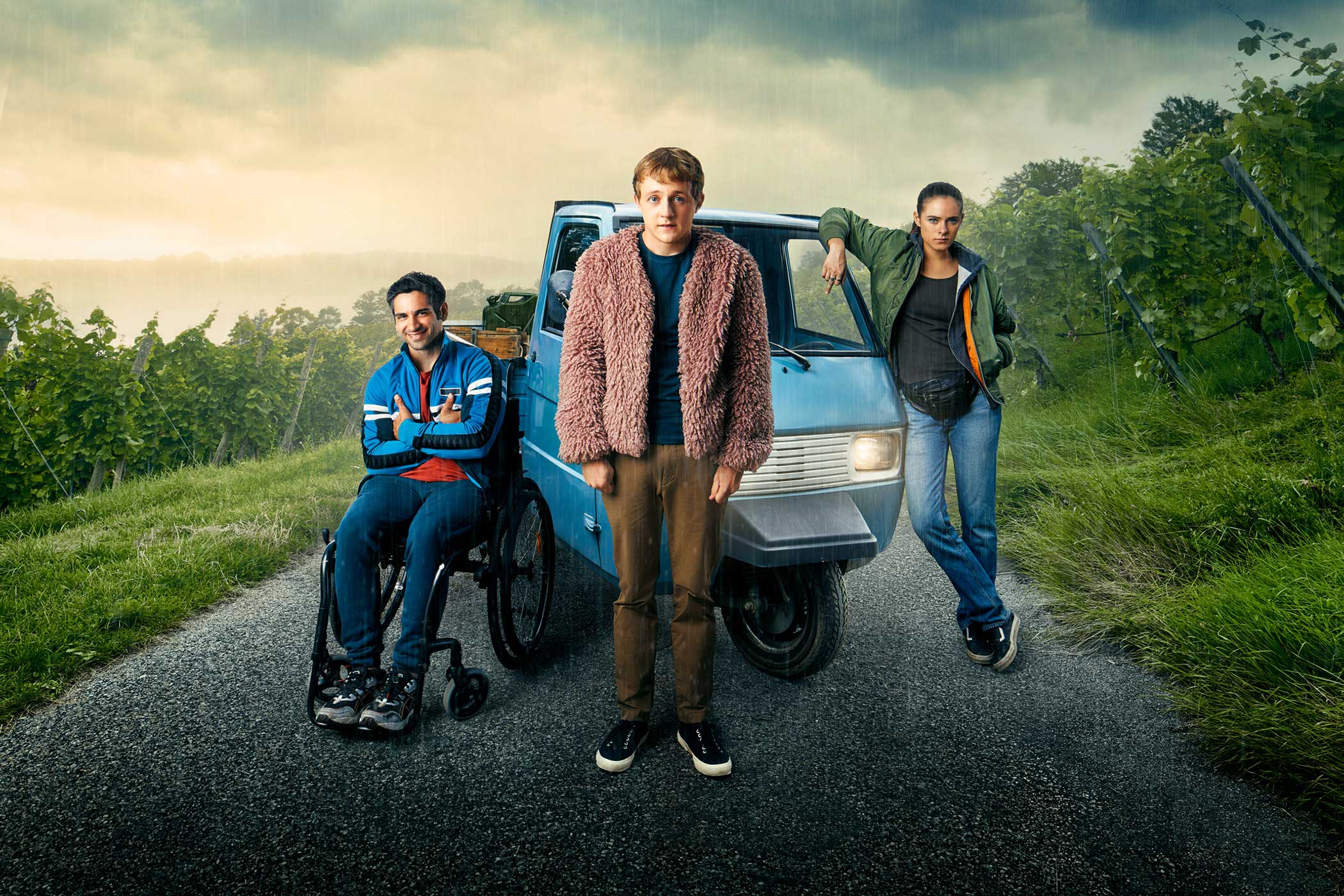
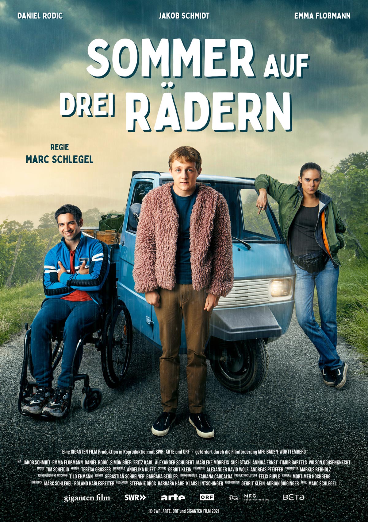
In the summer of 2021, I was commissioned by the Ludwigsburg-based production company Giganten Film with the press support for the TV film “Three Wheels, One Summer” (German title “Sommer auf drei Rädern”), a co-production with SWR, ORF and ARTE.
“Three Wheels, One Summer” is an entertaining coming-of-age comedy in which three extremely different characters embark on an adventurous road trip through the Swabian province. One almost said the word fast, but they are on the road in a Piaggio Ape. The small vehicle has only 11 horsepower—and can reach a top speed of 45 km/h.
Three Wheels, One Summer
Client:
Giganten Film Produktions GmbH
Creative direction:
Jonas Meyer
Photography & retouching:
Maximilian König
Producer:
Gerrit Klein
In the summer of 2021, I was commissioned by the Ludwigsburg-based production company Giganten Film with the press support for the TV film “Three Wheels, One Summer” (German title “Sommer auf drei Rädern”), a co-production with SWR, ORF and ARTE.
“Three Wheels, One Summer” is an entertaining coming-of-age comedy in which three extremely different characters embark on an adventurous road trip through the Swabian province. One almost said the word fast, but they are on the road in a Piaggio Ape. The small vehicle has only 11 horsepower—and can reach a top speed of 45 km/h.
In the first step, photographer Maximilian König and I developed the concept for a catchy key visual, which should sum up the character of the film and be suitable for various media applications: from the official film poster to use in social networks and integration in the media libraries of the co-producing TV stations.
In the second step, Maximilian realized the created idea and photographed the key visual at the end of July 2021 when cast and crew were filming in the Stuttgart area. Thanks to the support of producer Gerrit Klein, he was able to set up his own photo set right next to the film set, where he staged the Ape as well as the three main characters Flake, Kim, and Philipp. In this context, Maximilian also shot various character portraits for the broadcasters‘ media libraries.
In the third step, I created the film’s visual identity, designed the official film poster based on the final key visual, and conducted an extensive interview with director Marc Schlegel, DOP Mortimer Hochberg, and producer Gerrit Klein. After that, I created a comprehensive press kit to promote the film internationally.
In the third step, I created the film’s visual identity, designed the official film poster based on the final key visual, and conducted an extensive interview with director Marc Schlegel, DOP Mortimer Hochberg, and producer Gerrit Klein. After that, I created a comprehensive press kit to promote the film internationally.
apoBank – Die Zeit ist jetzt
Die Zeit ist jetzt
Kunde:
Deutsche Apotheker- und Ärztebank
Leadagentur:
K’UP
Redaktion, Text & Regie:
Jonas Meyer
Photography:
Maximilian König
Kamera, Schnitt & Grading:
Steven Lüdtke
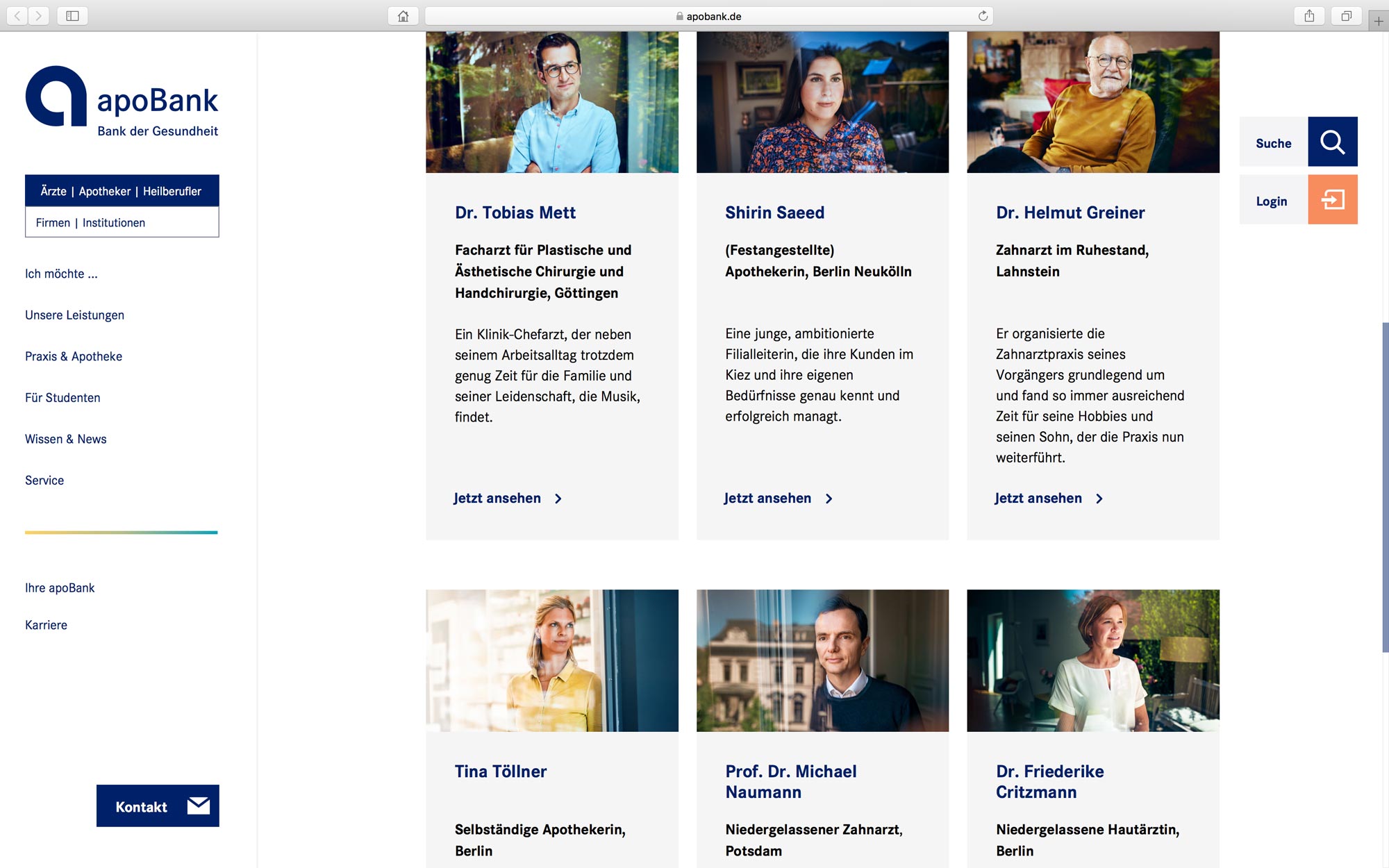
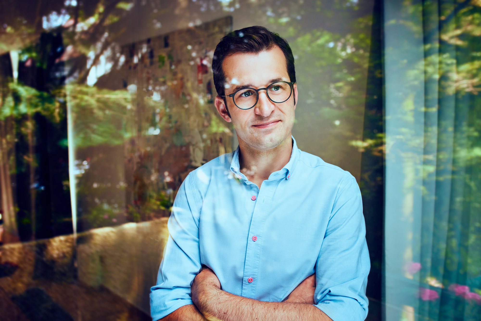
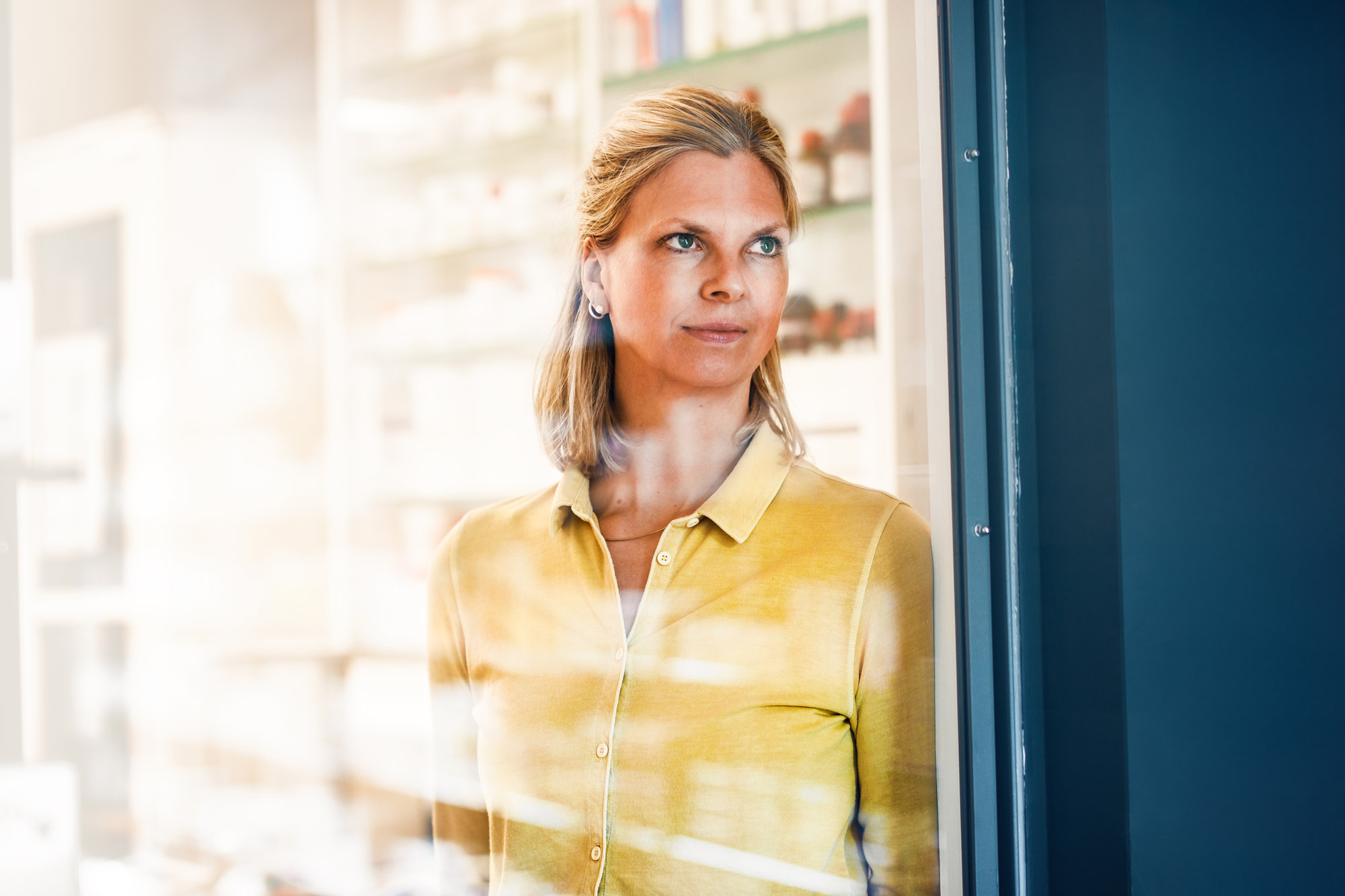
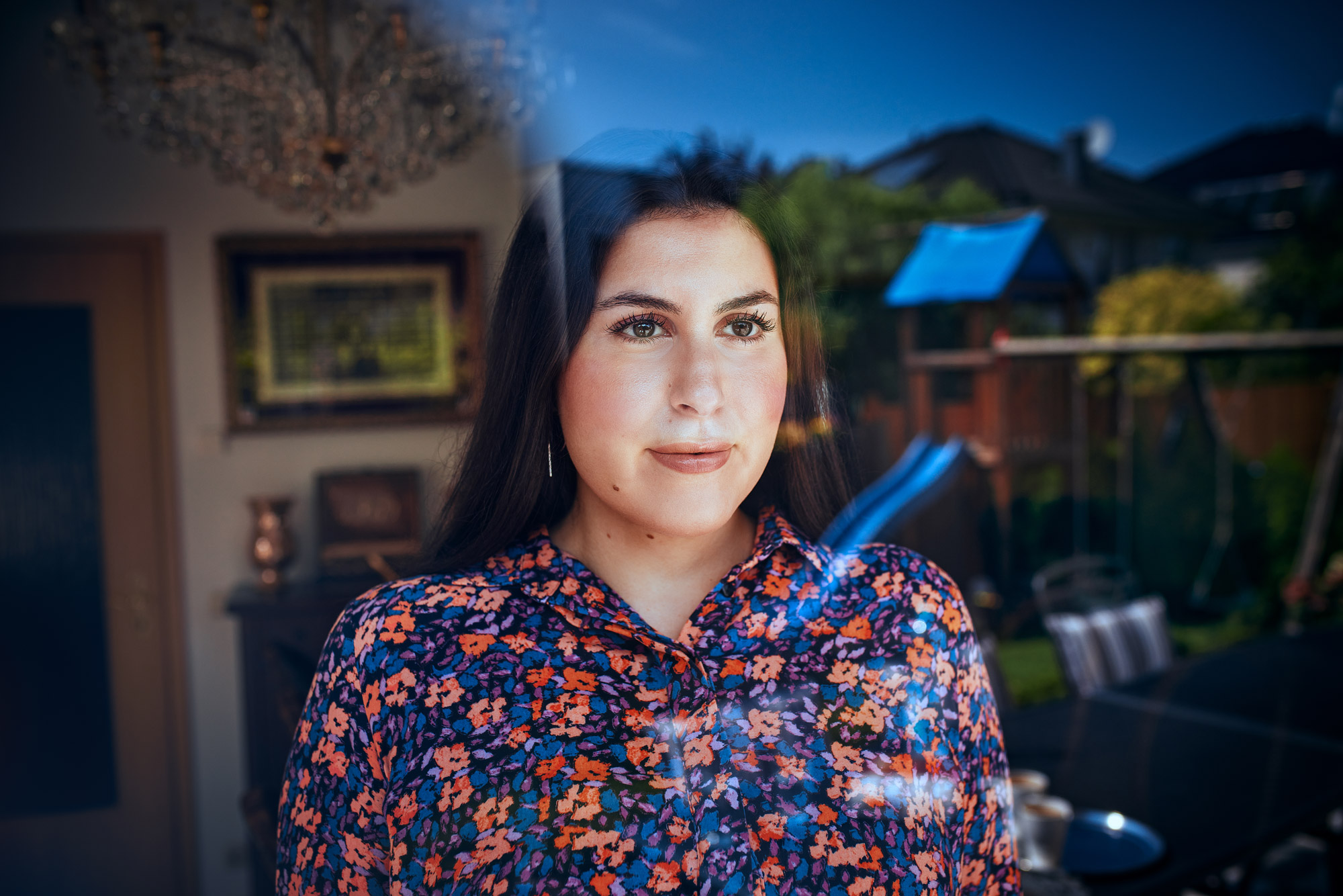
Im Laufe des Jahres 2021 durfte ich für die Deutsche Apotheker- und Ärztebank eine kundenzentrierte Markenkampagne mit dem Titel „Die Zeit ist jetzt“ realisieren, die von der Berliner Unternehmensberatung K’UP entwickelt wurde.
Diese Kampagne macht nicht nur die Vielfalt individueller Lebensentwürfe von Menschen in Heilberufen sichtbar, sondern beleuchtet auch, woraus diese Personen ihre Kraft schöpfen und was ihnen im Leben wichtig ist. Die apoBank, so die Kernbotschaft der Kampagne, macht es ihren Kund*innen leicht, ihrer jeweiligen Berufung zu folgen, um Zeit für das Wesentliche zu haben.
Die Zeit ist jetzt
Kunde:
Dt. Apotheker- und Ärztebank
Leadagentur:
K’UP
Redaktion, Text & Regie:
Jonas Meyer
Fotografie:
Maximilian König
Kamera, Schnitt & Grading:
Steven Lüdtke
Im Laufe des Jahres 2021 durfte ich für die Deutsche Apotheker- und Ärztebank eine kundenzentrierte Markenkampagne mit dem Titel „Die Zeit ist jetzt“ realisieren, die von der Berliner Unternehmensberatung K’UP entwickelt wurde.
Diese Kampagne macht nicht nur die Vielfalt individueller Lebensentwürfe von Menschen in Heilberufen sichtbar, sondern beleuchtet auch, woraus diese Personen ihre Kraft schöpfen und was ihnen im Leben wichtig ist. Die apoBank, so die Kernbotschaft der Kampagne, macht es ihren Kund*innen leicht, ihrer jeweiligen Berufung zu folgen, um Zeit für das Wesentliche zu haben.
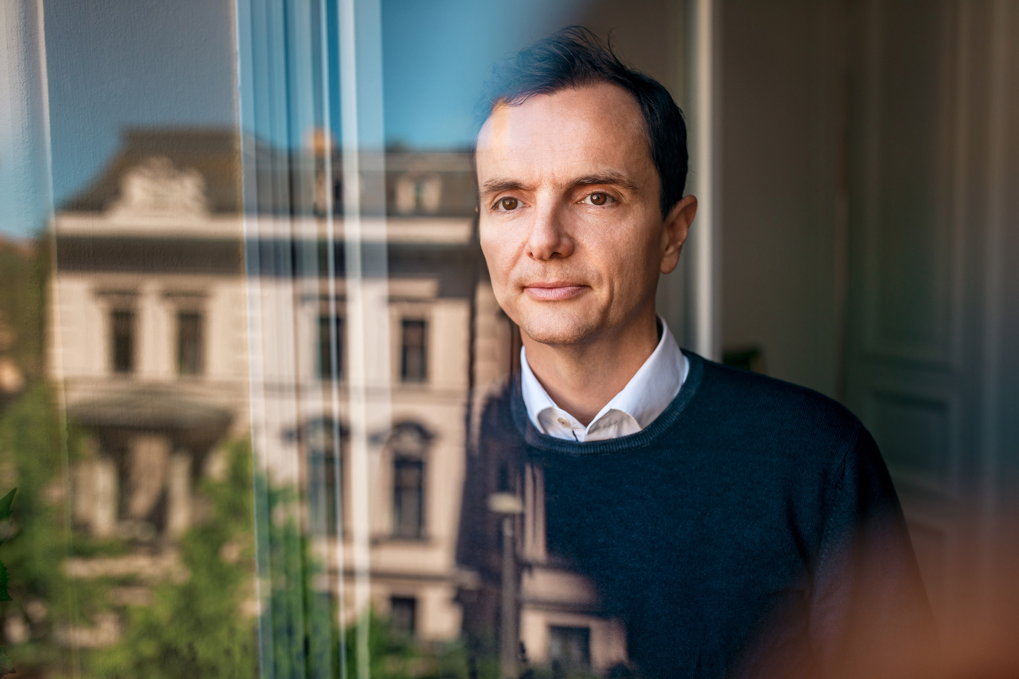
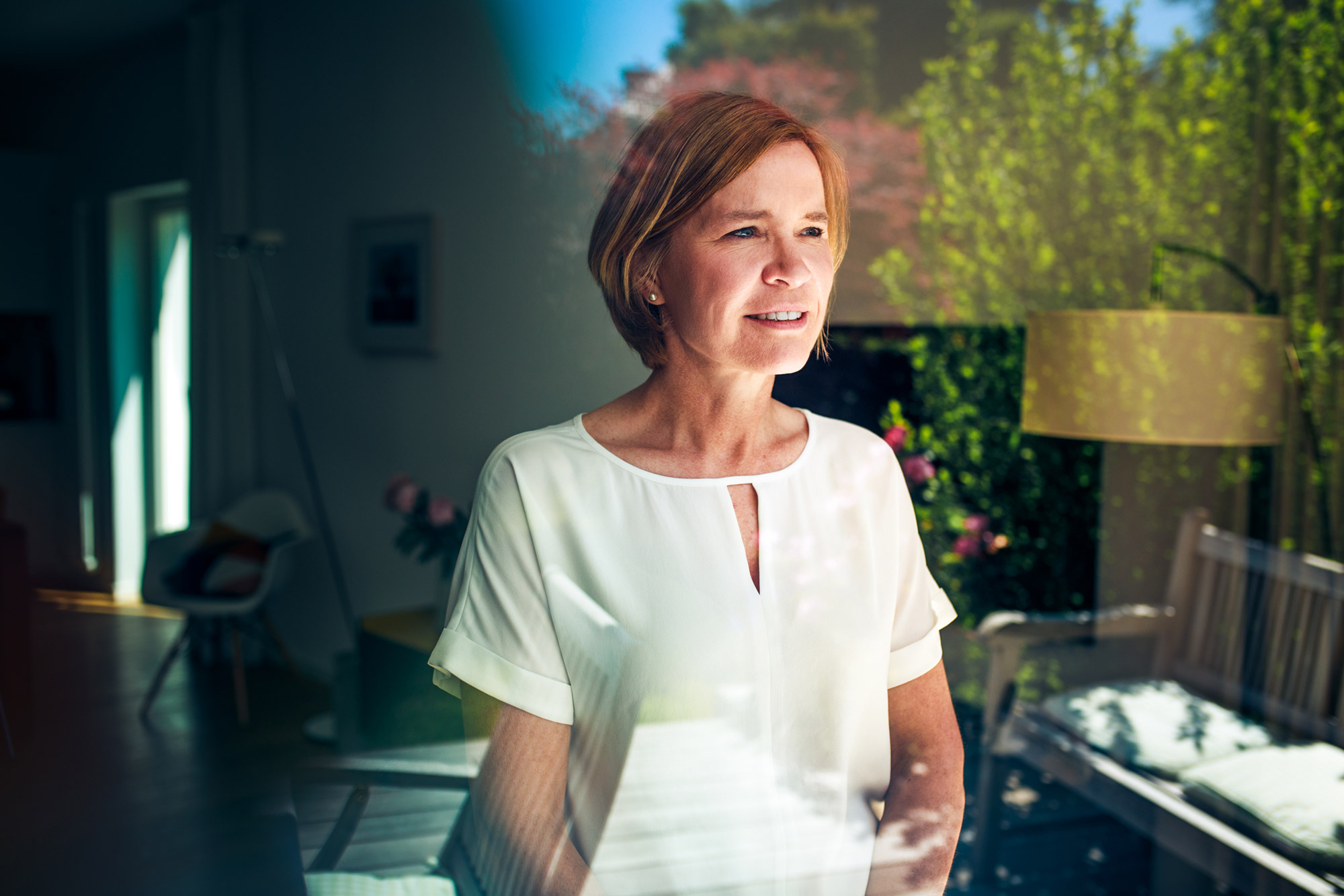
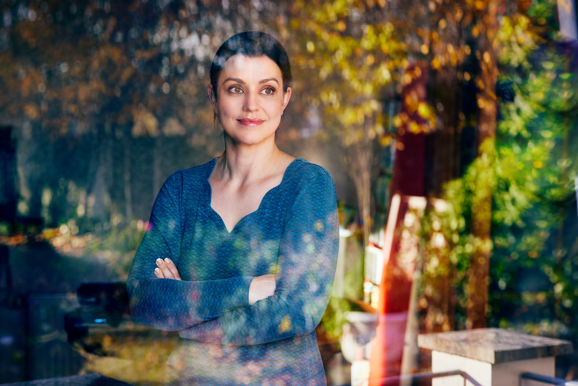
In Zusammenarbeit mit Fotograf Maximilian König und DOP Steven Lüdtke durfte ich eine Reihe außergewöhnlicher Persönlichkeiten aus den unterschiedlichsten Heilberufen portraitieren. Während Max für die Fotografie der Keyvisual-Motive und Editorials zuständig war und Steven das Ganze filmisch in Szene setzte, war es meine Aufgabe, ausführliche Interviews mit den Protagonist*innen zu führen, daraus individuelle Portraittexte für die Kampagnenwebsite zu entwickeln und persönliche Voiceover-Texte für die jeweils etwa 45-sekündigen Kurzvideos zu verfassen. Darüber hinaus wurde ich mit der Regie während der Produktions- und Postproduktionsphase betraut.
In Zusammenarbeit mit Fotograf Maximilian König und DOP Steven Lüdtke durfte ich eine Reihe außergewöhnlicher Persönlichkeiten aus den unterschiedlichsten Heilberufen portraitieren. Während Max für die Fotografie der Keyvisual-Motive und Editorials zuständig war und Steven das Ganze filmisch in Szene setzte, war es meine Aufgabe, ausführliche Interviews mit den Protagonist*innen zu führen, daraus individuelle Portraittexte für die Kampagnenwebsite zu entwickeln und persönliche Voiceover-Texte für die jeweils etwa 45-sekündigen Kurzvideos zu verfassen. Darüber hinaus wurde ich mit der Regie während der Produktions- und Postproduktionsphase betraut.
Zusätzliche Infos auf der offiziellen Kampagnenwebsite →
Weitere Testimonials:
Weitere Testimonials:
Credits:
Redaktion, Text & Regie: Jonas Meyer
Fotografie & Postproduktion: Maximilian König
Kamera, Schnitt & Grading: Steven Lüdtke
Kreativdirektion: Lars Weber
Grafik: Emily Gelbert
Produktion: K’UP
Strategische Supervision: Dr. Marc Herz
Credits:
Redaktion, Text & Regie: Jonas Meyer
Fotografie & Postproduktion: Maximilian König
Kamera, Schnitt & Grading: Steven Lüdtke
Kreativdirektion: Lars Weber
Grafik: Emily Gelbert
Produktion: K’UP
Strategische Supervision: Dr. Marc Herz
apoBank – The time is now
The time is now
Client:
Deutsche Apotheker- und Ärztebank
Lead agency:
K’UP
Text & direction:
Jonas Meyer
Photography:
Maximilian König
Camera, editing & grading:
Steven Lüdtke
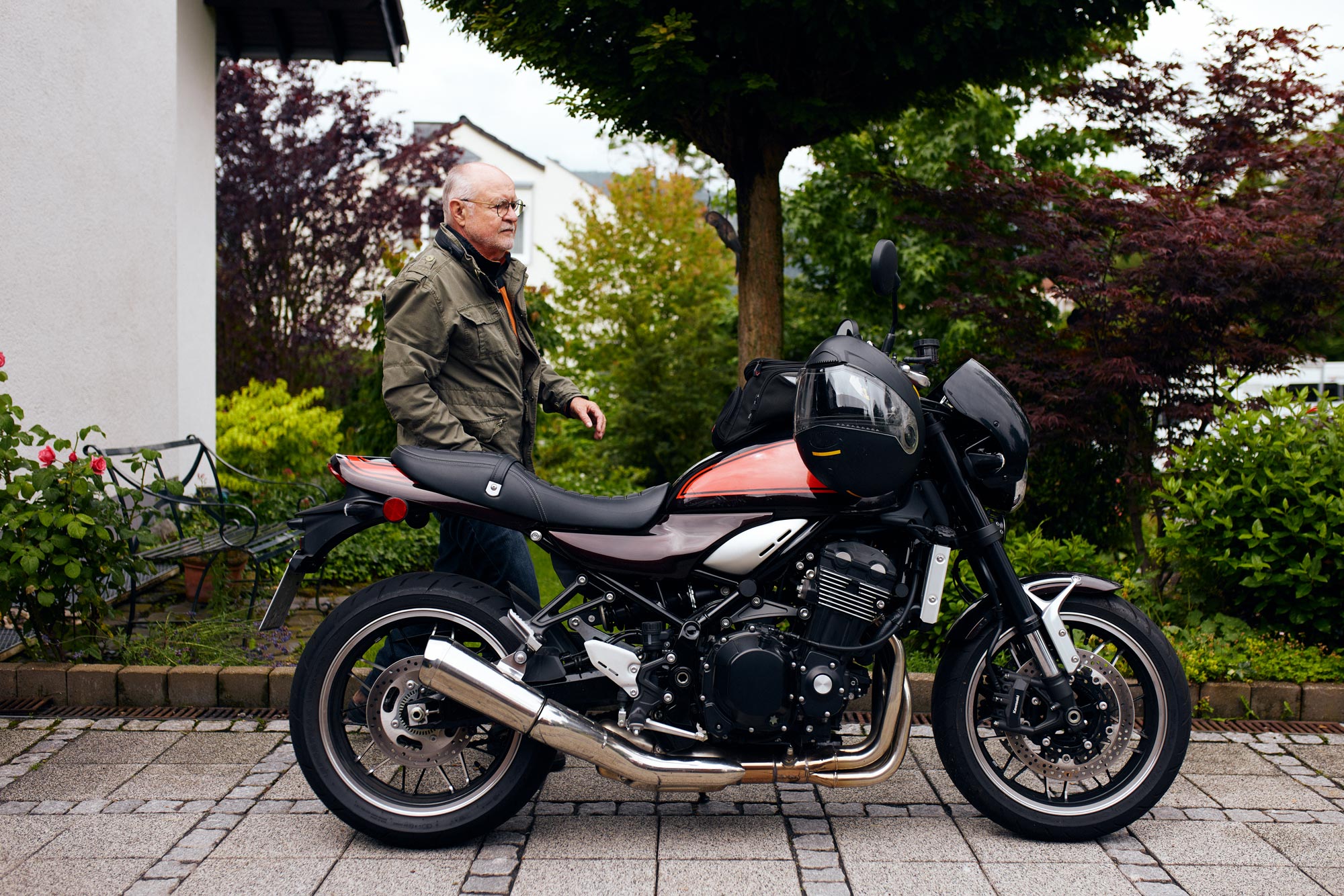
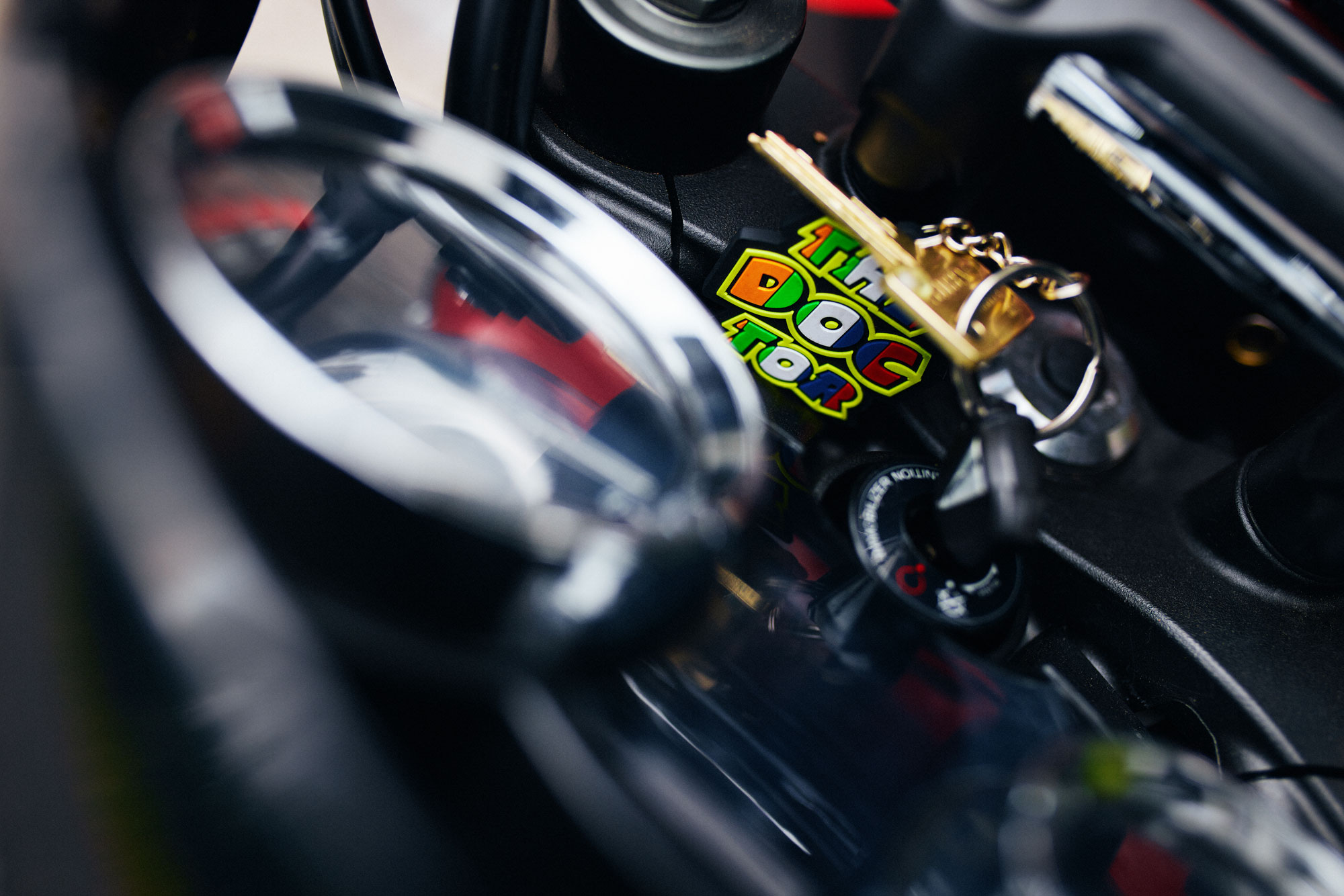
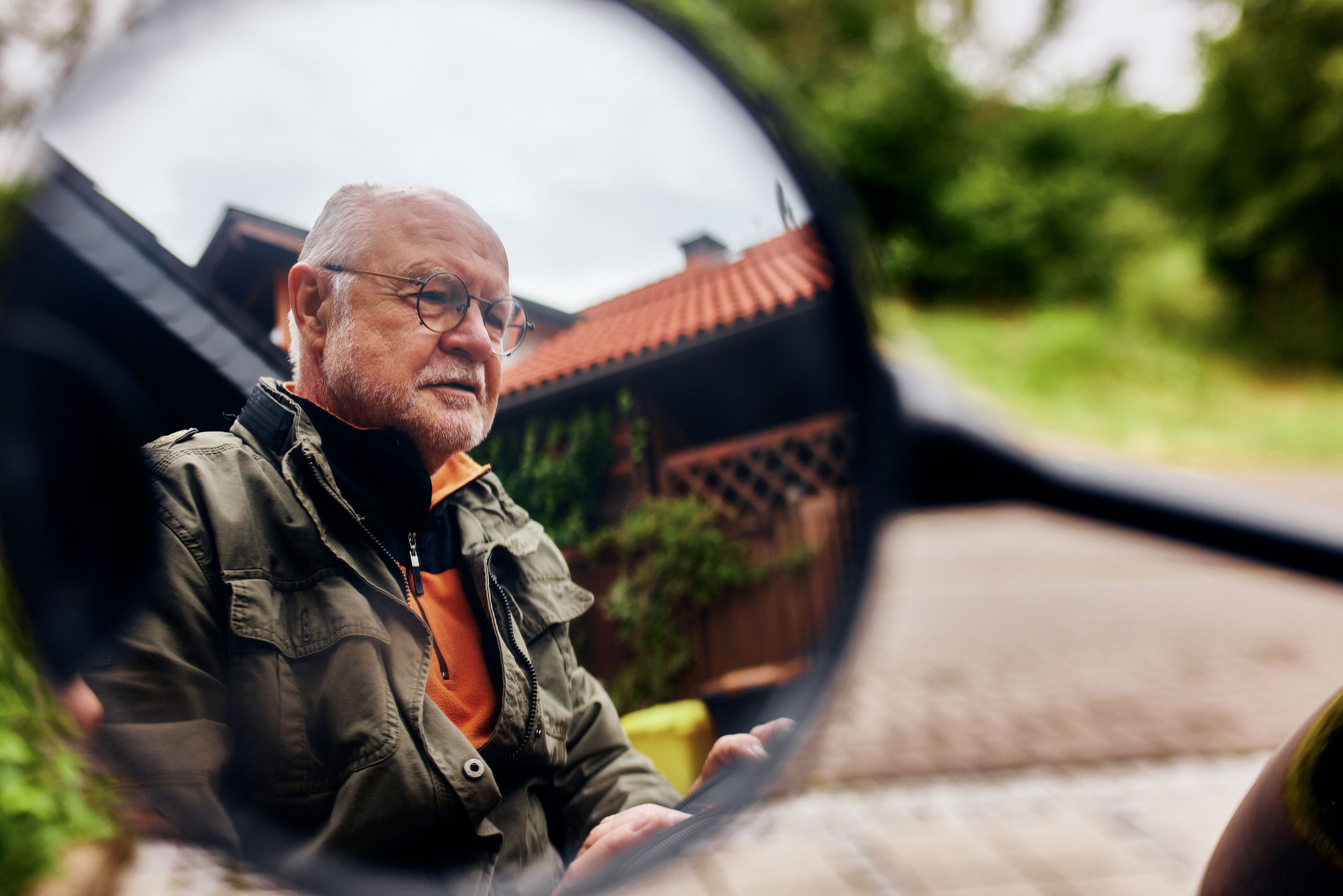
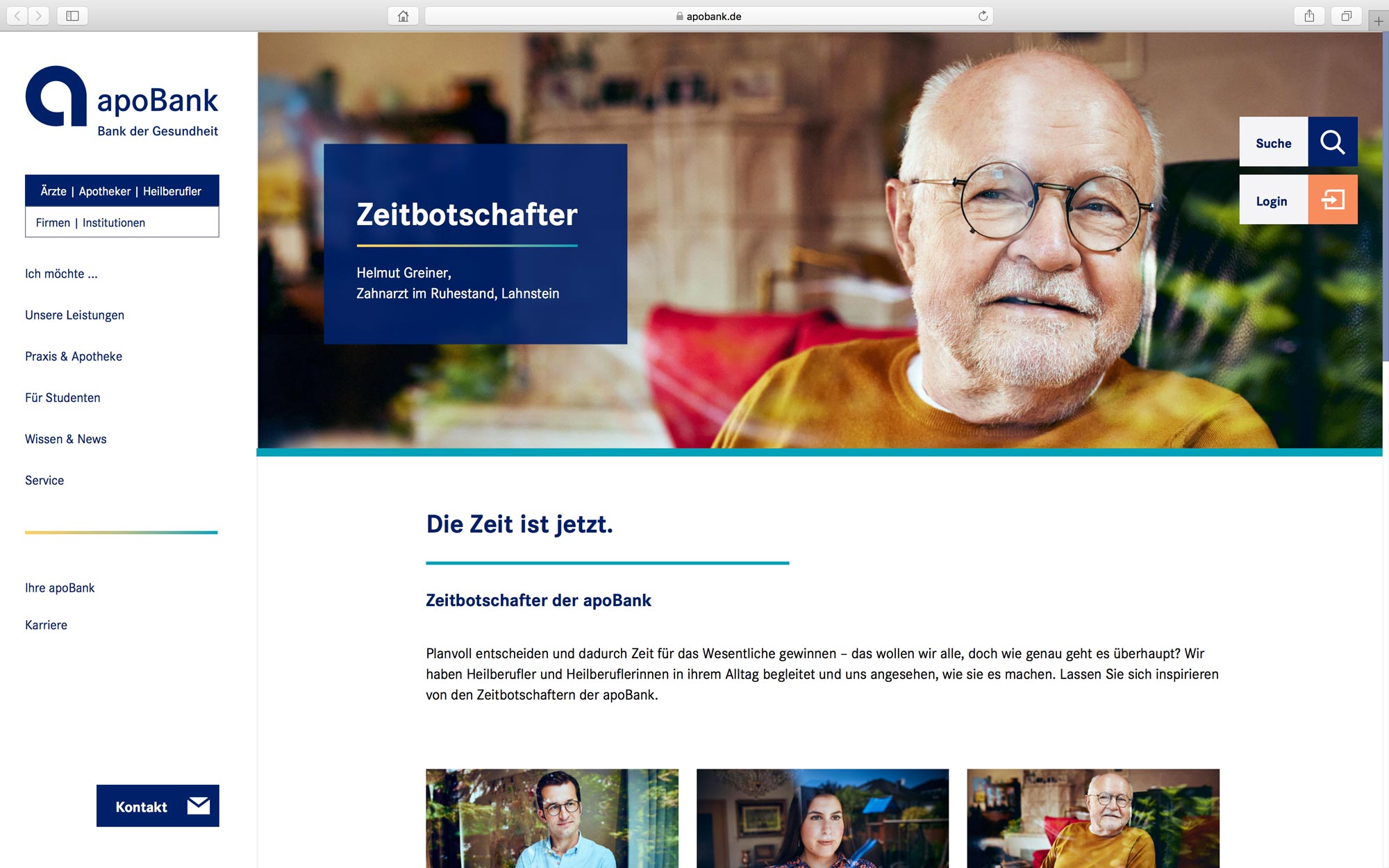
Over the course of 2021, I had the pleasure to realize a new brand campaign entitled „Die Zeit ist jetzt“ (The time is now) for Deutsche Apotheker- und Ärztebank, developed by Berlin-based brand consultancy K’UP.
This campaign not only makes visible the diversity of individual lifestyles of people working in healing professions. It also sheds light on what these people draw their strength from and what is important to them in life. The core message of the campaign is that apoBank makes it easy for its customers to follow their vocation in order to have time for the essentials in life.
The time is now
Client:
Dt. Apotheker- und Ärztebank
Lead agency:
K’UP
Text & direction:
Jonas Meyer
Photography:
Maximilian König
Camera, editing & grading:
Steven Lüdtke
Over the course of 2021, I had the pleasure to realize a new brand campaign entitled „Die Zeit ist jetzt“ (The time is now) for Deutsche Apotheker- und Ärztebank, developed by Berlin-based brand consultancy K’UP.
This campaign not only makes visible the diversity of individual lifestyles of people working in healing professions. It also sheds light on what these people draw their strength from and what is important to them in life. The core message of the campaign is that apoBank makes it easy for its customers to follow their vocation in order to have time for the essentials in life.
For the campaign, photographer Maximilian König, DOP Steven Lüdtke and I portrayed a number of extraordinary personalities from a wide range of medical professions. While Max was commissioned with the production of the key visuals and editorials and Steven was responsible for the filming, it was my task to conduct in-depth interviews with the protagonists, develop individual portrait texts for the campaign website, and write personal voiceover texts for the 45-second short videos. Furthermore, I was entrusted with the direction during the production and post-production phases.
For the campaign, photographer Maximilian König, DOP Steven Lüdtke and I portrayed a number of extraordinary personalities from a wide range of medical professions. While Max was commissioned with the production of the key visuals and editorials and Steven was responsible for the filming, it was my task to conduct in-depth interviews with the protagonists, develop individual portrait texts for the campaign website, and write personal voiceover texts for the 45-second short videos. Furthermore, I was entrusted with the direction during the production and post-production phases.
Learn more on the bank’s official campaign website →
Further testimonials:
Further testimonials:
Full credits:
Editorial department, text & direction: Jonas Meyer
Photography & post-production: Maximilian König
Camera, editing & grading: Steven Lüdtke
Creative direction: Lars Weber
Graphics: Emily Gelbert
Production: Kleinundpläcking
Strategic supervision: Dr. Marc Herz
Full credits:
Editorial department, text & direction: Jonas Meyer
Photography & post-production: Maximilian König
Camera, editing & grading: Steven Lüdtke
Creative direction: Lars Weber
Graphics: Emily Gelbert
Production: Kleinundpläcking
Strategic supervision: Dr. Marc Herz